On a daily basis, on assignment, I have to interact with different stakeholders in a project. Depending on the position and the appetite for the discipline of UX-UI design, everyone has a different knowledge of the terms used.
Over the course of the missions, I have therefore compiled a large number of concepts and it is a vocabulary that I would have liked to have had when I started and which I have therefore consolidated gradually to help future students or new to digital.
I have therefore prepared a series of articles for you where each concept will be explained so that you can refer to it. We therefore close this series with the last 20 concepts. If you ever want to consult both parts - upstream, here are the links: 1 part, 2 part et 3 part.
#1 _ Layouts
carousel
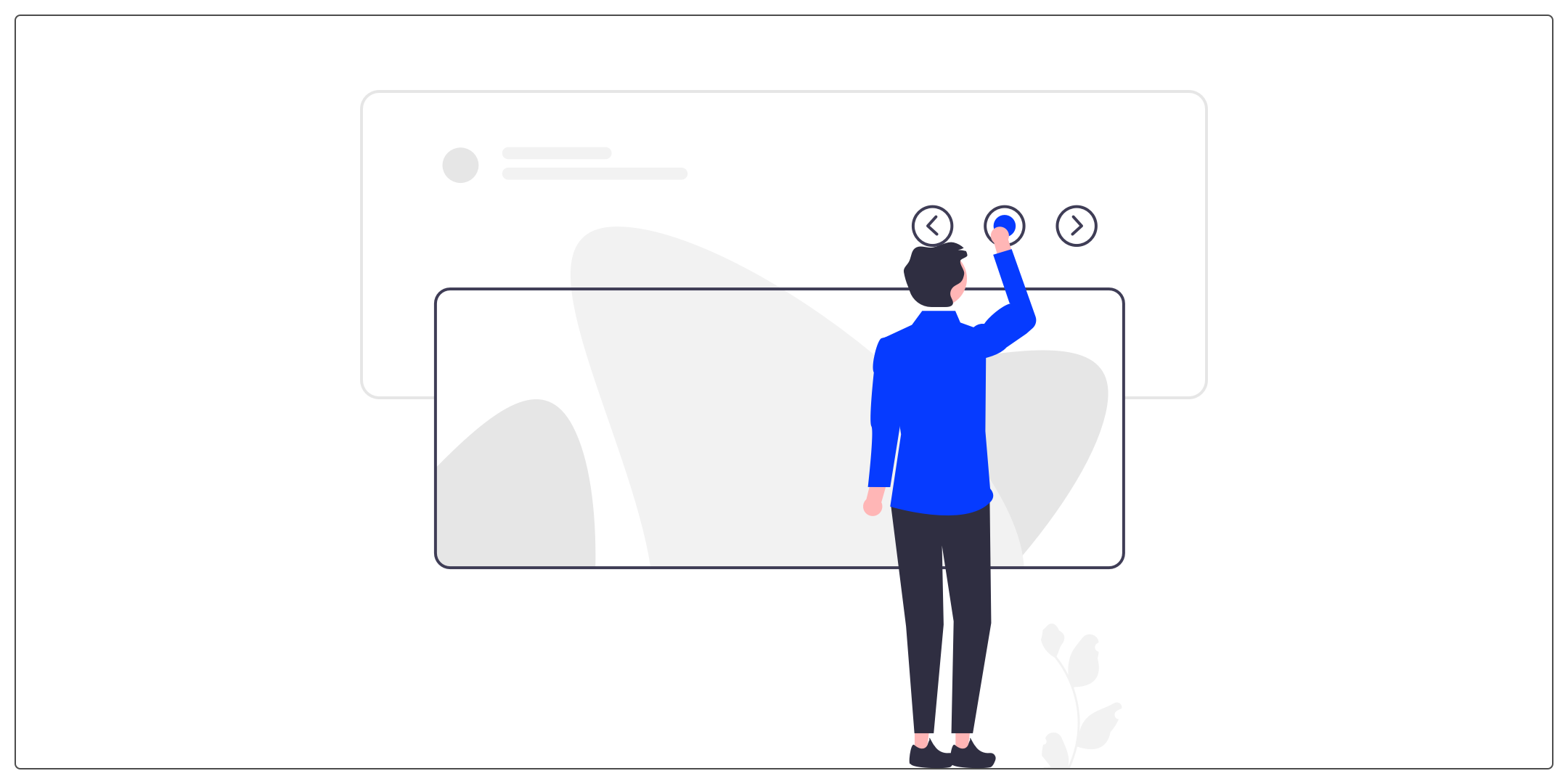
The carousel allows you to browse content such as images, maps, etc. using horizontal navigation. We often find them on the home page of a website to present the news.
Accordions
Accordions allow users to expand and collapse sections of content. They are very useful for organizing content and showing a clearly defined hierarchy to the user.
Pagination
Often at the bottom of a page, pagination organizes content into pages. We therefore find the number of each page. Sometimes some are hidden, depending on the number. Good practice is to always keep the first and last. Another good practice, to simplify use, is to display the “previous” and “next” buttons.
Item
An item is an element of a list. This is an important element because it is often what we will repeat several times by adapting the data displayed.
List
It is made up of a set of elements which follow one another in alphabetical, numerical or even random order.
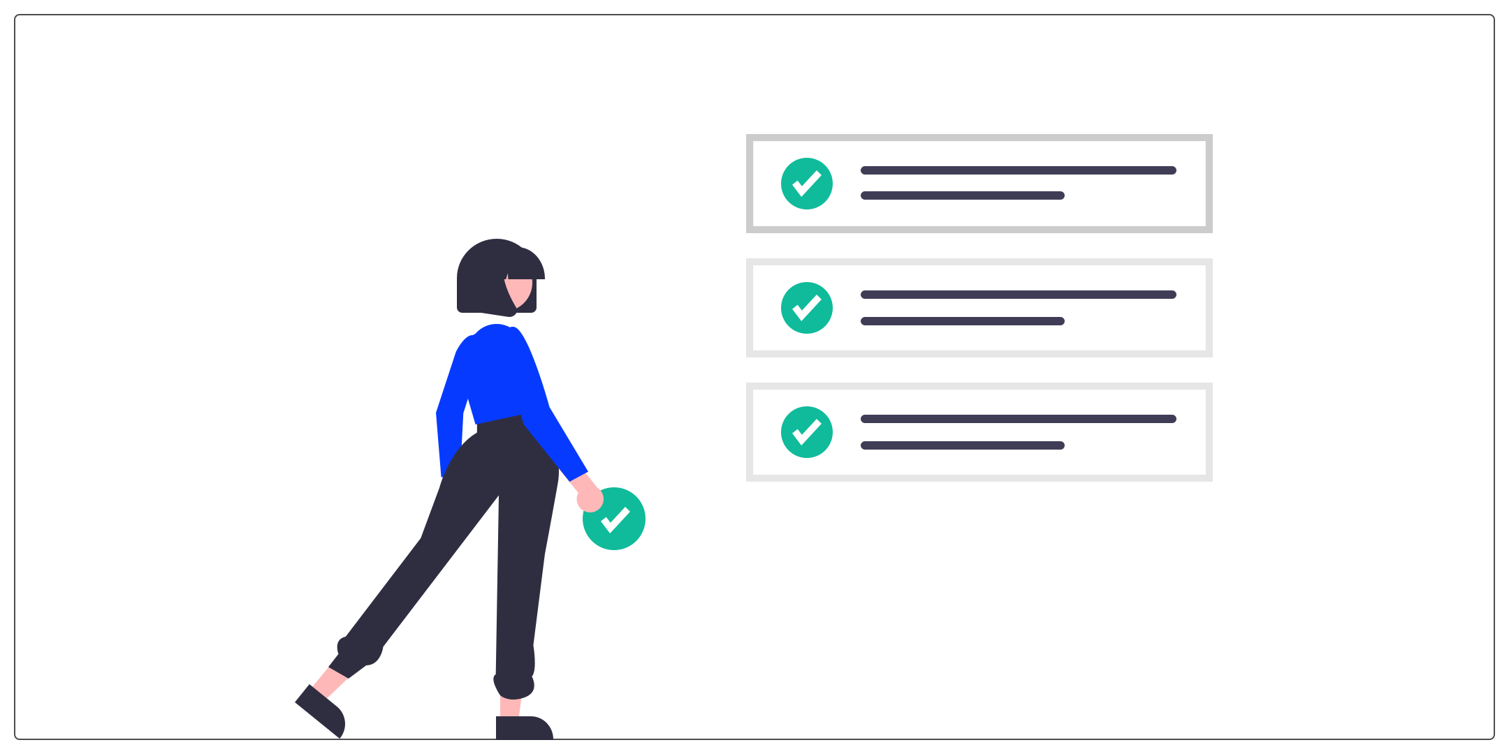 Several components can be nested there such as text, images, status, button, etc.
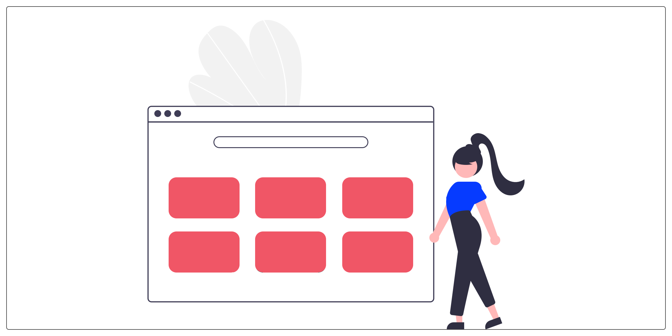
Grid list
Grid lists display a collection of images in an organized grid. Unlike the list, the elements are arranged vertically and horizontally, and no longer in a single vertical column like the list.
Card
The map is a component that allows you to group together within the same group.
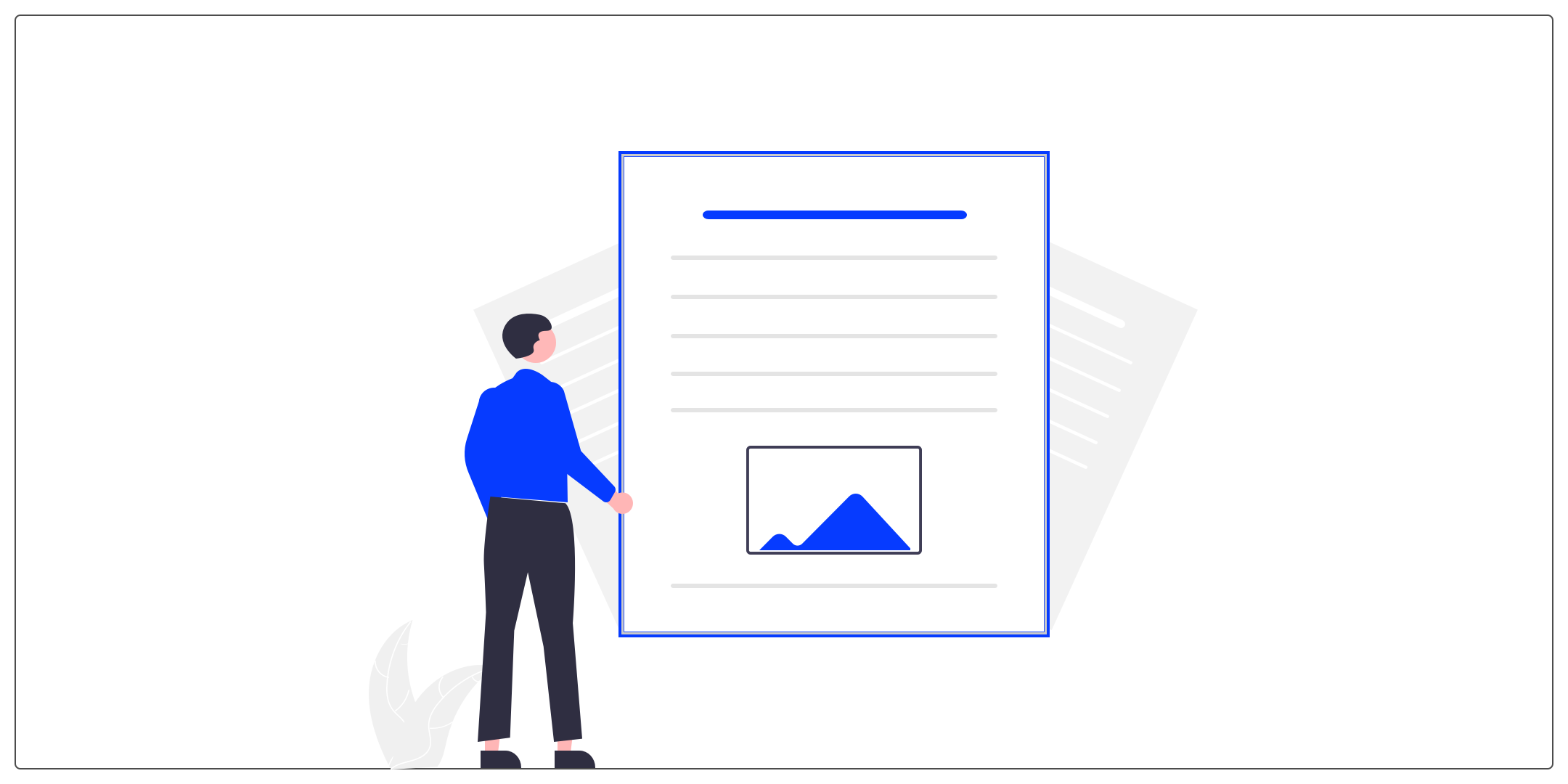
For example, a title, content and an image to materialize a media article. Or an image, a title and a purchase button on an e-commerce site.
#2 _ Forms
Contact Form
Forms allow you to retrieve information completed by the user. He will enter, complete or add elements into the system then submit them.
Field (input in English)
The field allows the user to enter information. This information could be in several forms, as can be described in the following concepts.
Text fields
Text fields allow users to enter and edit text. This can be a single line or multiple lines.
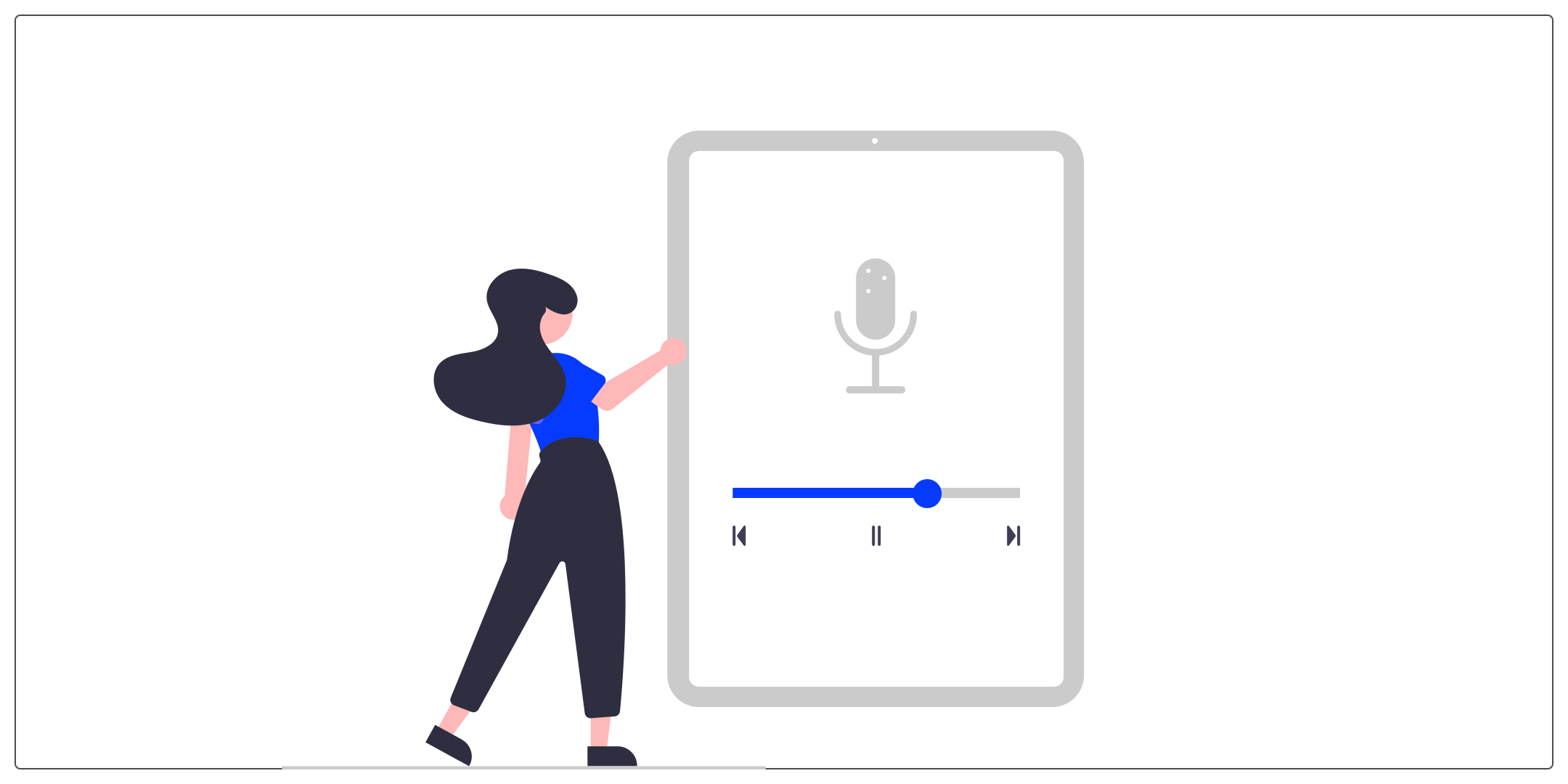
Cursor
The slider allows users to move through a series of values. It is mainly materialized by an interactive bar. For example, to adjust the volume or to move within an audio/video track.
Dropdown list (Dropdown or “select” in English)
The drop-down list allows you to choose between two and an unlimited number of options.
Checkbox
The checkbox allows users to select one or more options from a list. It is a component that allows the user to indicate choices from a list of proposals. Graphically, a checked box is generally materialized differently (thanks to an icon or a color), while an unchecked box is left empty. A box can also be grayed out when the choice is not possible.
Radio button
The radio button allows the user to select a single option from a set. Graphically, a radio button is represented by a circle. As with the check box, the user's selection is materialized differently (using an icon or a color).
Toggle/switch
The toggle is used for binary options. They allow you to activate or deactivate the state of a single element.
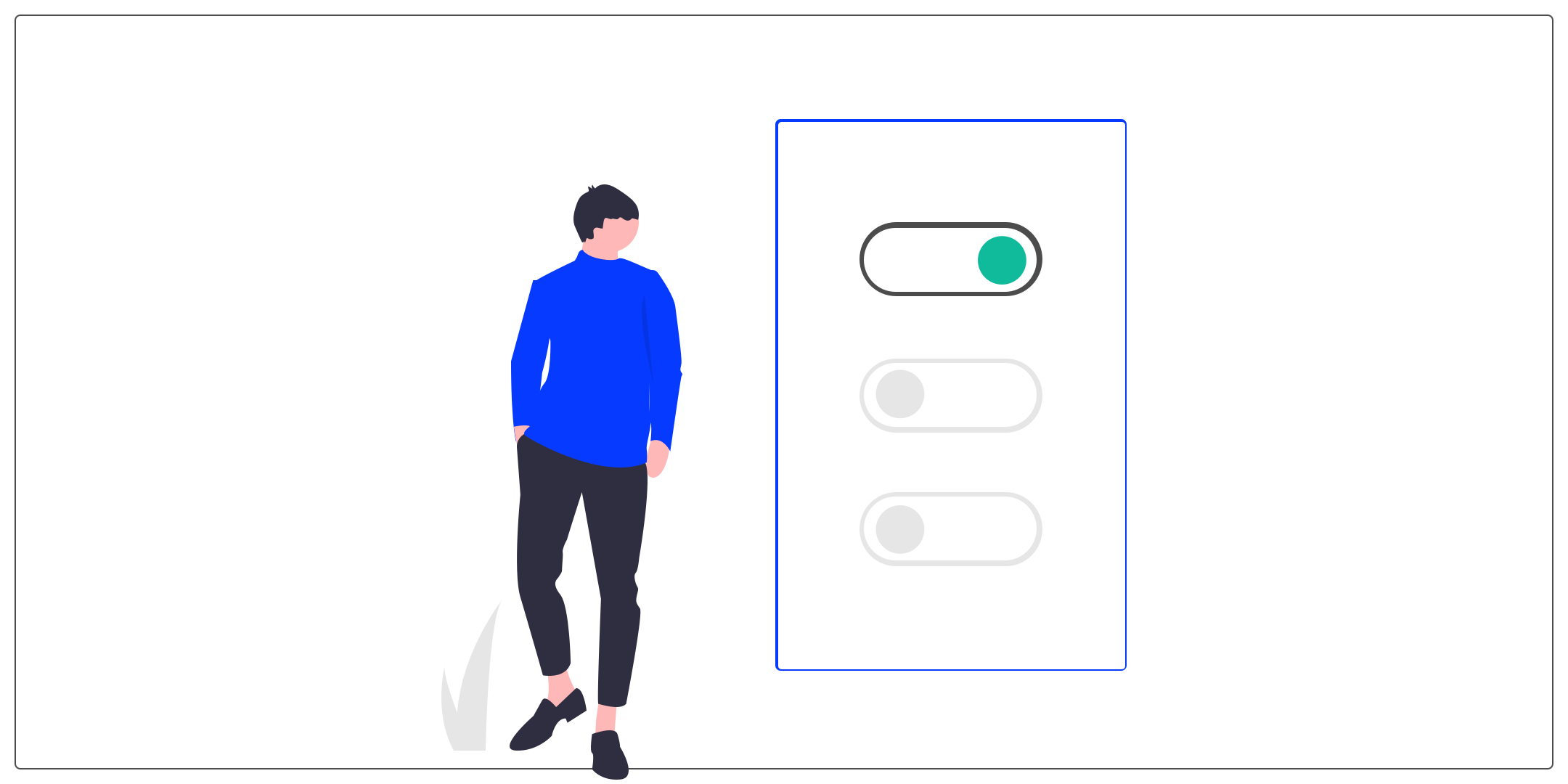 It's like a switch, the toggle can only take two positions (eg: on/off button).
Placeholder
A placeholder is an attribute used to display text by default in certain form fields. It will give the user clues to fill in a field. For example, to give the expected format of a date, an address or a telephone number.
#3 _ Actions
Button
A button allows users to make actions and choices with a single tap or click.
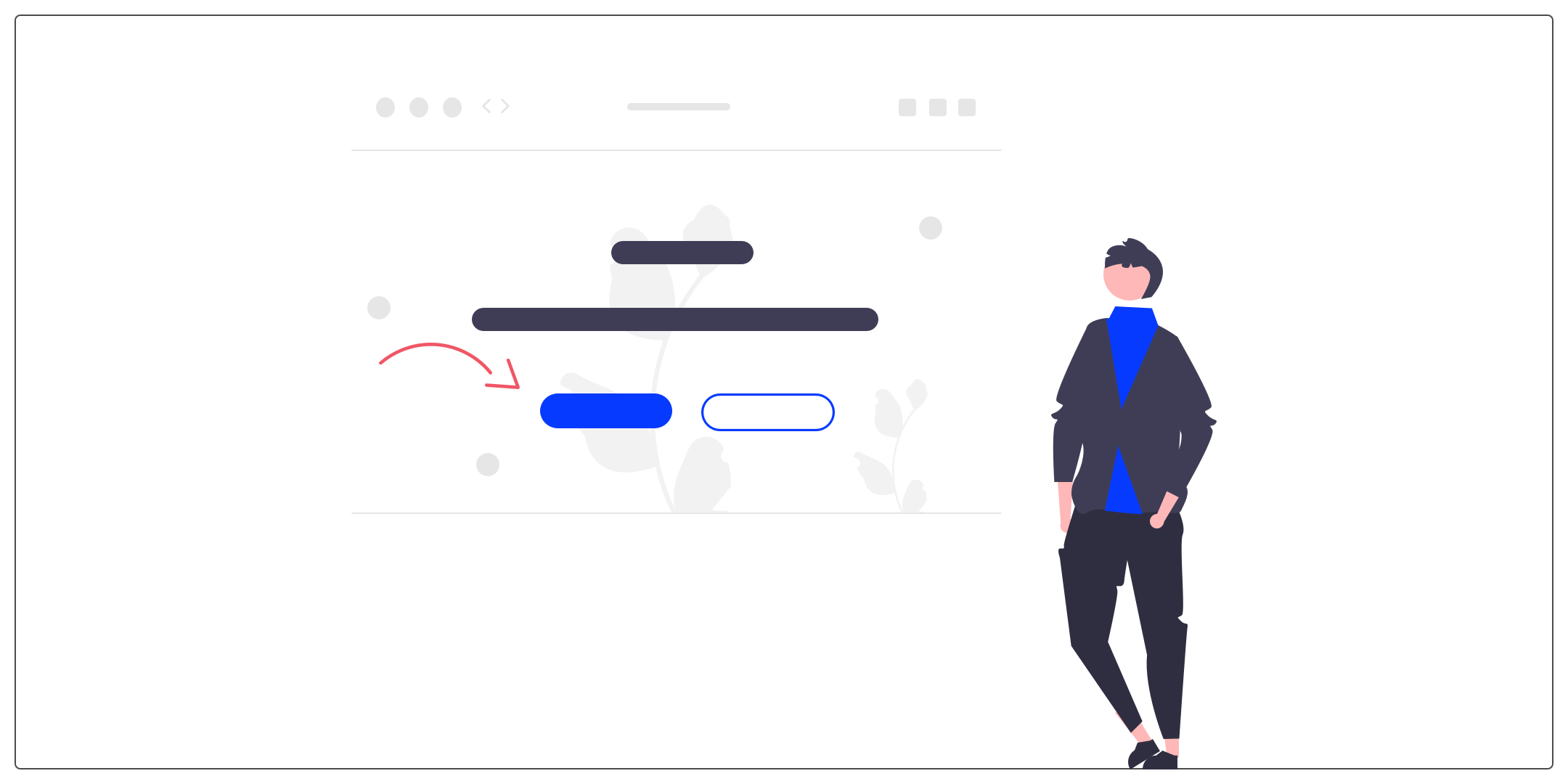 The button is one of the most important components of an interface because it directs the user along key paths: to purchase a product, take out a subscription or to register for example.
Link
A link is a way to move from one page to another. By clicking on a link, the user will directly access the information sought.
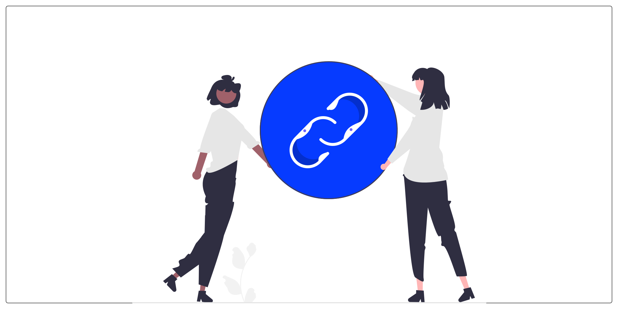 On the design side, it is important to clearly identify them. Often they are represented using underlining and color.
FAB (Floating Action Button)
The floating action button is a button that is a little different from the buttons we are used to seeing on platforms. Its particularity is that it will float in the interface, above content. Floating action buttons are mostly placed at the bottom right of the screen of your favorite applications. They are used in interfaces to group main actions for users.
Search bar
The search bar is a somewhat special input field because it allows you to search or filter elements. The search can be cross-site or on a specific functionality.
Conclusion
We therefore close our series of the small UX-UI glossary with these notions. There is no doubt that we will relaunch a new series to guide you on new concepts (probably non-existent to date!). Thank you for following us and don't hesitate to contact us if a concept is still giving you trouble!
To view the first three parts, here are the links: 1 part, 2 part et 3 part.
If you ever want to deepen your knowledge and practice designing a web interface, the UX-Republic training center offers “UI Design, the fundamentals” training. Here is the link to find out more.
Alexa CUELLAR, UX Designer @UX-Republic
