On a daily basis, on assignment, I have to exchange with different actors of a project. Depending on the position and the appetite for the discipline of UX-UI design, everyone has a different knowledge of the terms used.
Over the course of the missions, I have therefore compiled a large number of concepts and it is a vocabulary that I would have liked to have had when I started and which I have therefore consolidated gradually to help future students or new to digital.
I have therefore prepared a series of articles for you where each concept will be explained so that you can refer to it.
And we start our series with the first 21 notions.
#1 _Generic concepts
The affordance
If we look at the definition on the internet, affordance is “the capacity of a system, an object or a product to suggest its own use”.
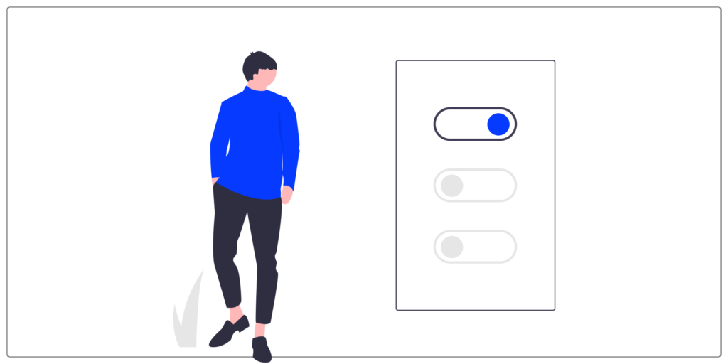
In other words, the affordance causes a spontaneous interaction between the user and his environment. For example, when we see a door handle, a dial to adjust the sound or a switch, we know how to interact with it.
The use of the object is intuitive thanks to the way it has been designated.
Here, we have the example of the switch where the button changes place and color depending on the state.
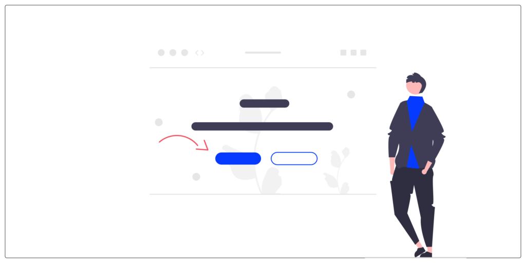
To prioritize the information, several techniques can be used:
● Colors and contrasts
● Element sizes
● Locations
web accessibility
Web accessibility consists of optimizing an interface to meet the needs of a greater number of users, in particular users with disabilities.
We therefore eliminate all obstacles to understanding and readability in order to provide reading comfort and provide access to information and content in an equitable manner to all our users.
A dark pattern
A “dark pattern” or “dark UX” is an interface that has been specially designed to trick or manipulate users.
Often these choices can be put in place to engage the user more and make the user stay longer on a service using cognitive biases. They also help to generate more sales and collect more information about users.
An example that I see often, and surely you too, happens on online travel sites where a sense of urgency is created in the user. with information such as “Attention only one room available!”, “Attention, other people are viewing this reservation at the moment”.
An Empty State
An “empty state” is the empty state that explains to the user what to do and how to do it. The idea is to explain to him as clearly as possible and also with a touch of sympathy his options.
The tone of voice
Tone of Voice refers to how the company communicates its values, personality and vision to its users and how this influences the perceived message.
It is well known that a brand is distinguished by the visual aspect but the language is also a strong element of differentiation.
I share you an article (in English) with examples of brands like Starbucks, Uber or Coca Cola.
gamification
Gamification is the use of game mechanics (video games, mobile games, etc.) in a context outside the game to retain and engage users.
An application that I recommend to you to understand the term “Gamification” is the Duolingo application! It is an application that allows you to learn a new language with a progression and objectives to achieve.
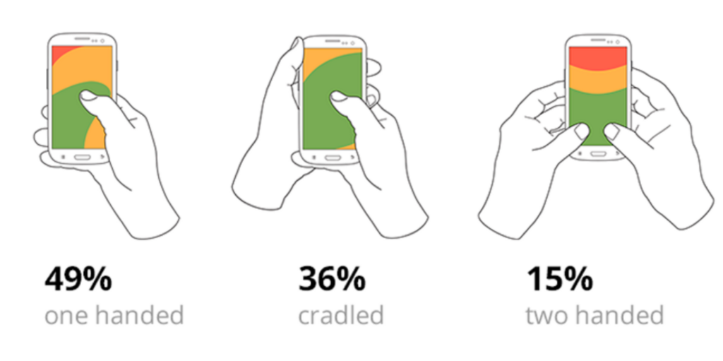
The “thumb zone”
Graphical representation of which areas of our product (using color) are easiest or hardest to click with a thumb on a mobile device.
Image often used to show how a user holds his phone and therefore hard-to-reach spaces.
#2 _Should we add this feature?
A zone
A zoning allows you to roughly schematize the content elements that you want to highlight on the final interface and to prioritize them.
I use this method a lot, especially on paper, to clarify my ideas or defend an idea in front of the team.
But it's an easy-to-learn technique that can be very useful in the hands of your project team, especially for co-design workshops.
A wireframe
A wireframe is a simplified, detailed diagram of a page. It makes it possible to concretely translate the functional specifications.
Good practice is therefore not to use colors or images to focus on the functional aspect.
We seek to describe the basics: What does the page contain? What information is there? How are they highlighted?
A graphic model
The model gives an overview of the potential final rendering before it is developed.
During the creation of the models, we will make important decisions on the graphic details: the colors, the typography, the visual style and everything related to the general graphic aspect of the interface.
A prototype
The prototype is the dynamic representation of your final project. This step allows you to test the solution.
This makes it possible to test whether the journeys are adapted to the needs of the users, whether they contain errors or other usability problems.
A graphical chart
A graphic charter is a document that defines the standards according to which the different elements of the visual identity must be used. The charter makes it possible to have consistency on all the supports where the brand will be represented (logotype, colors, iconography, etc.)
A UI Kit
A UI Kit is a document produced on software to create components using the elements listed in the graphic charter and the style guide.
A style guide
The style guide or GUI (Graphical User Interface) is a document that compiles all the elements of an interface that makes up a website or an application.
The style guide serves as a common reference for all widgets. It is both useful for the UI designer, when creating models, and for the front-end development team, during integration. It is also very useful for discussing the different evolutions of the project, during the iterations.
A Design System
It is a library which gathers all the graphic elements and the components of an interface. It brings together various elements (marketing, design, dev, etc.) and assets and documents. It is an evolving and shared tool.
#3 _Entertainment
rollover
Rollover is the change in appearance of an element on mouseover. We can therefore change the appearance of the text, the background color, animation of appearance or disappearance, a zoom, …
motion design
Motion design is a technique that consists of animating graphic elements. Images are brought to life through movement in order to convey a message in a dynamic way.
“Parallax” scrolling
“Parallax” scrolling is a technique that allows pages of sites to be scrolled at different speeds.
The result is that, when you scroll, you have a depth effect that gives the impression of 3D.
How to create a parallax effect?
The layers that make up the scene scroll at varying speeds.
Loading screens
Loading screens are designed to let users know that the system is performing an action in the background and should wait.
Progress bars
Progress bars help users visualize where they are in a series of steps.
Conclusion
We meet again for the next series where we will see together four main themes: page types, cross-functional organizations, brand identity and typography.
If you ever want to deepen your knowledge and practice the design of a web interface, the UX Republic training center offers training “UI Design, the fundamentals”. here is the link to know more.
Alexa CUELLAR, UX Designer @UX-Republic
Source images:
– https://undraw.co/ – https://giphy.com/
Our next trainings
STORYTELLING: THE ART OF CONVINCING # Paris
SMILE Paris
163 quay of Doctor Dervaux 92600 Asnières-sur-Seine
UX/UI ECO-DESIGN # Paris
SMILE Paris
163 quay of Doctor Dervaux 92600 Asnières-sur-Seine
DESIGN THINKING: CREATING INNOVATION # Belgium
UX-REPUBLIC Belgium
12 avenue de Broqueville - 1150 Woluwe-Saint-Pierre
MANAGING AND MEASURING UX # Paris
SMILE Paris
163 quay of Doctor Dervaux 92600 Asnières-sur-Seine
DESIGN SPRINT: INITIATION & FACILITATION # Paris
SMILE Paris
163 quay of Doctor Dervaux 92600 Asnières-sur-Seine
UX-DESIGN: THE FUNDAMENTALS # Belgium
UX-REPUBLIC Belgium
12 avenue de Broqueville - 1150 Woluwe-Saint-Pierre
GOOGLE ANALYTICS 4 #Paris
SMILE Paris
163 quay of Doctor Dervaux 92600 Asnières-sur-Seine
ACCESSIBLE UX/UI DESIGN # Belgium
UX-REPUBLIC Belgium
12 avenue de Broqueville - 1150 Woluwe-Saint-Pierre
