On a daily basis, on assignment, I have to exchange with different actors of a project. Depending on the position and the appetite for the discipline of UX-UI design, everyone has a different knowledge of the terms used.
Over the course of the missions, I have therefore compiled a large number of concepts and it is a vocabulary that I would have liked to have had when I started and that I have therefore consolidated as I go along to help future students or new to digital.
I have therefore prepared a series of articles for you where each concept will be explained so that you can refer to it.
We continue the series with this third part and the 21 concepts that make it up. If you ever want to consult the first two parts beforehand, here are the links: 1 part et 2 part.
#1 _ Grid and spacing
Grid
The grid is a repository for building the structure of pages and prioritizing information. This is one of the exercises to tackle first when creating our wireframes and models; and this for each of the devices.
Baseline
The baseline provides a reference point when placing a block of text and determining which line spacing to choose.
Breakpoint
A breaking point is a plateau. From a certain width of the window, the layout and arrangement of the contents may vary to adapt to the available space.
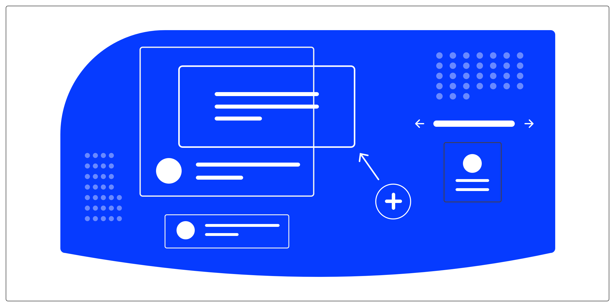
Spacings
The spacing between the different elements and content of your interfaces is very important. By correctly adapting the spaces, you will be able to create reading comfort and limit the risk of error.
- Margin: Controls the space between the current element and other elements on the page
- Padding: Controls the space between the content and the element border.
Border-radius
The “border-radius” property is a CSS property that allows you to define the angle of the corners of an element. Each angle can be defined differently to create an uneven shape or each angle can have the same value. We find border-radiuses on different elements of an interface: a background, a map, a button, etc. The choice of border-radius will have a strong impact on the overall feeling of the interface. It is therefore important to understand the properties that each offers.
I wrote an article to be guided in the choice of the border-radius that we use in UI design: I'll share the link with you here.
#2 _ Notifications and alerts
Toast / Snackbar
The toast and the snackbar are components that inform the user of an action in progress. These are “in app” notifications, contextual and which are non-obstructive (they generally only appear for a few seconds before disappearing).
They allow you to give a short message about something that is happening (for example, a state).
- Toast: gives feedback on what is currently happening
- appears and disappears without user action required
- there is only an information message (no action)
- can be contextual more broadly at the application level
- Snackbars: displays alerts, additional actions
- you can make it disappear manually using a gesture or a button
- contextual actions to the action are proposed
- must be linked to the context of the displayed screen or to the current action
Modal/non-modal window
- Modal window: opens above the application and does not allow the user to interact with the application window "below" (the window that opened it), until it remains open.
- Non-modal window: also opens above the application but allows the user to continue to interact with the application window located “below”, without necessarily having to close it.
Pop-up / Pop-in
- Pop-up: is a window that appears above the content. This is opened by your browser and not by the site. Until the user closes it, they are blocked.
The pop-up is used to display advertising messages, warning or notification. - Pop-in: is a window that is displayed above the content as well. Their operation is similar to pop-ups. The difference is that it is triggered by the code of the website and not the browser. The pop-in is used to display content related to the website such as images, photos, videos, etc.
Popover
A popover can be used to display one content over another. For example, the description of a location on a map when you click on a city.
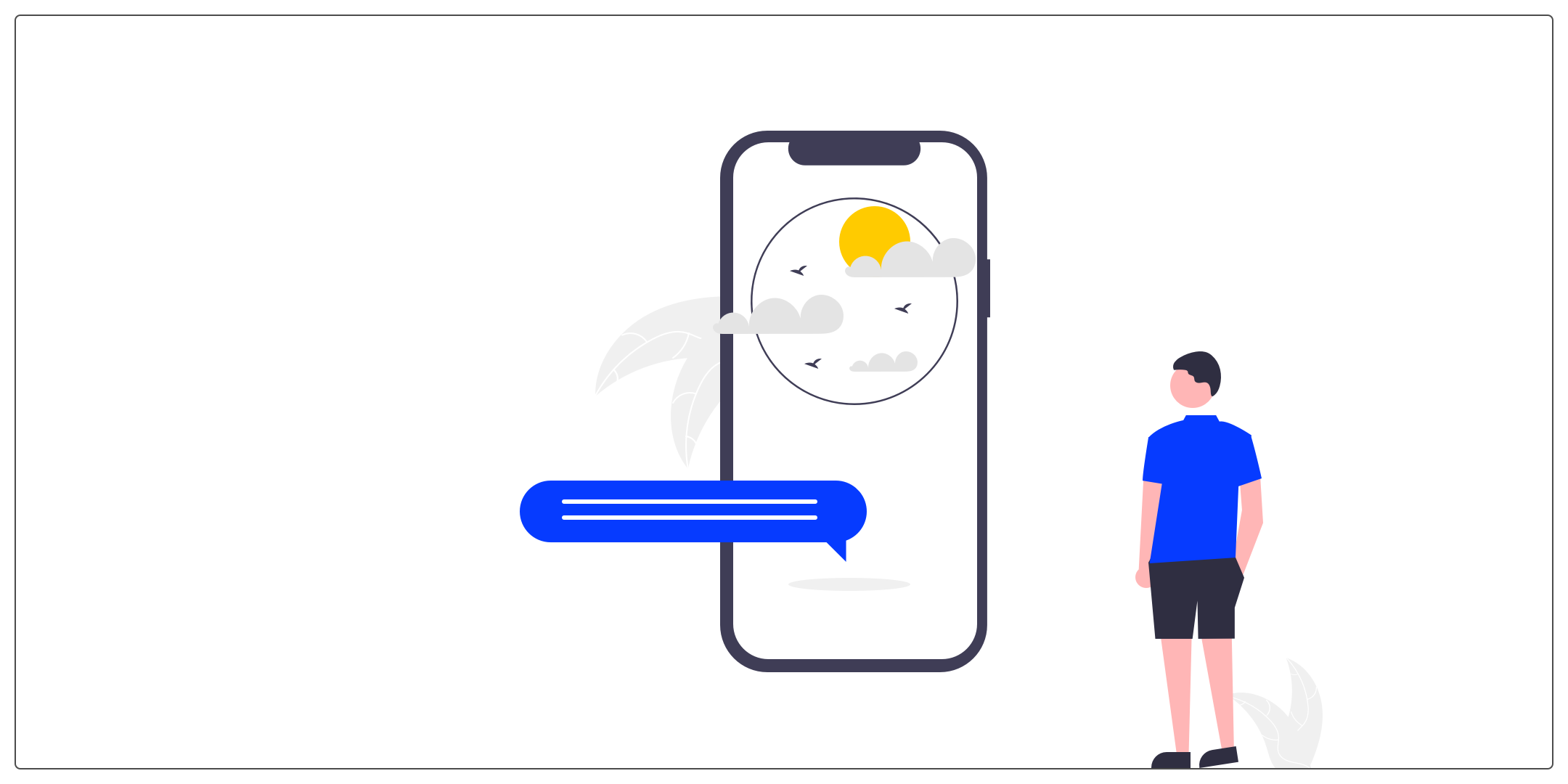
Push notifications
Push notification is an alert message sent by the server (which “pushes” information) to a user through a mobile application.
#3 _ The different types of menu
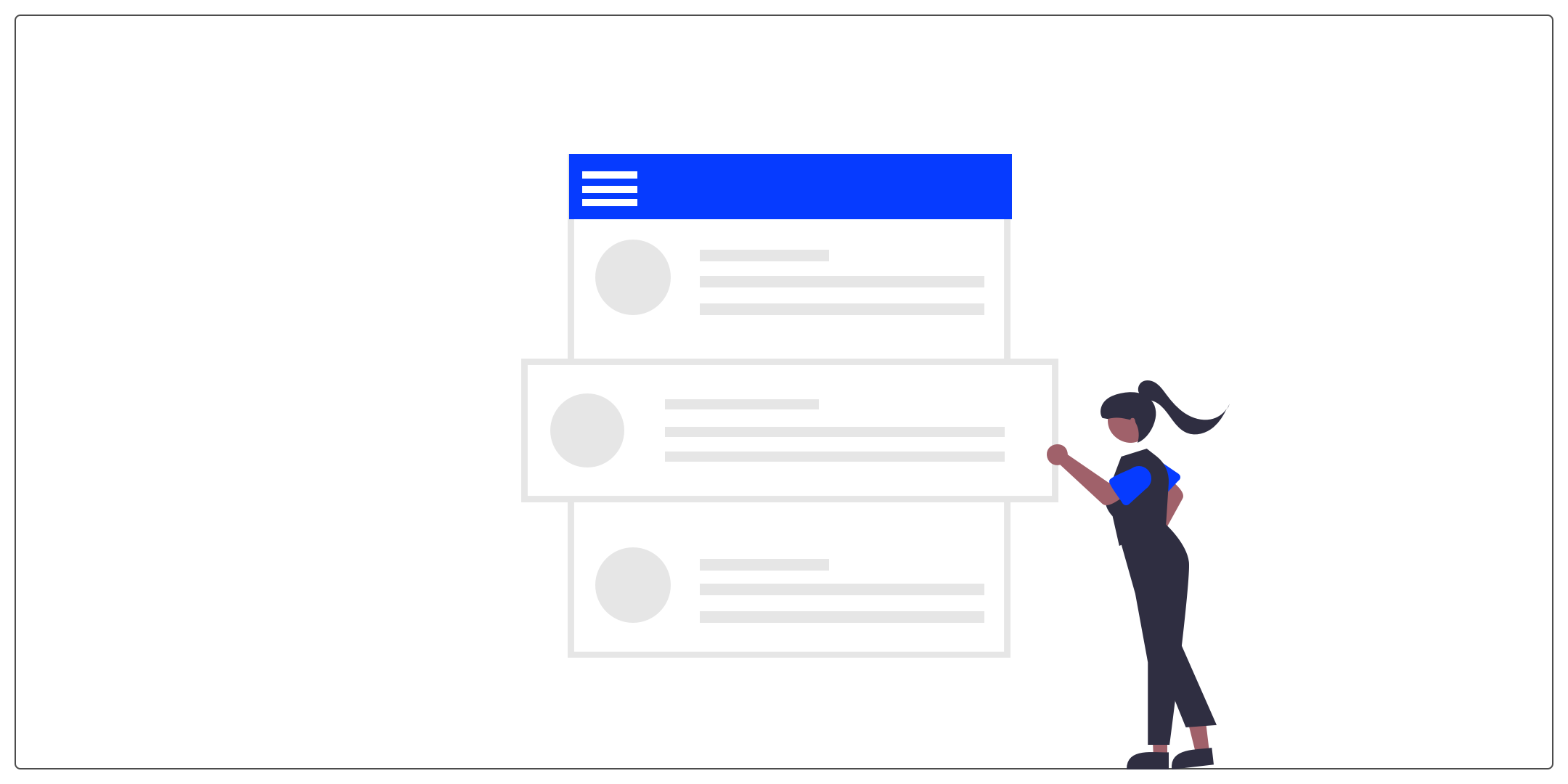
It allows you to bring together the entries of a site behind a single button.
Tab bar
The tab bar appears at the bottom of a mobile application and allows users to quickly move between the main pages of an application.
Conclusion
We meet again for the next series, the fourth and last, where we will see together a big theme: layout components, forms and actions.
If you ever want to deepen your knowledge and practice designing a web interface, the UX Republic training center offers “UI Design, the fundamentals” training. Here is the link to find out more.
Alexa CUELLAR, UX Designer @UX-Republic
