Here is a question that was asked to me a long time ago, when I started as a UI designer, and I had long looked for the why and how!
Today, we find buttons of different sizes, colors and styles on interfaces.
The shape of the buttons has not escaped the customization of a site or an application.
When we navigate, we don't really ask ourselves the question of the shape that a button can have, as long as it works and directs us to the page or the action that we want.
And yet, it is a property that has a lot of power and can bring tone and personality to a charter.
I share with you today the keys to define which border-radius adopted according to the message carried by your service / product.
Border-radius, kesako?
Before going any further, let's define together what the border-radius is.
It is a property in CSS which allows to define the angle of the corners of an element.
- Each angle can be defined differently to create an uneven shape or each angle can have the same value.
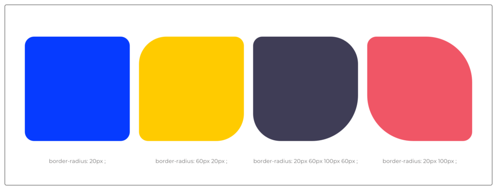
- We find border-radius on different elements of an interface: a background, a card, a button, etc.
The choice of border-radius will have a strong impact on the overall feeling of the interface. It is therefore important to understand the properties that each offers.
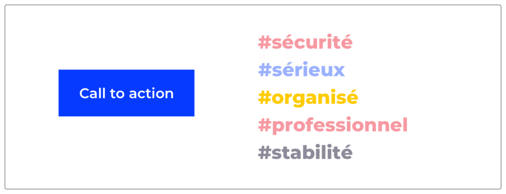
#1 Radius at 0px
The classic option that brings seriousness and stability to an interface.
When a brand uses it, they want to give you a sense of security and show you the professionalism of their service or product.
These buttons are found at right angles on ministerial and e-commerce sites.
- Departmental sites: commitment, seriousness
- E-commerce sites: secure paymentThe geometric shape keeps the elements aligned and organized to maintain a balance between all. This balance gives confidence to the user.
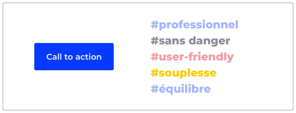
#2 Radius at 3 – 4px
The most commonly seen and harmless option when it comes to UI design.
Indeed, it allows to have a professional spirit but without being strict.
The lightness of the border-radius makes it possible to be closer to the users and to provide what is called a user-friendly atmosphere.
We erase the angular sides to create small bends that will bring flexibility while maintaining the balance between the different elements.
This is an option that you will find in many types of sites.
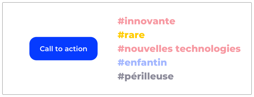
#3 Radius at 6 – 12px
We can say that this option is unusual but we find it more and more in the graphic charters of sites related to new technologies.
It is rare and considered innovative although it is dangerous to use.
Indeed, unlike the previous options, it can be uncomfortable for both the user and the UI designer!
- For a user, it may be perceived as childish or as a developmental defect.
- For a UI designer, it can create imbalance and inconsistency in an interface. It is therefore necessary to be careful about its use but not to put it aside for all the good reasons mentioned!
#4 Completely Round Corners
To go around all the options, we must also mention the full rounding option: the round button!
This option is very common in interfaces because it creates a user-friendly and creative atmosphere.
The eye is naturally drawn to curves and this makes it easier to read and detect buttons with rounded corners.
Indeed, on an interface, surrounded by straight lines and parallel structures, the rounded button will stand out and be highlighted graphically.
The negative point of this materialization is the complexity to use it on all the components. It works very well for buttons but should be set aside for form fields for example.
It should therefore be used sparingly and in combination with one of the other options to counterbalance.
This option is used for many types of sites for all these advantages and for the dynamics it brings.
So much so that it is often found in communication elements such as the “Play” button of a video or the sharing buttons of social networks.
# In conclusion
So there is no right or wrong answer when it comes to selecting the border-radius within your interface.
The objective that you must have in mind is to maintain consistency in your choices to have consistency throughout the course (coherence of the whole, charter, brand and graphic strategy).
This graphic consistency will bring a particular tone to your interfaces to highlight your message and your product or service.
Image source: https://undraw.co/illustrations
Alexa CUELLAR UX-UI Designer @UX-Republic
Our next trainings
UX/UI ECO-DESIGN # Paris
SMILE Paris
163 quay of Doctor Dervaux 92600 Asnières-sur-Seine
DESIGN THINKING: CREATING INNOVATION # Belgium
UX-REPUBLIC Belgium
12 avenue de Broqueville - 1150 Woluwe-Saint-Pierre
MANAGING AND MEASURING UX # Paris
SMILE Paris
163 quay of Doctor Dervaux 92600 Asnières-sur-Seine
DESIGN SPRINT: INITIATION & FACILITATION # Paris
SMILE Paris
163 quay of Doctor Dervaux 92600 Asnières-sur-Seine
UX-DESIGN: THE FUNDAMENTALS # Belgium
UX-REPUBLIC Belgium
12 avenue de Broqueville - 1150 Woluwe-Saint-Pierre
GOOGLE ANALYTICS 4 #Paris
SMILE Paris
163 quay of Doctor Dervaux 92600 Asnières-sur-Seine
ACCESSIBLE UX/UI DESIGN # Belgium
UX-REPUBLIC Belgium
12 avenue de Broqueville - 1150 Woluwe-Saint-Pierre
EXPERIENCE MAPPING # Paris
SMILE Paris
163 quay of Doctor Dervaux 92600 Asnières-sur-Seine

