Over the course of the missions, I have therefore compiled a large number of concepts and it is a vocabulary that I would have liked to have had when I started and that I have therefore consolidated as I go along to help future students or new to digital.
I have therefore prepared a series of articles for you where each concept will be explained so that you can refer to it.
We started the series last month with the first part, we continue it with the following 19 notions.
#1 _Types of pages and screens
Template (template, layout in English)
A template serves as a reference document that uses the same structure of the elements that compose it.
For example, on a media site, we will create a standard page for articles that will be repeated each time. Text and images will have their designated place.
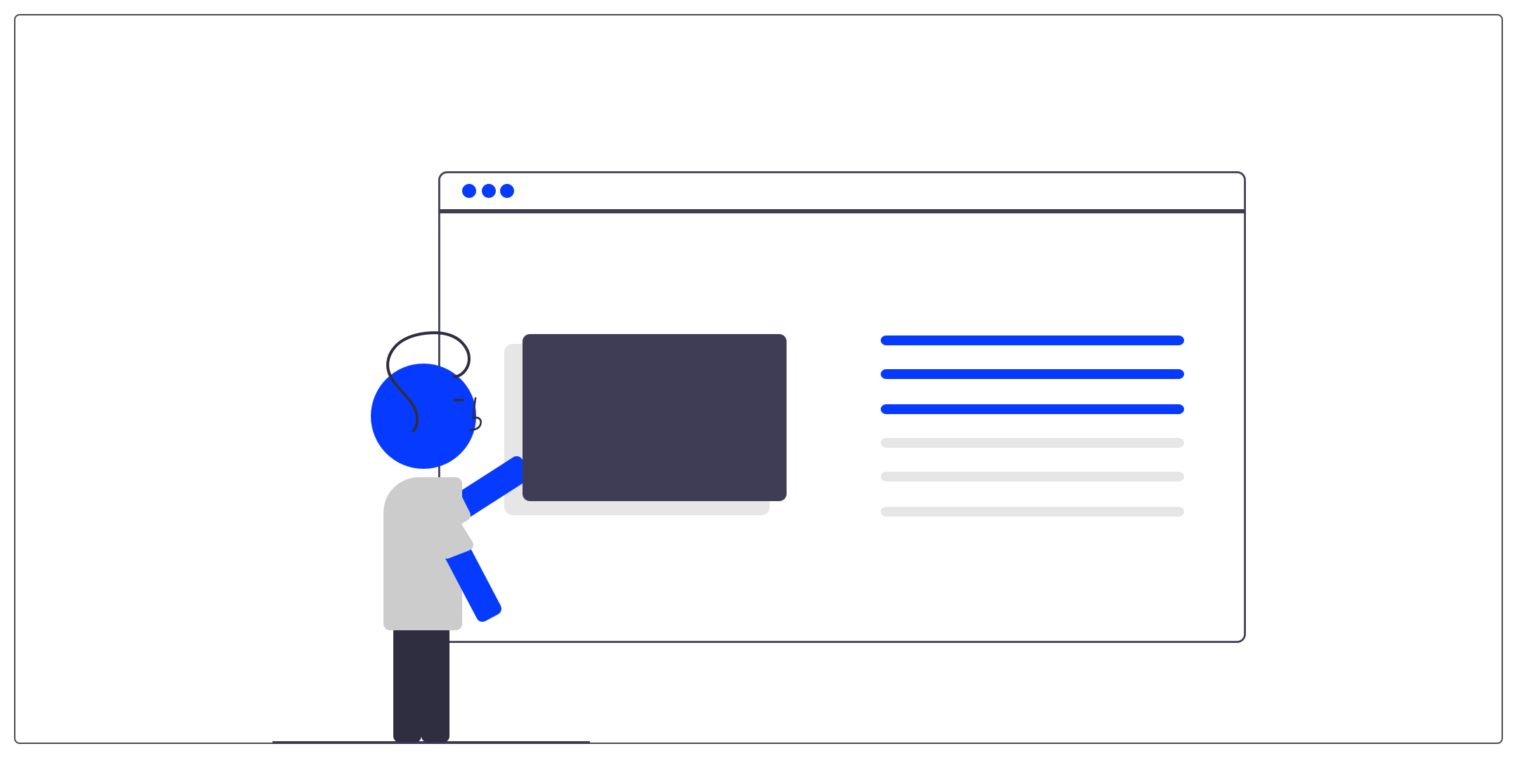
Splash screen
This is a screen that is displayed when opening an application or when loading data on the screen.
This screen allows the user to wait. The app's logo is often highlighted.
Onboarding
The onboarding steps are represented by a few screens to introduce the product or a new feature to a user when they access it for the first time.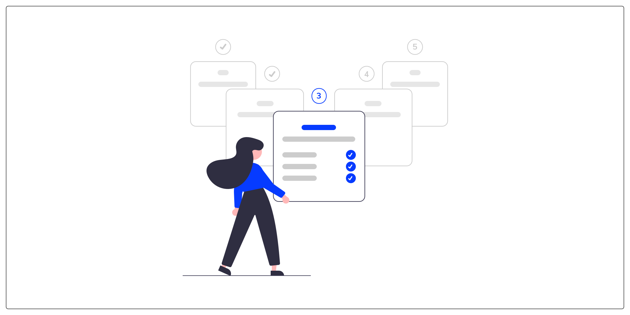
This is an important step in the experience that is increasingly found in the tools we use because it helps to make a good first impression and guide to key features.
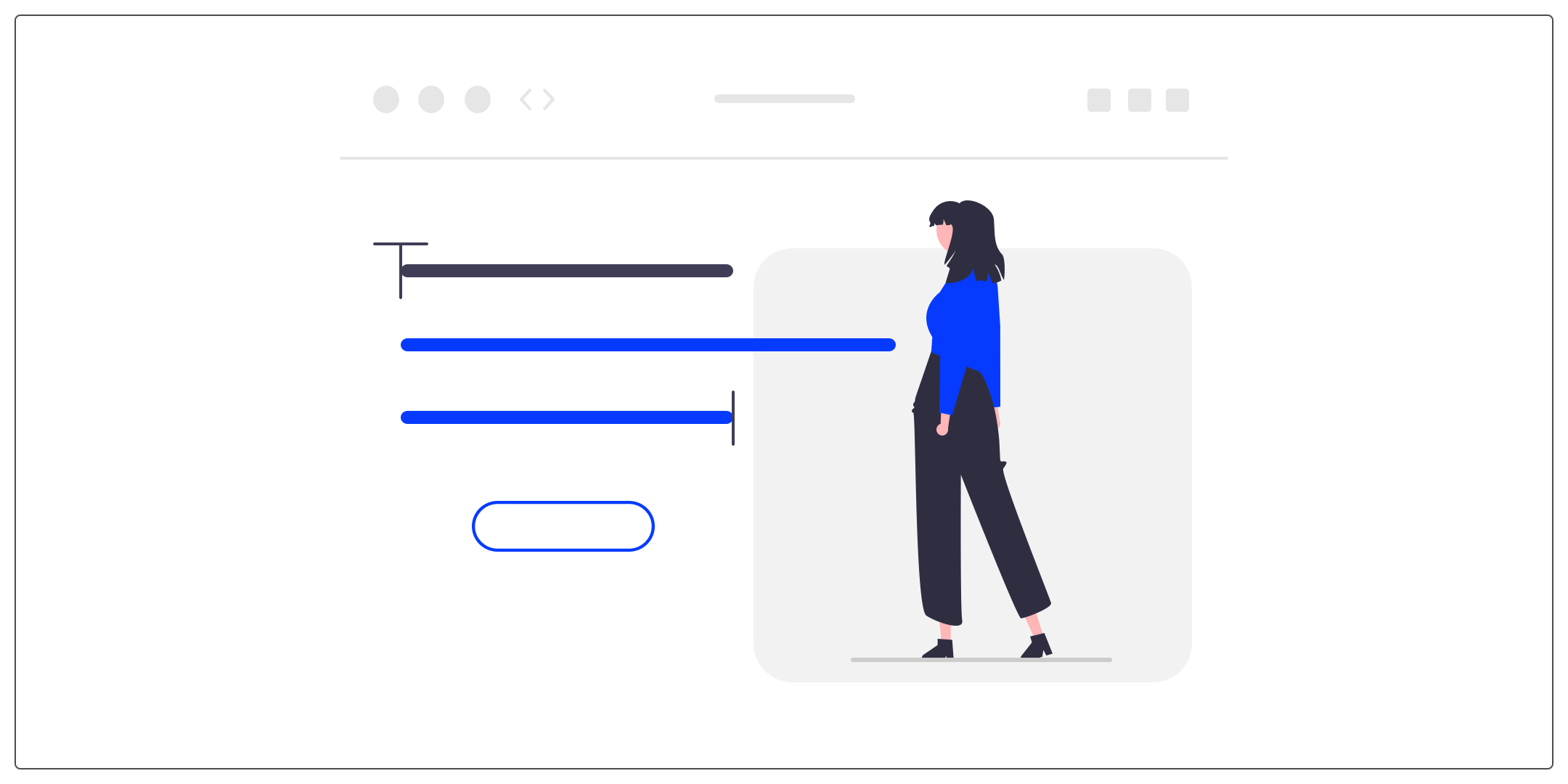
Landing page
A landing page is a specific web page. The user accesses it after clicking on an advertisement or an action button for example. Its objective is to roll out a marketing campaign to market a product or service.
The user can arrive on a landing page by consulting social networks, an advertisement on a site or an email.
#2 _Transversal organizations
Header
A header designates the top of a page on a website. It is mostly transverse, that is to say that it is present on the vast majority of the pages of the site.
It has a double objective, to identify the company and to present the navigation.
Sidebar (aside or side bar in English)
A sidebar allows you to have a group of navigation or content actions on the side of the page.
Footer
A footer designates the lower part of a website. Like the header, it is found identically, as a general rule, on all pages.
The footer allows you to finalize the site. Its design is therefore important. You can refer to it for links and texts that must appear on all pages, such as contact information, the site map, legal notices, etc.
Breadcrumbs
The breadcrumb allows users to see their current location and view content hierarchy. The user will be able to return to a page consulted during his navigation more quickly.
hero banner
A hero banner is a section of a web page that spans the full width of the screen.
It is often used at the top of pages to inspire the user and create a universe.
#3 _Brand Identity
The logo
A logotype corresponds to the name of the company which is designed graphically to represent it.
We will often use a font or shapes that we will customize to convey the identity and values of the company.
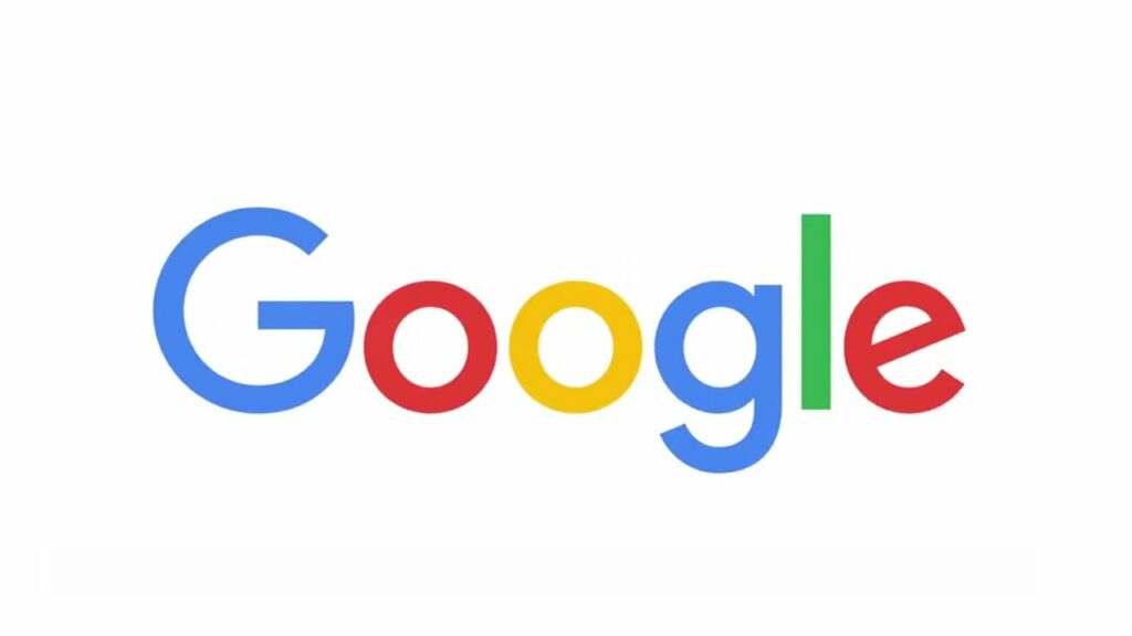
Google logo
The logomark (= badge in French)
The logomark usually does not include the company name. This is a more abstract representation that will help strengthen the identity of a company.
We often use a very telling pictogram that will allow the reader to identify the nature of the company. Moreover, it is often the logomark that is used on objects (goodies), clothing and other advertising elements.
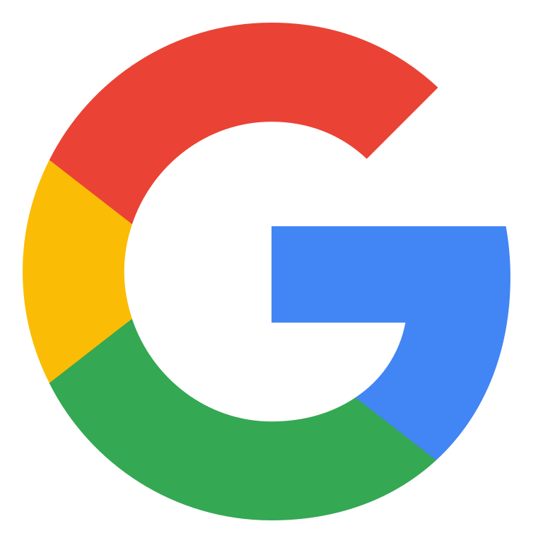
Google logo mark
The logo
The logo refers to all types of emblems that can represent a brand. So both logotypes and logomarks.
Some logos are both at the same time, the UX Republic logo for example. They contain both a stylized text element and a graphic element. Depending on the use, we will find either the logotype, the badge or the combination of the 2.

The UX Republic logo
Favicon
This is the icon that appears in tabs and links added to favorites in web browsers.
The word favicon is a contraction of the terms "favorite" and "icon". It is a graphic element designed to more easily identify sites in the lists and favorites bars of your web browser.
The color palette
The color palette is usually divided into several groups:
● Primary and secondary colors
● Shades of gray
● Status colors (success, warning, etc.)
The color palette makes it possible to create the universe of a brand and to guide the consumer on his inspirations.
By defining a palette, we make sure to bring consistency and homogeneity to the paths to optimize the user experience.
#4 _Typography
The police
The font designates an assortment of typographic characters having a particular design (letters, numbers, punctuations, etc.).
A font has 5 characteristics that can be varied individually:
● the family
● fat
● shape or style
● the size (the body)
● case (uppercase, lowercase)
Fonts
It is a set of characters of the same font having the same family, the same weight, the same size and the same shape. For example, at UX Republic we use the Montserrat font.
Typographic families
There are 5 families:
● Serif : which includes serif fonts (examples: Times New Roman, Georgia, Garamond…)
● Sans serif : or sans serif fonts (e.g. Helvetica, Montserrat, Myriad…)
● Cursive: which are the fonts that simulate handwriting (ex: Lucida Handwriting, but also Comic Sans MS (and yes!))
● Fantasy: more exotic, decorative fonts (e.g. Impact, Fraktur…)
● MPV: fixed-width fonts (width used for each character) (e.g. Courier New, Lucida Console, etc.)
# Conclusion
We meet again for the next series, the third and penultimate, where we will see together 3 main themes: grid and spacing, notifications and alerts and finally the different types of menu on the web.
If you ever missed the first part of this series, I invite you to consult this link.
If you ever want to deepen your knowledge and practice the design of a web interface, the UX Republic training center offers training “UI Design, the fundamentals”. here is the link to know more.
Alexa CUELLAR, UX Designer @UX-Republic
Source images:
– https://undraw.co/
Our next trainings
DIGITAL ACCESSIBILITY AWARENESS #Paris
SMILE Paris
163 quay of Doctor Dervaux 92600 Asnières-sur-Seine
DIGITAL ACCESSIBILITY AWARENESS #Belgium
UX-REPUBLIC Belgium
12 avenue de Broqueville - 1150 Woluwe-Saint-Pierre
ACCESSIBLE UX/UI DESIGN # Paris
SMILE Paris
163 quay of Doctor Dervaux 92600 Asnières-sur-Seine
AWARENESS OF DIGITAL ECO-DESIGN # Belgium
UX-REPUBLIC Belgium
12 avenue de Broqueville - 1150 Woluwe-Saint-Pierre

STORYTELLING: THE ART OF CONVINCING # Paris
SMILE Paris
163 quay of Doctor Dervaux 92600 Asnières-sur-Seine
UX/UI ECO-DESIGN # Paris
SMILE Paris
163 quay of Doctor Dervaux 92600 Asnières-sur-Seine
DESIGN THINKING: CREATING INNOVATION # Belgium
UX-REPUBLIC Belgium
12 avenue de Broqueville - 1150 Woluwe-Saint-Pierre
MANAGING AND MEASURING UX # Paris
SMILE Paris
163 quay of Doctor Dervaux 92600 Asnières-sur-Seine
DESIGN SPRINT: INITIATION & FACILITATION # Paris
SMILE Paris
163 quay of Doctor Dervaux 92600 Asnières-sur-Seine
