Often forgotten or overlooked for lack of time, here is a list of small UI elements that improve the user experience.
And as a certain Leonardo da Vinci said:
“Details make perfection and perfection is not a detail”
#1 Skeleton screens
We have all come to a site with an abnormally long loading time, with an irritating loader, wondering if it would not be better to leave. Bugs and other loading latencies happen daily, and there is nothing we can do about it. However, there are still a few solutions that can allow you to pass this step with complete peace of mind and not scare the user away.
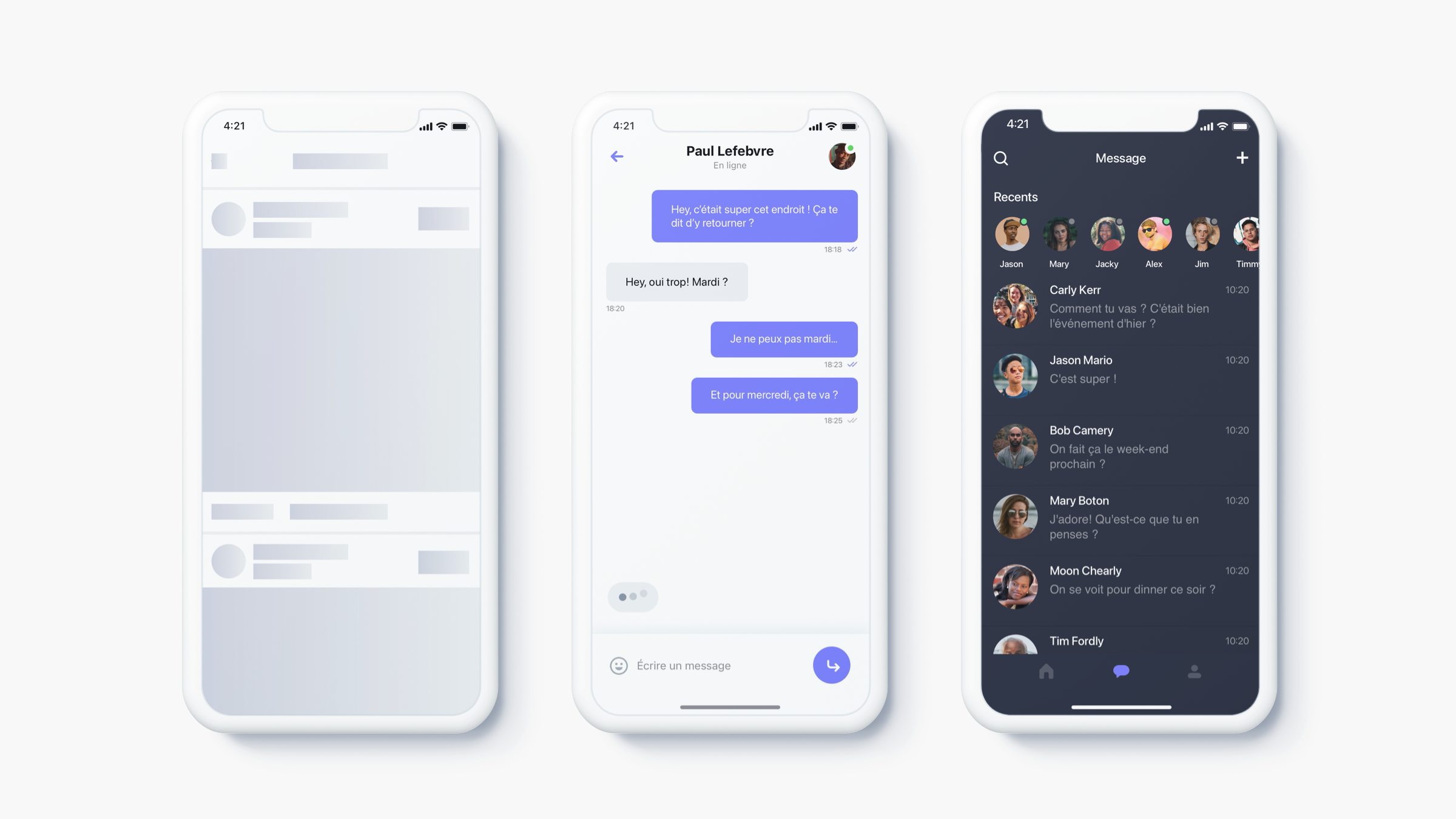
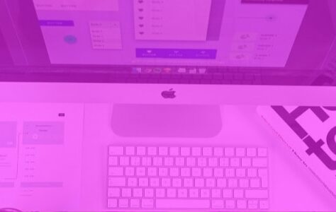
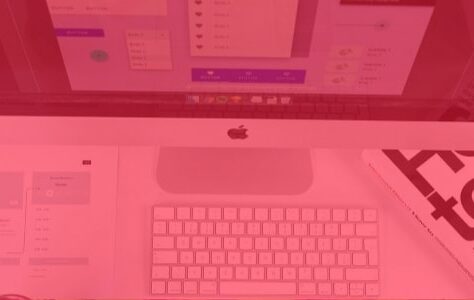
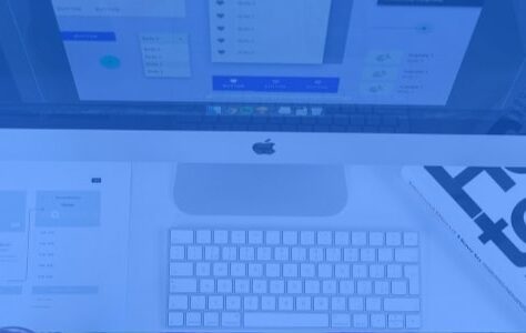
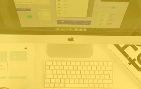
Skeleton screen from the Unsplash website
What are skeleton screens?
The skeleton screens are simplified pages, without text or image, which reflect the structure of the page to appear. They show the user that the page is loading.
Compared to traditional loaders which do not give a real indication of the loading time and are often looked at too much, they allow a first fast reading the structure of the page and remove this feeling of loss time for the user. They focus his attention on the progress rather than the time to wait.
How is a skeleton screen made?
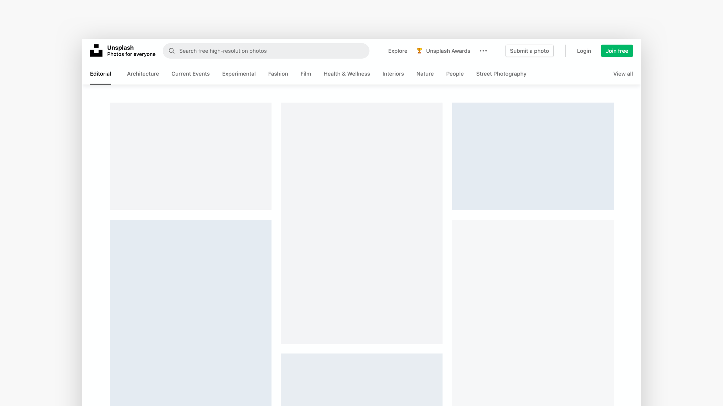
Most of the time, skeleton screens often go unnoticed, especially when used to load page content as you go. They can be composed in different ways. Either with content blocks, either with color blocks or images.
For example, companies like Youtube, Medium or Facebook use content blocks.
While Pinterest or Unsplash use color blocks.
Skeleton screen from Youtube and Pinterest
Although a skeleton screen has no real content, it gives the impression and seems faster. In team with your Frontend developer, it is therefore essential to think ahead of these screens which will further improve your user experience.
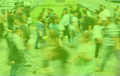
#2 – Micro-interactions
Due to lack of time, micro-interactions are often not taken into account in the design process. Lack of time, budget or ignorance of their possibilities, they nevertheless offer many advantages to the user experience.

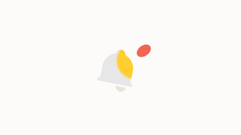
Andrew Tanchuk – Dribbling
What is a micro-interaction?
It is the result of theuser action on an element. Whether clicking on a button, scrolling a page, sending a message...
Present on a daily basis, they significantly improve the user experience while conveying information that cannot be said. Like scrolling down a page on mobile to update content.
Engaging, educational, identity, sometimes humorous, they play on the emotions of the user to the benefit of his experience and make the interface more lively and human.
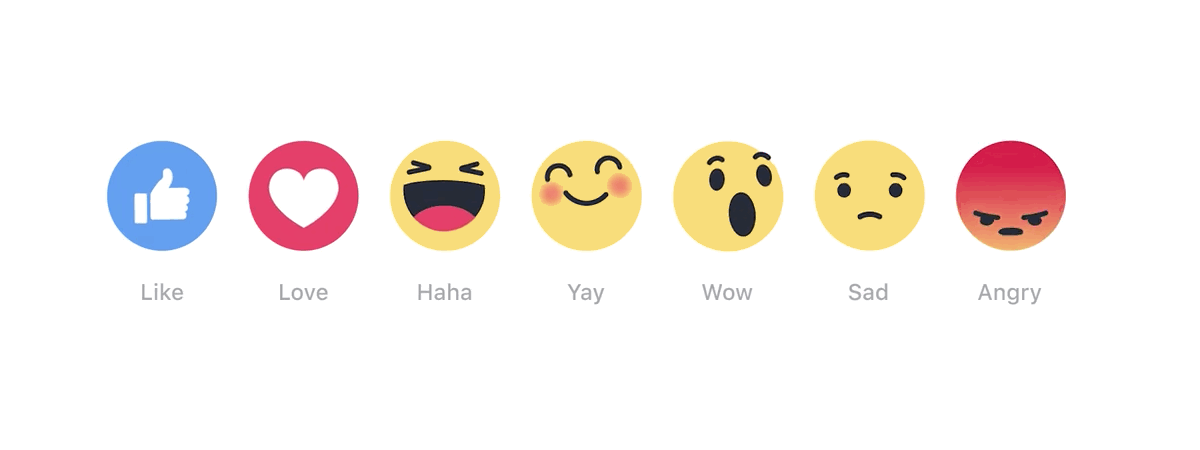 Emojis Facebook
How to use a micro-interaction?
As with skeleton screens, a micro interaction should not give the user the impression of wasting their time. It should not be used excessively and mustbe simplified to be subtle.
The question of its duration over time is also essential. After 100 views, won't it be annoying? An essential point to raise at the time of design so that it does not become harmful to the user experience.
Source: magazineduwebdesign.com
To learn more about micro-interactions, discover our dedicated article on the subject here !
#link to the article on micro-interactions
#3 – Dark mode
The “dark mode” or “dark mode” in French, is anchored in the habits of users. Accustomed to having the possibility of switching between light or dark themes, which adapt the colorimetry of the entire interface. Asking the question of this change of mode at the time of design is now essential.
Unsplash in dark mode
What is dark mode?
In recent years, more and more sites and applications have been developing an alternative version in dark mode. This mode allows you to change the entire colorimetry of an interface, in particular by inverting the color of the background and the text. This choice of theme can be native via the operating system or optional via the browser or the preferences of an application or a site.
Less bright and more comfortable for reading, it also has the huge advantage of making content stand out. Content which must then be designed in UI for these two interface possibilities.
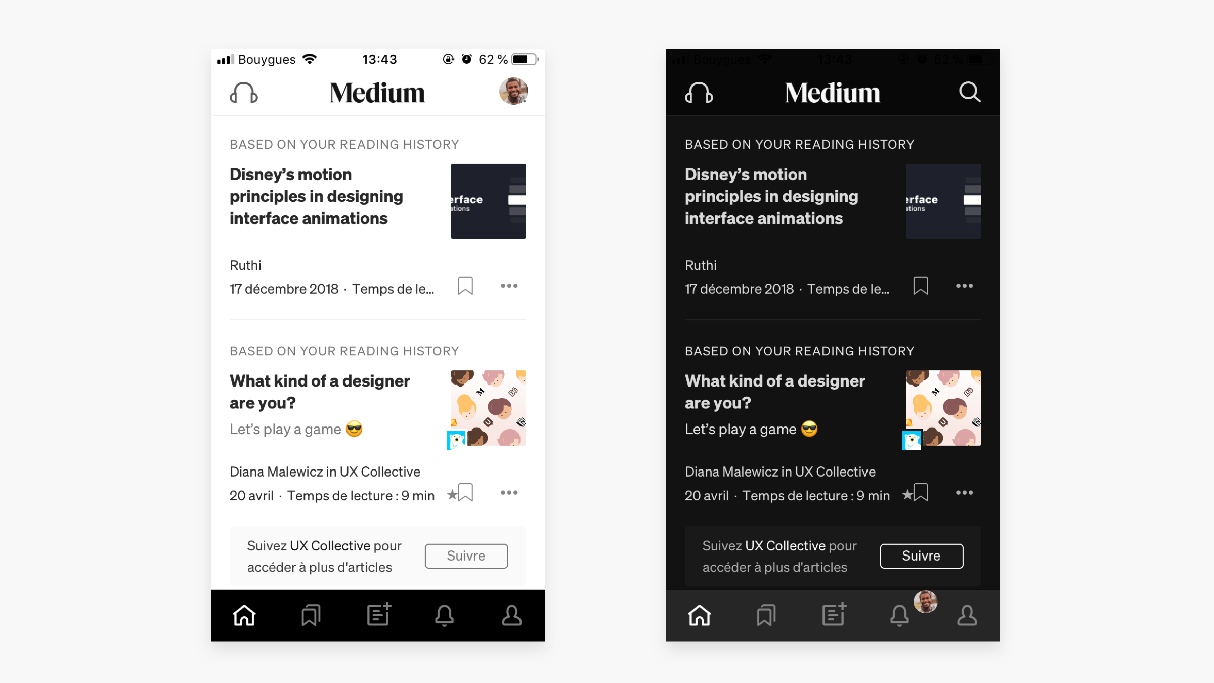
The native light and dark modes of the Medium site
How to design components for dark mode?
Even if the majority of sites are not yet designed for dark mode, browser extensions like Dark reader on chrome allow the user to switch at any time.
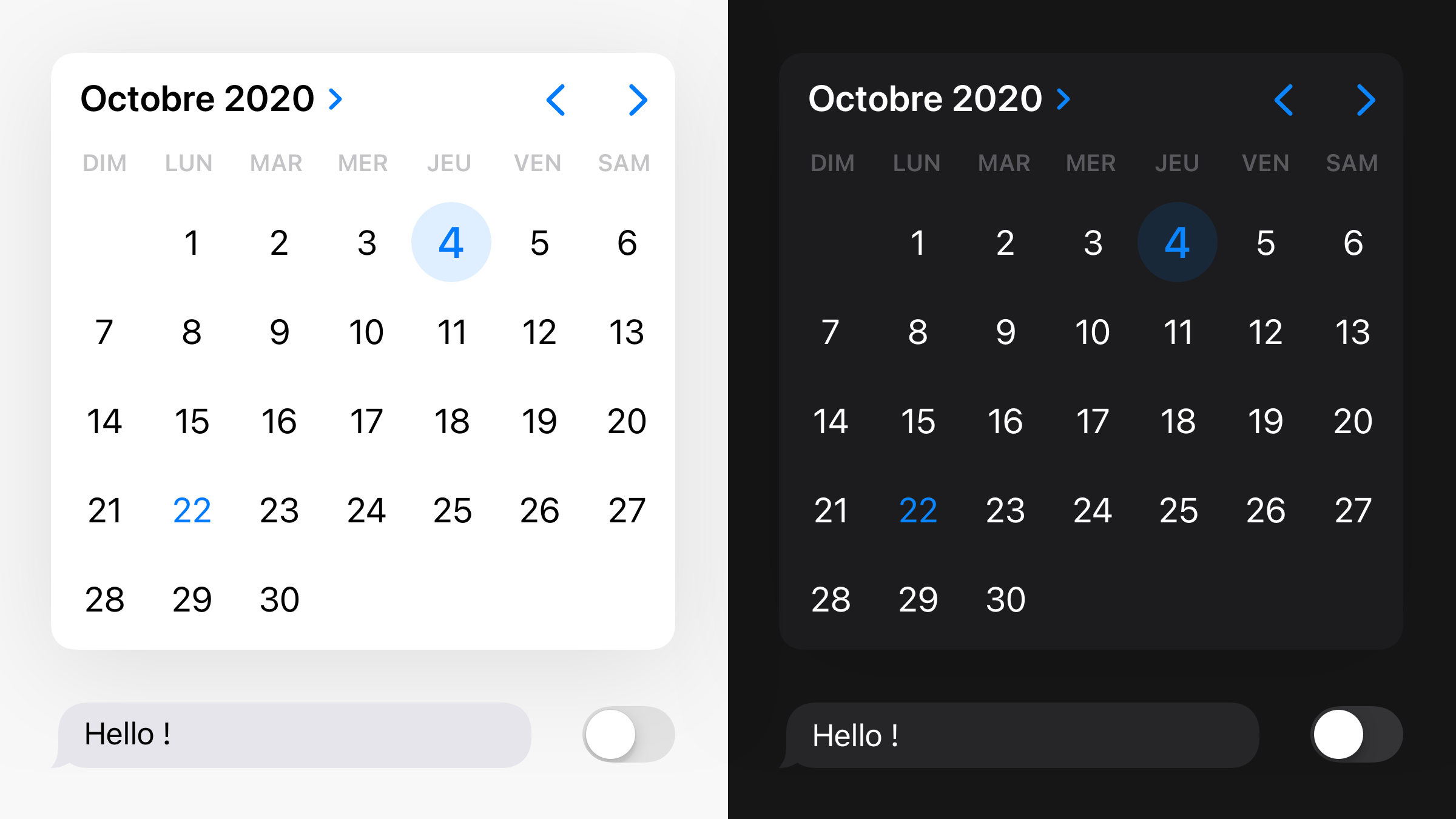
IOS components in light and dark mode
And in order not to scare away the user when an unsuitable interface appears with poorly cut images or invisible icons, here are the main questions to ask:
- Do images and logos fit on a dark background?
- Are the icons clearly visible, cut out in png or vector format?
- Are the colors of my design system legible on a dark background?
- Are all buttons, texts, rules and shadows legible on a dark background?
To prevent the case of a change of mode by the user, it is better to think of the components of its design system in both modes.
Check readability on both modes
- Set background colors for these two modes.
- Check color readability through an accessibility tool.
- Adapt your icons as needed, creating two versions.
Taking extra time to design these elements will never be a waste of time, but ultimately a real plus for your user experience.
Before leaving
Spending more time designing a real dark mode, micro-interactions and a skeleton screen are all elements that help improve the user journey. So do not hesitate to plan more time upstream of a project for the realization of these details. And remember that these are the details that make all the difference!
Domitille D'ERSU, UI Designer @UX-Republic
UX/UI ECO-DESIGN # Paris
SMILE Paris
163 quay of Doctor Dervaux 92600 Asnières-sur-Seine
DESIGN THINKING: CREATING INNOVATION # Belgium
UX-REPUBLIC Belgium
12 avenue de Broqueville - 1150 Woluwe-Saint-Pierre
MANAGING AND MEASURING UX # Paris
SMILE Paris
163 quay of Doctor Dervaux 92600 Asnières-sur-Seine
DESIGN SPRINT: INITIATION & FACILITATION # Paris
SMILE Paris
163 quay of Doctor Dervaux 92600 Asnières-sur-Seine
UX-DESIGN: THE FUNDAMENTALS # Belgium
UX-REPUBLIC Belgium
12 avenue de Broqueville - 1150 Woluwe-Saint-Pierre
GOOGLE ANALYTICS 4 #Paris
SMILE Paris
163 quay of Doctor Dervaux 92600 Asnières-sur-Seine
ACCESSIBLE UX/UI DESIGN # Belgium
UX-REPUBLIC Belgium
12 avenue de Broqueville - 1150 Woluwe-Saint-Pierre
EXPERIENCE MAPPING # Paris
SMILE Paris
163 quay of Doctor Dervaux 92600 Asnières-sur-Seine
