Myth #3: People don't use scrolling
In the mid 90's, the action of scrolling among users was not something usual… But little by little, we learned to navigate through a page by scrolling from top to bottom. For constant and long content, such as an article or a tutorial, scrolling offers better ergonomics rather than cutting the text over several pages.
It is no longer necessary to put all content at the top of the homepage or above the waterline (the fold).
To ensure that users will use the scroll, you must follow certain principles and provide content that keeps your visitors interested.
Keep in mind that content above the fold will always get the most attention and becomes crucial: Users decide whether to continue reading the content or not.
Lots of research proves that people use the scroll:
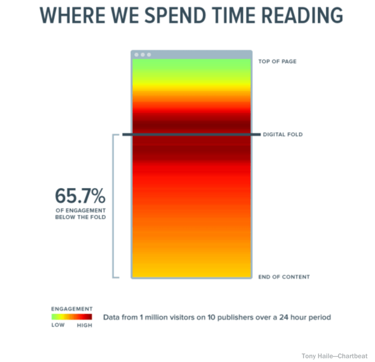
#1 Chartbeat
chartbeat, a data analytics provider, analyzed data from 2 billion visits and found that “66% of the attention on a normal support page went below the fold line.” – What You Think You Know About the Web Is Wrong
#2 ClickTale
ClickTale a heatmap service provider that has analyzed nearly 100.000 page views. The result: People were scrolling on 76% of pages, of which 22% scrolled all the way down regardless of page length. That said, it's clear that the top of the page is still the most valuable screen area. Unfolding the Fold et ClickTale Scrolling Report et Part 2
[youtube https://www.youtube.com/watch?v=FABn2I7dNpU&w=560&h=315]
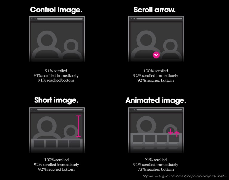
#3 Huge agency study
The Huge design agency measured the scrollbar in a series of usability tests and found “that participants almost always scroll, regardless of the way of the scroll used – and that's liberating.” – Everybody Scrolls
#4 Jakob Nielsen
The studies Eye-Tracking (Techniques for studying gaze or ocular behavior) carried out by Jakob nielsen a UX expert, show that if attention is focused on the top of the page, people scroll down, especially if the page is designed to encourage scrolling. – Scrolling and Warning
![]()
![]()
Test Eye Tracking with UX Cards
#5 MOVR
On mobile, half of users start scrolling within 10 seconds and 90% within 14 seconds – Stats from MOVR (published in Luke Wroblewski's tweet)
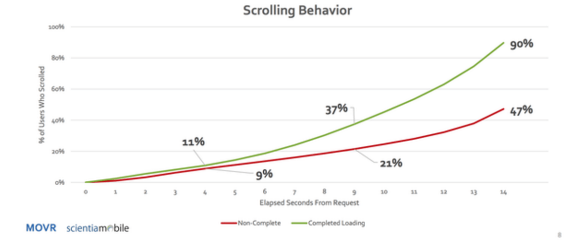
Luke Wroblewski also provided small stats snippets and tips on scrollbar behavior – There's No Fold
#6 Milissa Tarquini
By studying, TMZ.com's data analytics, Milissa Tarquini found that the most clicked link on the homepage is at the bottom. Also, she points out that the polls and galleries at the bottom of the AOL Money & Finance homepage get significantly more clicks despite their position. – Blasting the Myth of the Fold
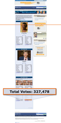
AOL News Daily Pulse with 10×7 fold line and vote count
#7 CX Partners
Another eye-tracking study conducted by CX Partners confirms that people scroll if certain design guidelines are followed. – The myth of the page fold: evidence from user testing
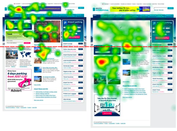
“With its two screens we noticed that the right screen with a large image on the homepage encouraged exploration below the waterline unlike the one with 2 small blocks” CX Partners
#8 SURL
Studies conducted by Usability Research Laboratory (the Software Usability Research Laboratory's) show that users can read for a long time, scrolling through pages faster than paginated ones. Which confirms that people are used to scrolling. – The Impact of Paging vs. Scrolling on Reading Online Text Passages
SURL conducted another study, confirming that people find both scrolling and paging natural on results pages. – Paging vs. Scrolling: Looking for the Best Way to Present Search Results
#9 Jared Spool
Usability testing of Jared Spool in 1998 show us that, even if the users position themselves against the scroll, they are finally ready to use it in their navigation. Long pages with a scroll bar seem the most optimal for users. – as the PageScrolls
More scrolling articles:
In July 2011, Apple removed the scrollbar for Mac OS X (users can put it back if they wish). This clearly shows that people are so familiar with scrolling that they don't even need a visual element to use it.
Jared Spool's article on design guidelines to encourage scrolling: Using the Cut-off Look to Encourage Users To Scroll. Do not miss Life below 600px, a witty article from the fold on page .
Translation of the article: Myth #3: People don't scroll by Zoltan Gocza
Bonus
Sites where the user becomes “creator” of the content thanks to the scroll:
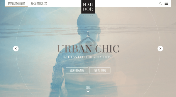
The scroll shows us the images and the texts:
The scroll tells us the story:
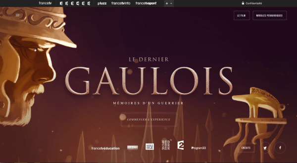
http://lederniergaulois.nouvelles-ecritures.francetv.fr/
The scroll presents us with a product:

CThe sites use in particular the parallax effect (moving several elements on different layers and at different speeds).
Laetitia Saintecroix, UX-Activist @UXRepublic

STORYTELLING: THE ART OF CONVINCING # Paris
SMILE Paris
163 quay of Doctor Dervaux 92600 Asnières-sur-Seine


UX/UI ECO-DESIGN # Paris
SMILE Paris
163 quay of Doctor Dervaux 92600 Asnières-sur-Seine
DESIGN THINKING: CREATING INNOVATION # Belgium
UX-REPUBLIC Belgium
12 avenue de Broqueville - 1150 Woluwe-Saint-Pierre


MANAGING AND MEASURING UX # Paris
SMILE Paris
163 quay of Doctor Dervaux 92600 Asnières-sur-Seine

DESIGN SPRINT: INITIATION & FACILITATION # Paris
SMILE Paris
163 quay of Doctor Dervaux 92600 Asnières-sur-Seine
UX-DESIGN: THE FUNDAMENTALS # Belgium
UX-REPUBLIC Belgium
12 avenue de Broqueville - 1150 Woluwe-Saint-Pierre


GOOGLE ANALYTICS 4 #Paris
SMILE Paris
163 quay of Doctor Dervaux 92600 Asnières-sur-Seine

ACCESSIBLE UX/UI DESIGN # Belgium
UX-REPUBLIC Belgium
12 avenue de Broqueville - 1150 Woluwe-Saint-Pierre
