
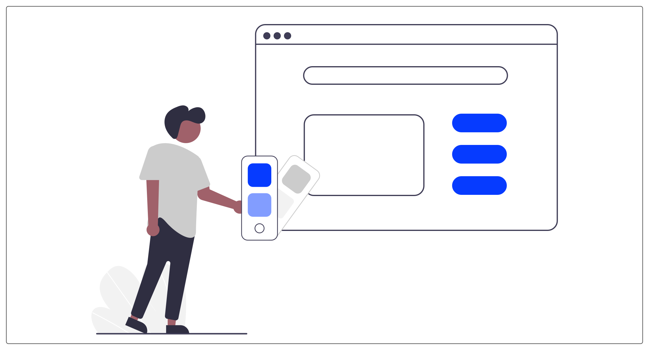
When applying the graphic charter to our interfaces, we have to ask ourselves the question of color.
If a charter has already been created, you must read it and apply it (often under the watchful eye of the marketing and communication department, which ensures the proper use of graphic elements).
But you may be in charge of creating the chart and therefore choosing the colors. To build the charter, you must pay particular attention to the symbolism and the combination of colors.
A coherent and harmonious palette makes it possible to correctly deliver a message. Colors have a very powerful communication power. Depending on its use, the choice and the diversity of the colors chosen, you will be able to create a hierarchy among your content and highlight certain elements, including calls-to-action for example.
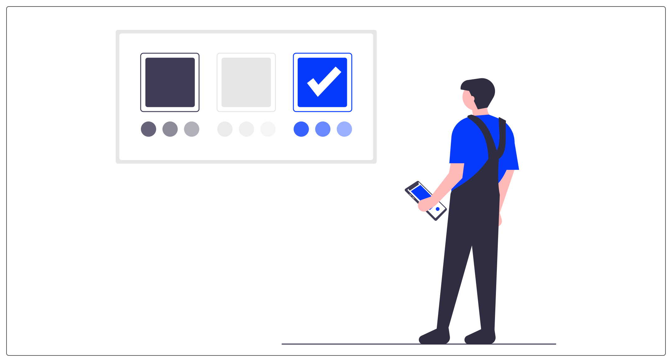
Special attention should also be paid to accessibility. When we mention accessibility for colors, we mainly think of the contrast of colors between backgrounds and texts. There is a ratio for choosing the right color matches.
I share you an online tool which will allow you to validate the marriage of your colors in terms of web accessibility.
Creating a color palette has three purposes :
- Bring aesthetics, harmony and consistency to your interfaces.
- Get your readers across the issues, values and personality of your brand.
- Stand out and mark the spirits compared to competitors.
I could even add an argument by talking to you about organization: as a designer, quickly defining your color palette and sticking to it allows you to build interfaces calmly and not get lost.
So today I'm sharing my tips for building your color palette.
Do not hesitate to give us in comments your good practices on your projects! At UX Republic, we are always listening to your best practices and your opinion!
#1 Main Color
Let's start with the beginning : the main color of your site! It is the color that brings your brand identity to life.

For this dominant color, it is interesting to learn about the psychology and meaning of
colors. Thus, depending on the sector of activity, the typology or the target, you will get help to choose it.
Don't choose based on your personal preferences or design trends. You need to have strong arguments for your client and above all your objective is to send a message to users through color.
You can create variations from this color to obtain different tones and different opacities.
#2 Secondary color
The secondary color provides contrast against your main color.
You have to think that it symbolizes different states in your interfaces and in particular actions (call-to-actions and links for example).
Since it will punctuate interactions and important content, it is essential to choose a color that stands out and encourages clicking, while remaining harmonious with your charter.
How do I find this color ?
Generally, one chooses a color opposite and complementary to the main color. You can use the color wheel for this. But this is not an absolute rule! Let your creativity run wild!
Many sites use black as an action color (especially in the luxury sector) and it works because it fits into the brand's universe and other processes are used to highlight the content.
The secondary color is a good practice in UX design but many designers do not use it and use the main color as the action color.
For example, in the Apple guidelines, we find the Tint Color, this unique color which symbolizes the brand / product color and the clickable elements.
#3 Background Colors
The background color used is often white or light grey. But once again, do not hesitate to do tests to awaken your creativity.
● The White is a safe option, it's a clean color that will make your content stand out.
● The light gray allows you to highlight content with white backgrounds and therefore highlight them (maps or a table for example).
● The dark colors you can also make your interface darker and use dark shades like charcoal gray or midnight blue. Again, depending on your palette.
● Gradients are also an option and for this you need several colors that go together and do not create an imbalance or too pronounced a split.
My trick for determining the background color is to start from the main color and lighten it to create a connection with it.
How do I find this color ?
- I select the main color in Figma, Sketch or other design tool.
- I switch to HSL mode (instead of being in Hex for example.
- I change the “L” value to 95.
#4 Text colors
A good practice to keep in mind for your designs is not to use black (#000000) for your elements, especially your texts.
We prefer to black variants that start from blue, green, gray, … Again, depending on your palette.
My trick for determining the color of text uses the method for the background color, that is to say, to start from the main color and to darken it to create a link with it.
How do I find this color ?
- I select the main color in Figma, Sketch or other design tool
I switch to HSL mode (instead of being in Hex for example) - I change the “L” value to 10
I also advise you to choose two colors for the texts. One dark and one lighter to create a hierarchy between different types of content.
#5 Alert Colors
For certain types of site, it is interesting to provide colors for the alerts: red, orange and green.

They can be used to send messages or notifications to your users such as an error or a validation.
These are colors that are used for :
● error messages, 404 pages, alerts (snackbars, toasts, modals, etc.).
● the states and/or statuses of an element
● buttons or links (red to destroy or delete for example)
# In conclusion
To build a color palette, your first task is therefore to first choose your main color. Thanks to this choice, you will be able to create a harmonious and coherent palette.
Small aside on the use and sharing of the charter that you are going to create: think of creating a document which groups the colors and their uses to share it with the project team and in particular with the developers of the project.
It can also take the form of a library in your favorite design tool.
And in this case, I advise you to use the terms (“primary-color”, “secondary-color”, …) . And not the name of the color (“Blue”, “red”, “#FEFEFE, …).
Thus, if a change is made it will be easier for you. And in use it will also be when creating your different courses.
Remember to take your time to get inspired, check the symbols, then do tests and challenge your choices.
Image source: https://undraw.co/illustrations
Alexa CUELLAR UX-UI Designer @UX-Republic
Our next trainings

STORYTELLING: THE ART OF CONVINCING # Paris
SMILE Paris
163 quay of Doctor Dervaux 92600 Asnières-sur-Seine


UX/UI ECO-DESIGN # Paris
SMILE Paris
163 quay of Doctor Dervaux 92600 Asnières-sur-Seine
DESIGN THINKING: CREATING INNOVATION # Belgium
UX-REPUBLIC Belgium
12 avenue de Broqueville - 1150 Woluwe-Saint-Pierre


MANAGING AND MEASURING UX # Paris
SMILE Paris
163 quay of Doctor Dervaux 92600 Asnières-sur-Seine

DESIGN SPRINT: INITIATION & FACILITATION # Paris
SMILE Paris
163 quay of Doctor Dervaux 92600 Asnières-sur-Seine

UX-DESIGN: THE FUNDAMENTALS # Belgium
UX-REPUBLIC Belgium
12 avenue de Broqueville - 1150 Woluwe-Saint-Pierre


GOOGLE ANALYTICS 4 #Paris
SMILE Paris
163 quay of Doctor Dervaux 92600 Asnières-sur-Seine

ACCESSIBLE UX/UI DESIGN # Belgium
UX-REPUBLIC Belgium
12 avenue de Broqueville - 1150 Woluwe-Saint-Pierre
