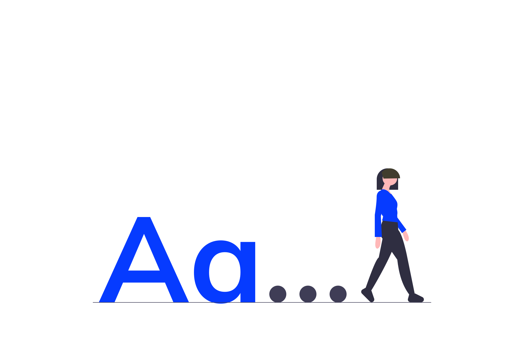
In each interface, we choose to highlight text, titles, paragraphs, links to create a dialogue with our user.
But during the audits that I was able to carry out on web or mobile interfaces, I often pointed out errors in typography and typographical styles.
Often perceived as small details, these errors are actually a brake on your communication.
Indeed, the user does not know you and if pitfalls prevent him or slow him down in his reading, he will not necessarily redouble his efforts to reach your message.
By avoiding these 7 errors, you will increase the readability of the different paragraphs of your interface, increase comfort and reduce reading time.
The objective of this article is to know how to detect these errors and to be able to correct them. But also to acquire a better understanding of the typographic styles anchored in the uses nowadays on digital interfaces and to use them wisely.
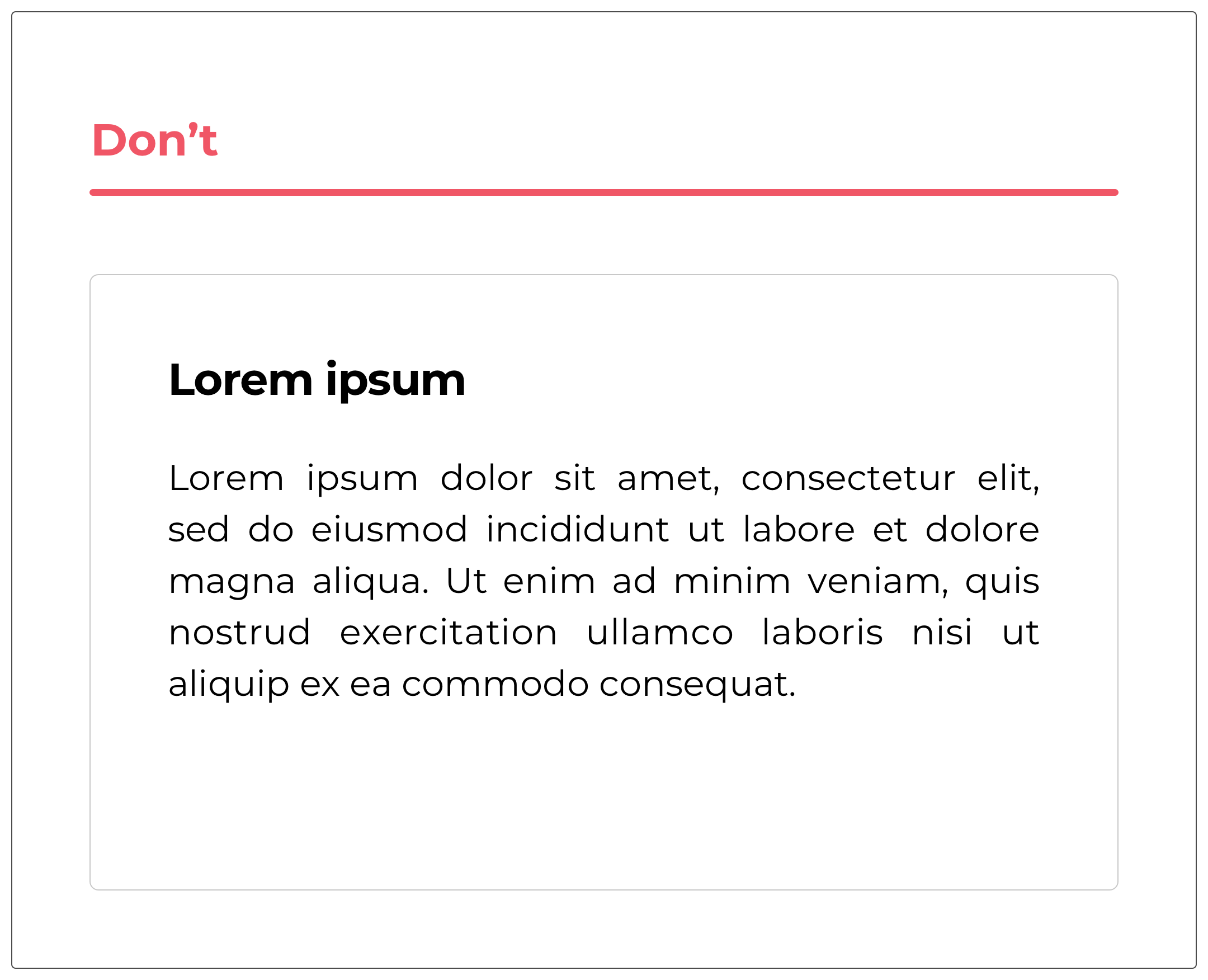
#1 All Caps
The subject of the use of capitals for the texts of an interface can pose debate but many studies have proven that a paragraph entirely in capitals can be complicated to read and readability is reduced.
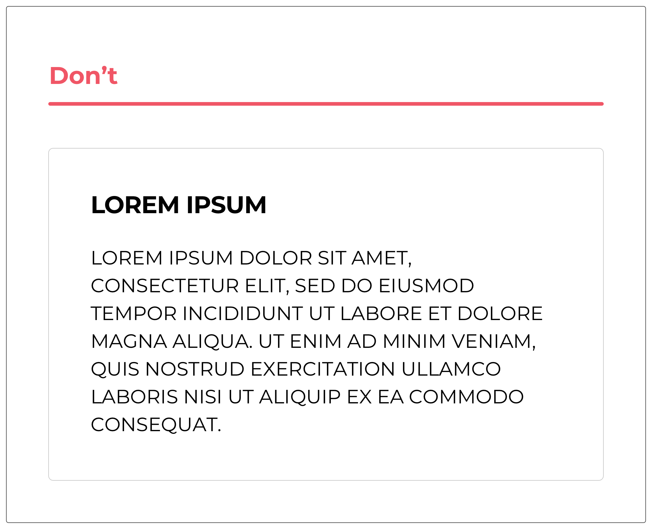
Often used to highlight a text, make it more important and/or more visible, we realize that this produces the opposite effect. Indeed, the user identifies these elements in uppercase and prefers to pass them.
For 2 reasons:
- The sometimes anxiety-provoking and aggressive effect of reading a text in capital letters. The user may have the impression that he is being shouted at and that there is a form of nervousness in our message.
- There are very few clues to identify the letters and their particularities, which complicates the task for the user to differentiate the letters from each other. The text becomes more difficult and longer to read. This last point is very important because you have to keep in mind that users read very little on the web. Often the information is scanned. Using capitals will prevent the user from doing this. And when he begins to read, he will be slowed down and this will create frustration. He will have the impression of not progressing in his reading.
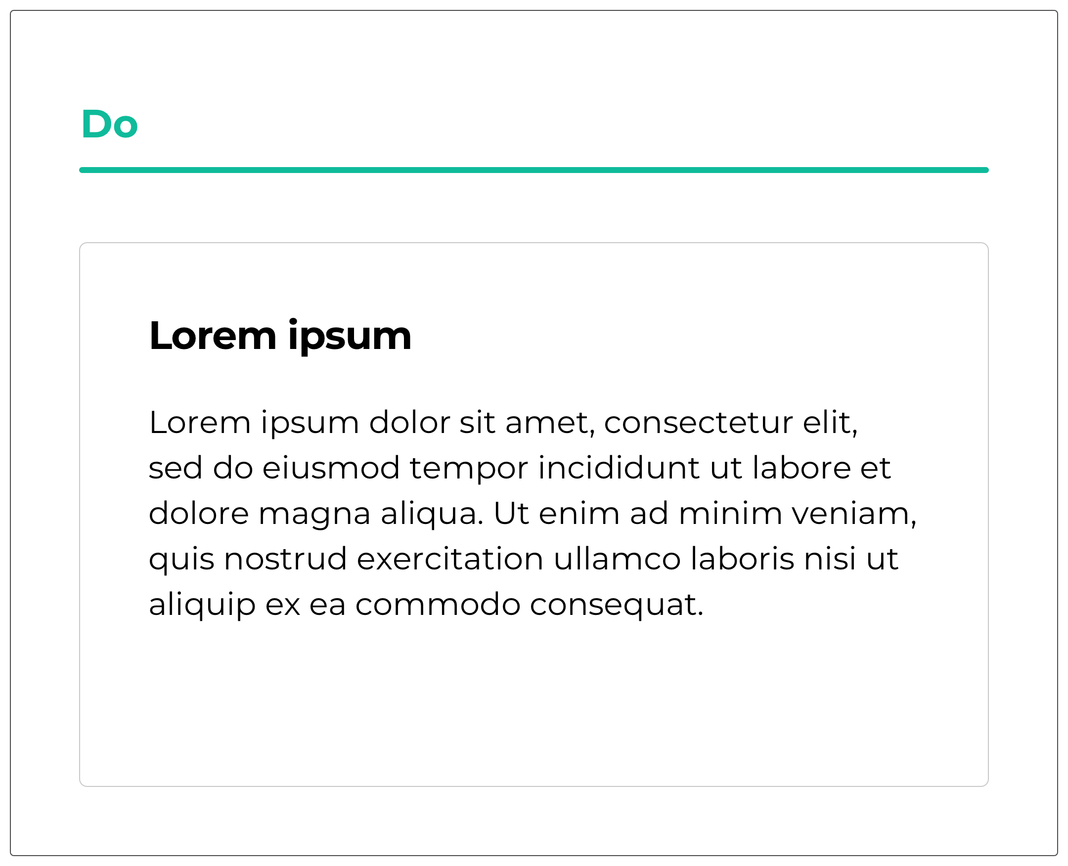
#2 Adopting too many fonts
Within a paragraph, we are sometimes tempted, to create a certain hierarchy, to use different fonts.
This will create an imbalance and confuse your user. It is better to stay consistent in form to deliver your message with more impact and clarity.

Nothing prevents you from putting forward an idea or a sentence by accentuating the fat for example. But you have to choose!
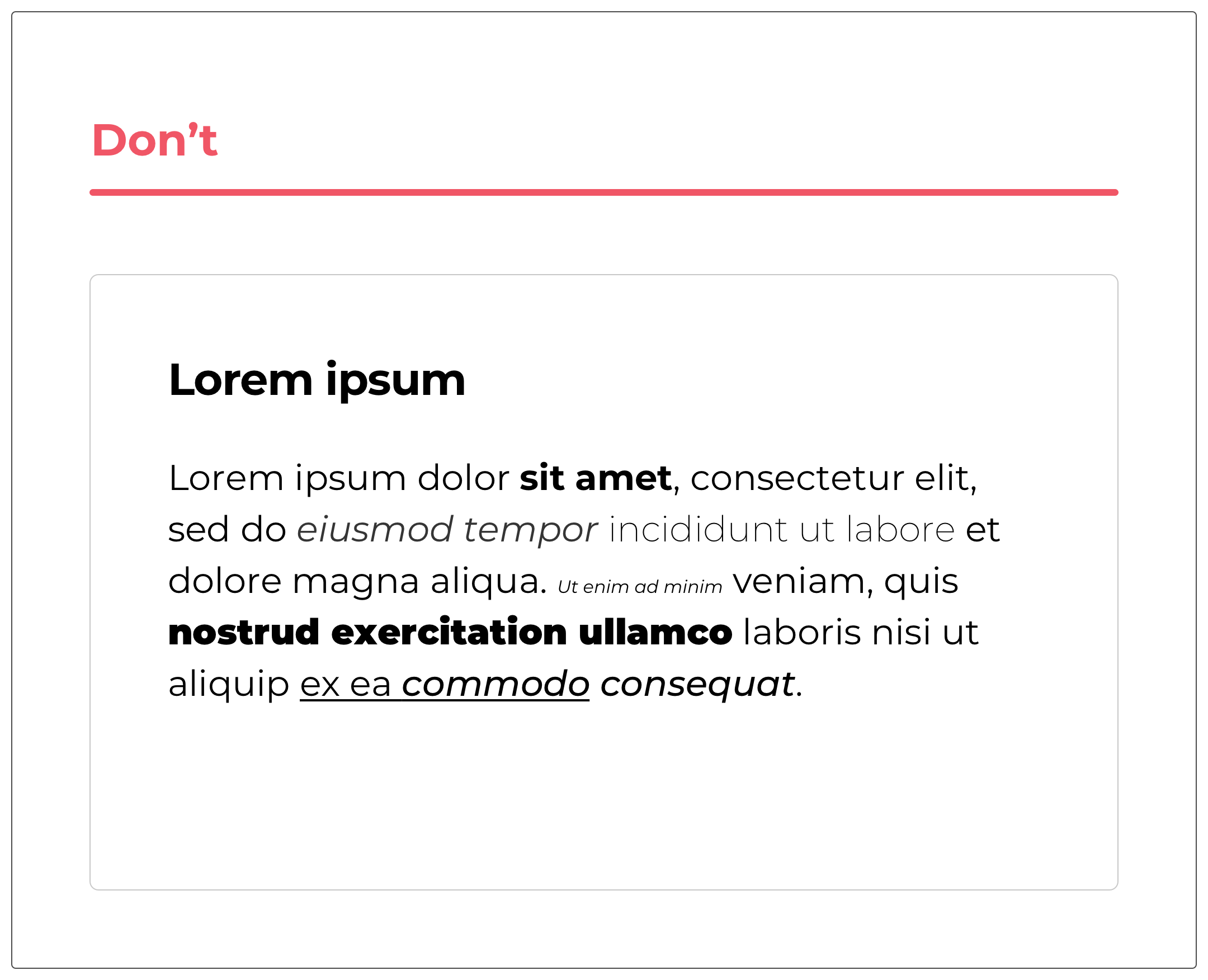
#3 Emphasize lots of elements
A good practice when making a paragraph available to its user is to highlight certain key words.
However, care should be taken not to have too many different text styles as this can confuse the user.
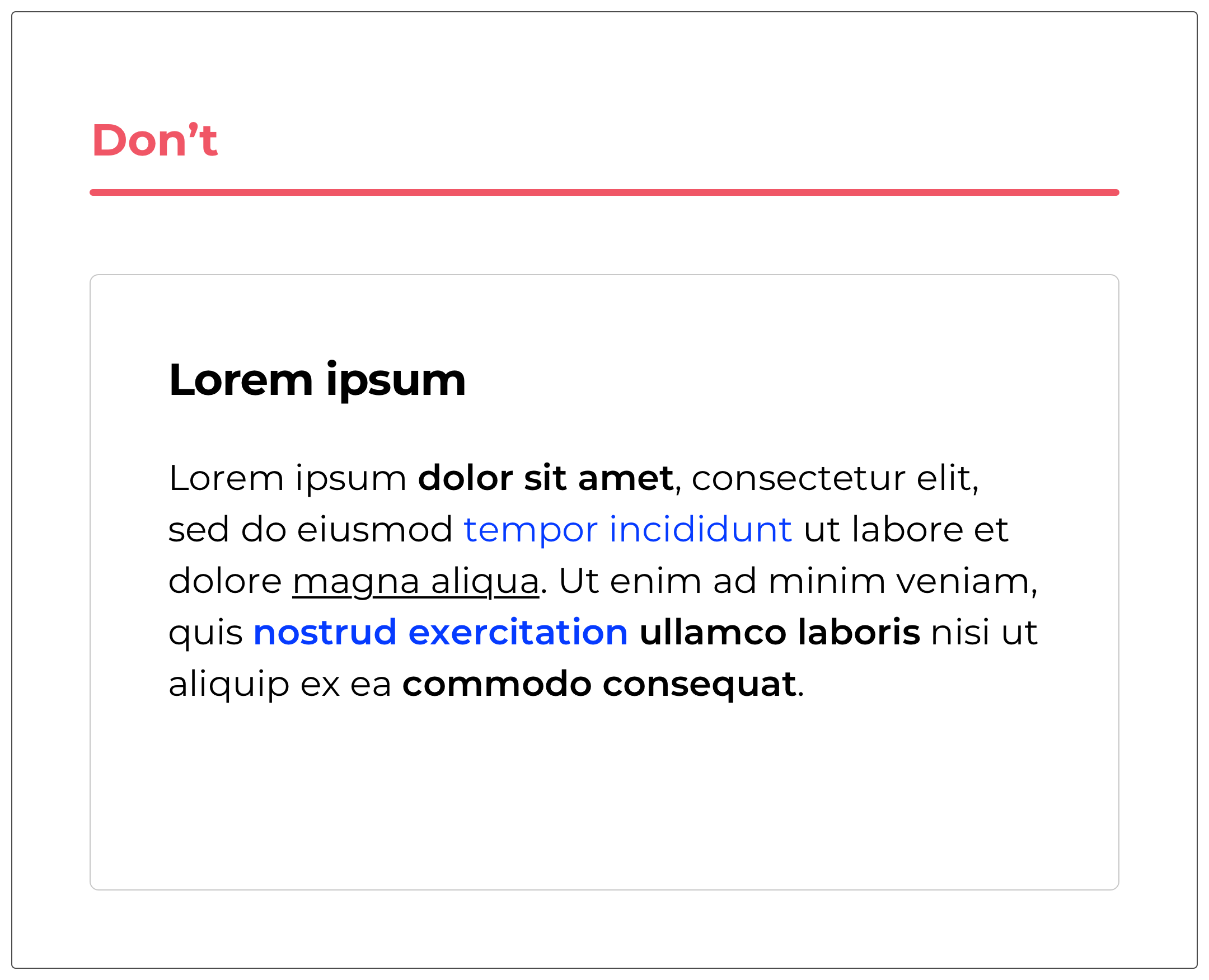
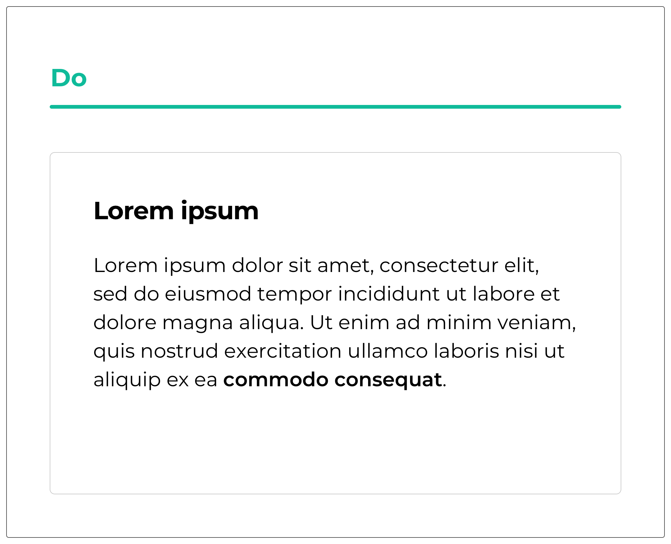
It is better to define your paragraph well in advance and visually highlight the key concept of it.
Keeping in mind that there will be this particular graphic style but also certain words in italics (for words from another language for example), underlined / colored links.
#4 Use link style for another element
When an element is underlined in the interfaces, the user is accustomed to finding a link there. He clicks on it and will be redirected to a new page.
Only, often during an interface audit, we find, for example, subtitles using this graphic style. This may confuse the user.
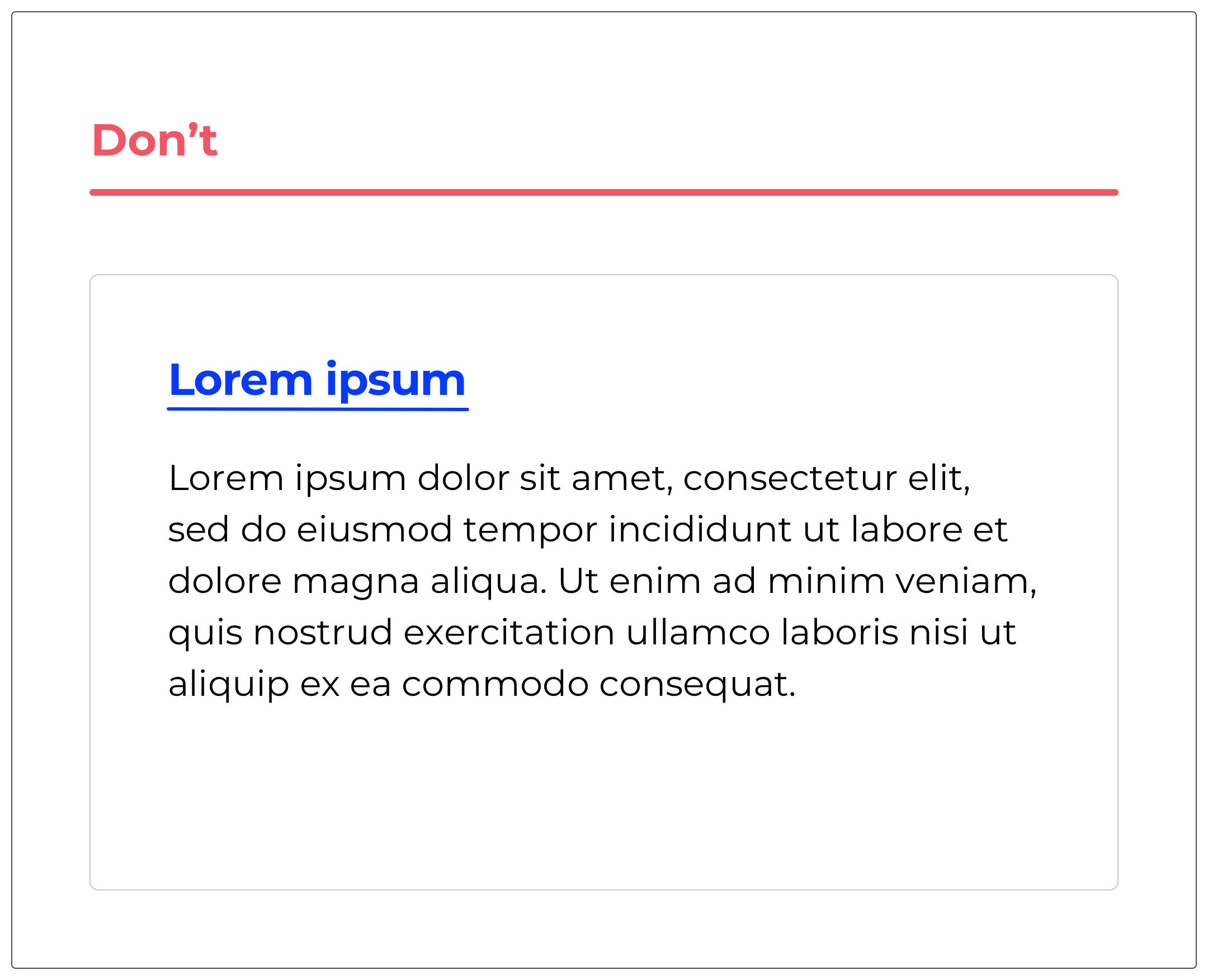

It is better to play on fat, color or size for example.
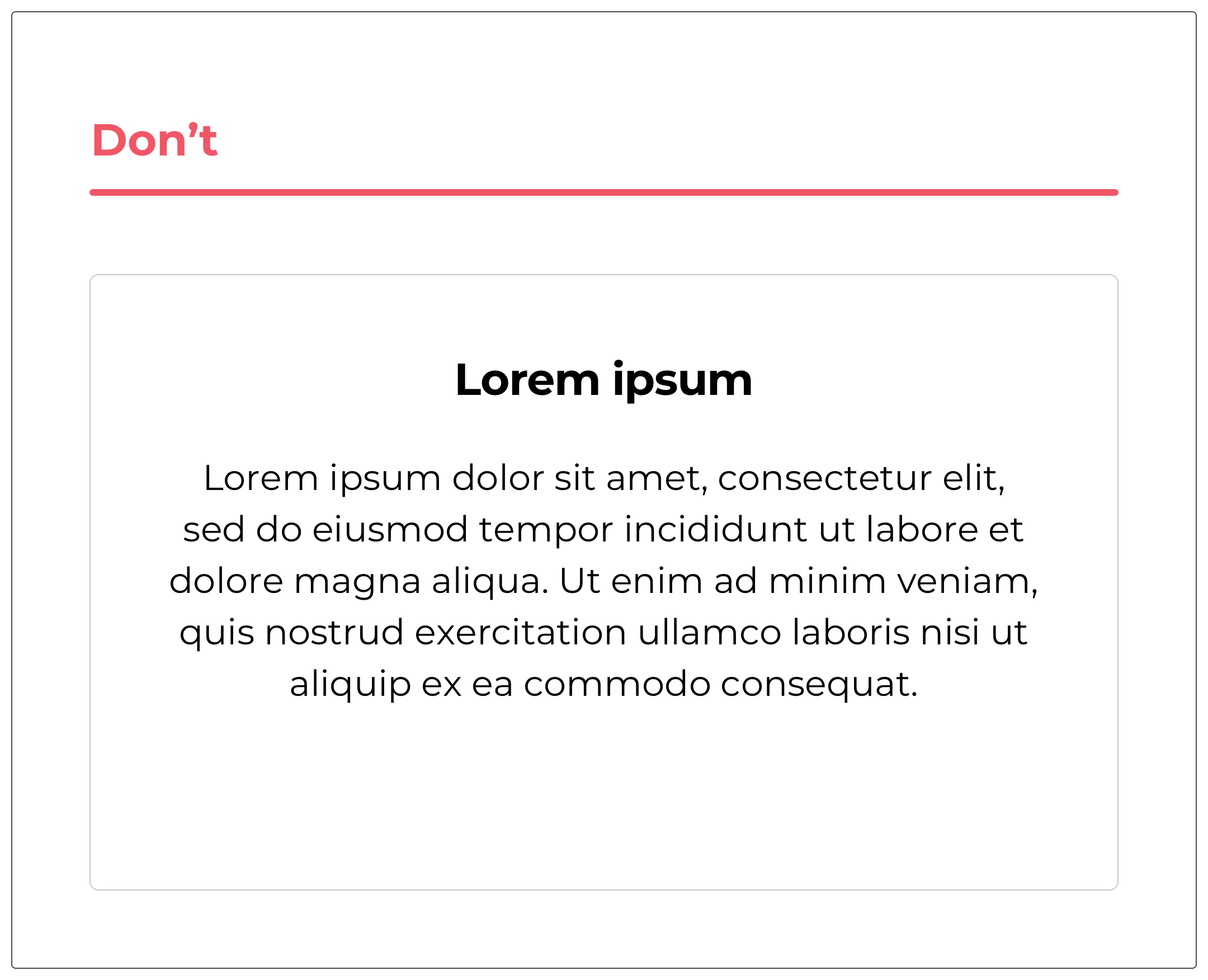
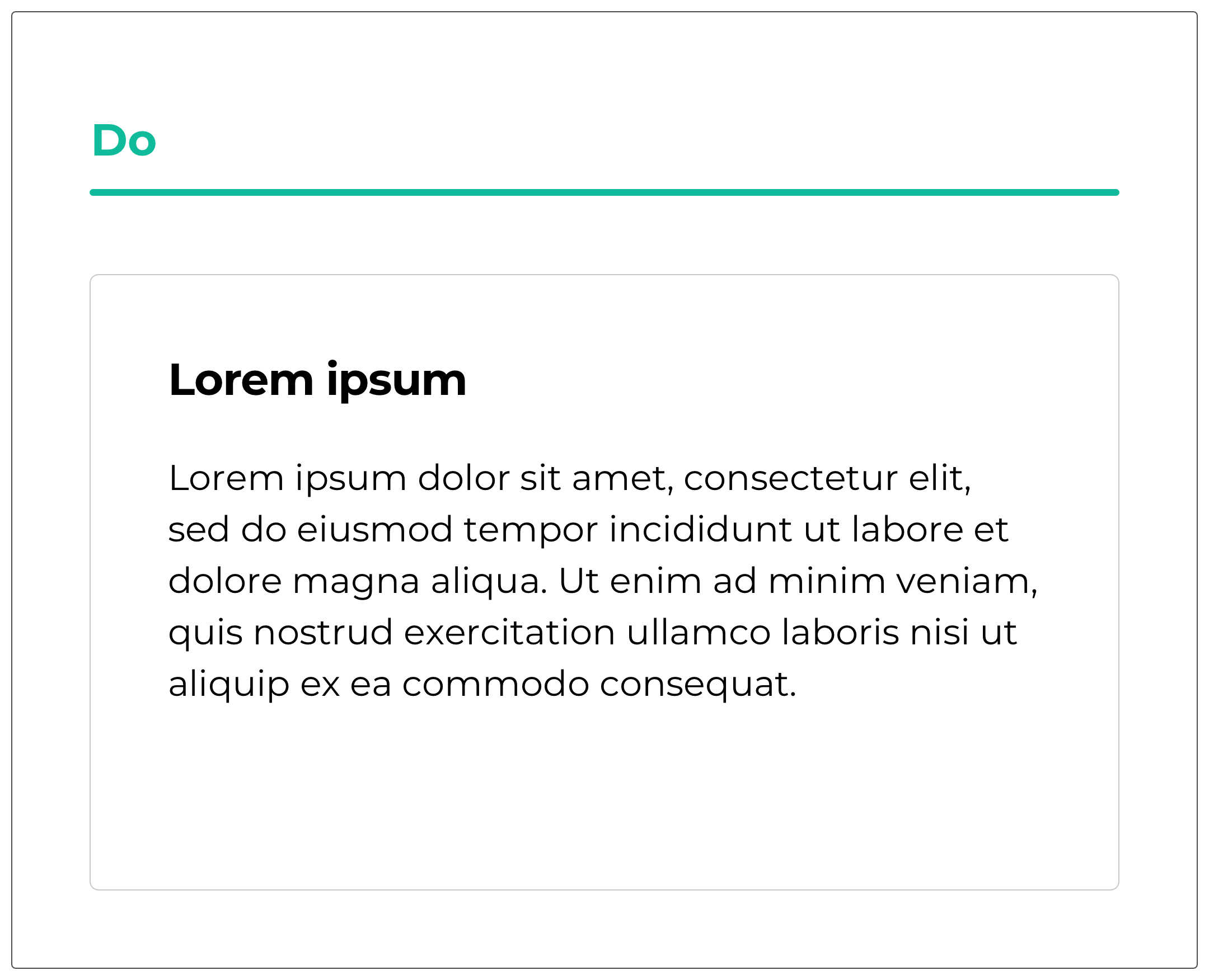
#5 Center the text
This is perhaps the first thing I learned as a designer when I started. I tended to center all the elements.
This is a good practice in print but it is not recommended for the web. It is preferable to align the text to the left to structure the block and thus provide reading comfort to our user.

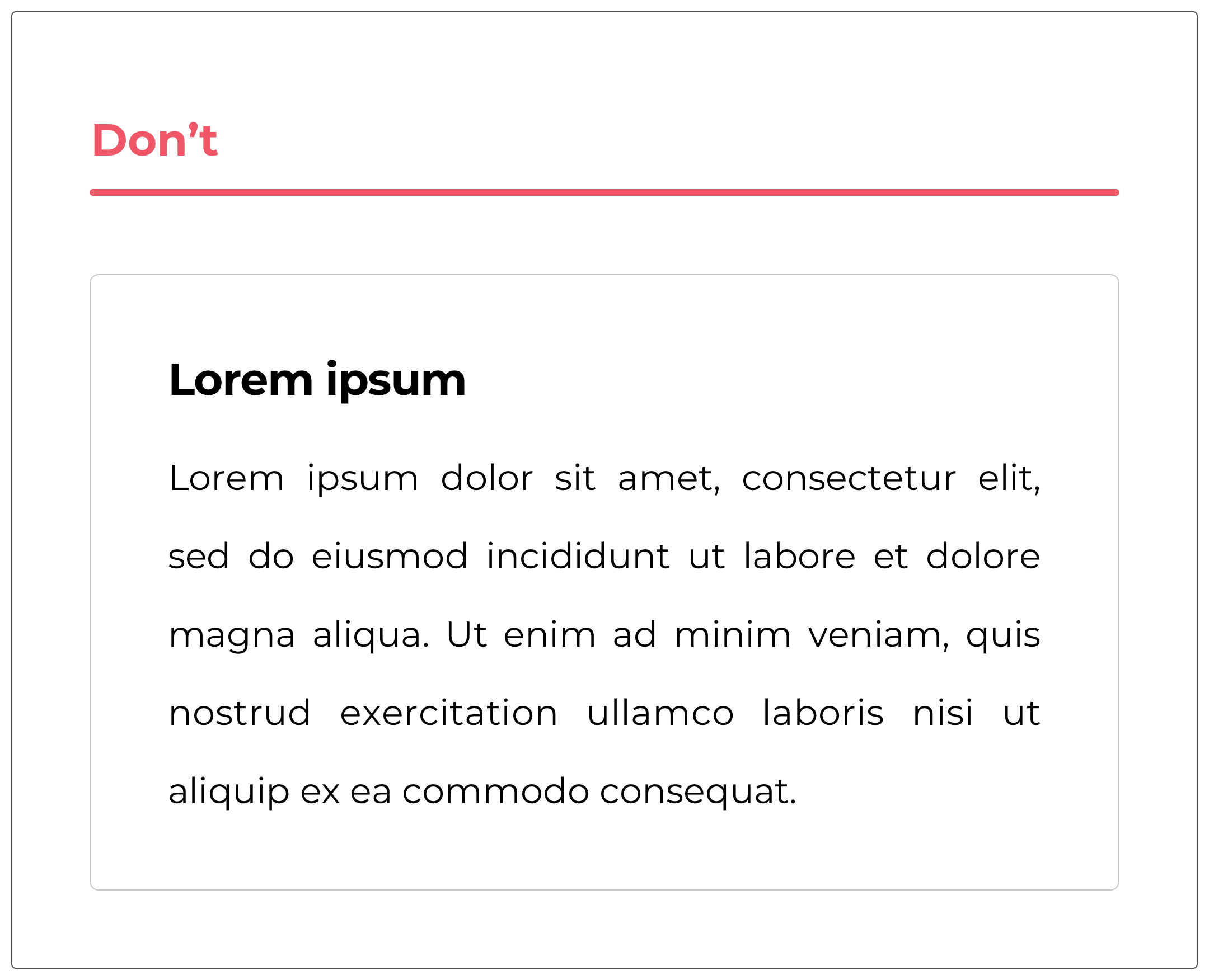
#6 Justify text
This is also the case for the justification of a text. Widely used in publishing but which is still poorly managed on the web because the interfaces are dynamic and move according to the resolutions. It is therefore very complicated to keep a coherent and readable result.

#7 Mismanaging line spacing
Sometimes we try to save space. Other times, we think – wrongly – that it will be more comfortable for reading to decrease the line spacing of a paragraph.
If the line spacing is too small, the letters will brush against each other and there will be a readability problem. If the line spacing is too large, the lines will be too far apart and will therefore cost the user more effort to read successfully.
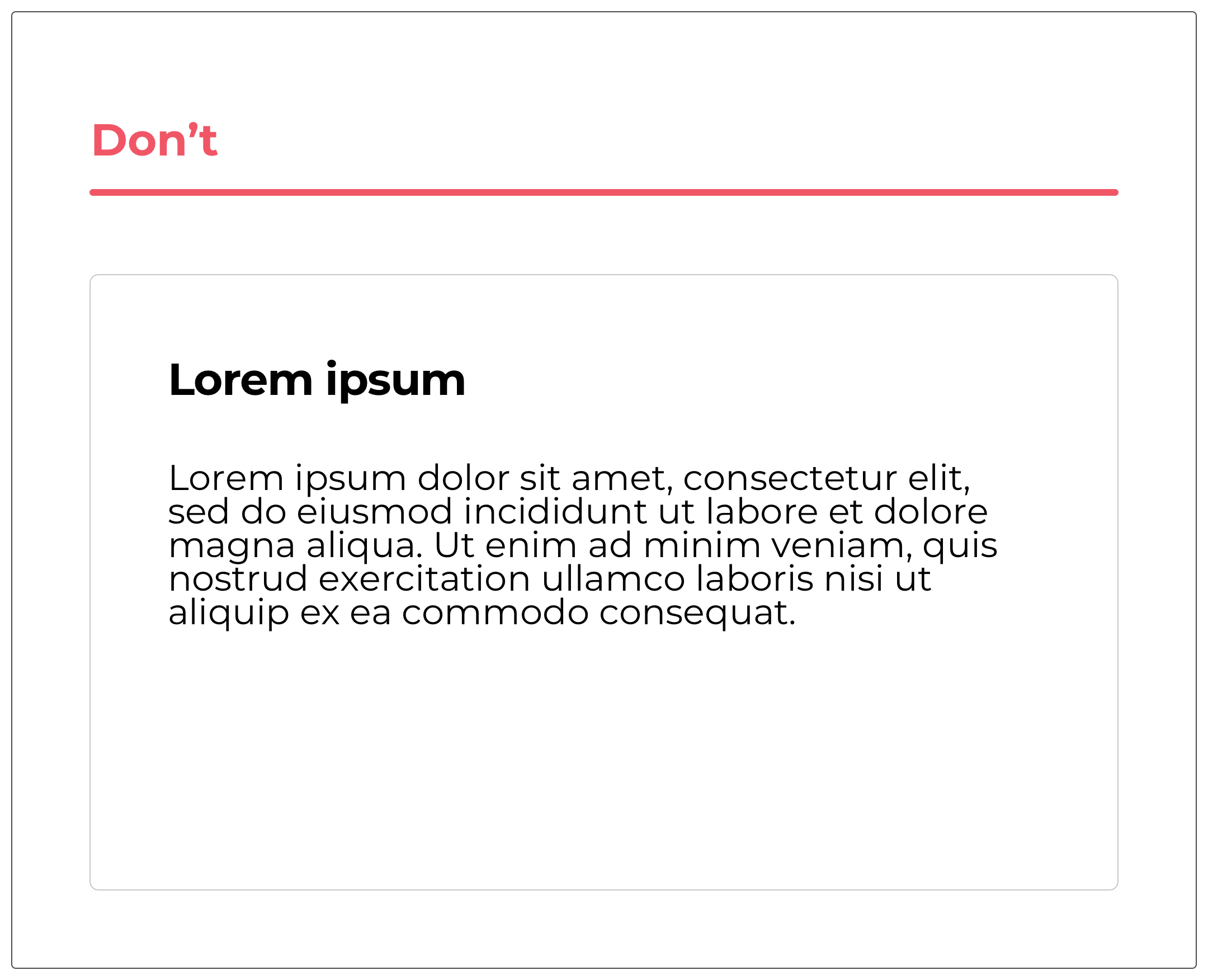
There is no ideal line spacing, it depends on each typography. It must therefore be studied and tested to find the right ratio that will facilitate reading.
# To conclude
These 7 shared tips will allow you to offer your users reading comfort. They will help you get your message across in the right way with the right tone.
As I said, these are errors that I often find during interface audits. They are easily modifiable and will allow you to increase the readability of your texts.
Image source: https://undraw.co/illustrations
Alexa CUELLAR UX-UI Designer @UX-Republic
Our next trainings

STORYTELLING: THE ART OF CONVINCING # Paris
SMILE Paris
163 quay of Doctor Dervaux 92600 Asnières-sur-Seine


UX/UI ECO-DESIGN # Paris
SMILE Paris
163 quay of Doctor Dervaux 92600 Asnières-sur-Seine
DESIGN THINKING: CREATING INNOVATION # Belgium
UX-REPUBLIC Belgium
12 avenue de Broqueville - 1150 Woluwe-Saint-Pierre


MANAGING AND MEASURING UX # Paris
SMILE Paris
163 quay of Doctor Dervaux 92600 Asnières-sur-Seine

DESIGN SPRINT: INITIATION & FACILITATION # Paris
SMILE Paris
163 quay of Doctor Dervaux 92600 Asnières-sur-Seine
UX-DESIGN: THE FUNDAMENTALS # Belgium
UX-REPUBLIC Belgium
12 avenue de Broqueville - 1150 Woluwe-Saint-Pierre


GOOGLE ANALYTICS 4 #Paris
SMILE Paris
163 quay of Doctor Dervaux 92600 Asnières-sur-Seine

ACCESSIBLE UX/UI DESIGN # Belgium
UX-REPUBLIC Belgium
12 avenue de Broqueville - 1150 Woluwe-Saint-Pierre
