To answer the daily question that resonates in our open space: "What are you eating for lunch? », we discovered many companies that delight us in the delivery of their tasty meal (or not), delivered to the office in record time (or not). Uberization has been attacking catering for some time, we are talking about food Tech.
Food Tech: What is it?
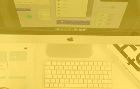
Since home meal delivery services are emerging in number, we had the opportunity to test a few applications for the delivery of our lunches. It then came to me the idea of drawing up a UX analysis of a few mobile screens from different players. If applications copy each other, some have a different positioning and a distinct approach in terms of User eXperience.
Today we will be analyzing a few screens of the Pop Chef app.
We will mainly study the following concepts:
- Focal point : The focal point is an element that attracts attention by emerging from a scene, because it is particularly salient and different from the rest. (Amelie Boucher, 2015)
- Affordability: Affordances are the possibilities of actions suggested by an object when we see it, even before using it. (Amelie Boucher, 2015)
POP CHIEF:
Pop chef is a French start-up that delivers healthy and balanced dishes to homes in record time. Pop chef caters mainly to an office clientele by delivering lunches from Monday to Friday from 11:30 a.m. to 13:30 p.m. Four dishes a day are offered on average. They rely on the quality of their products and the originality of their recipes rather than quantity.
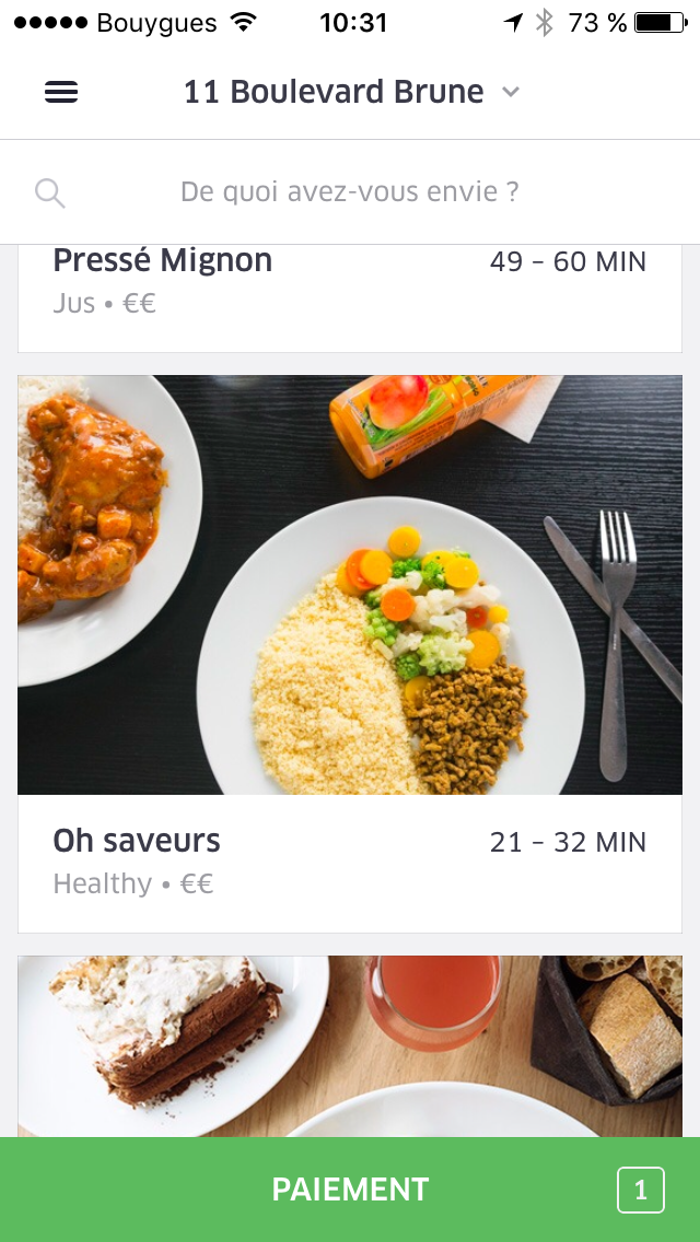
a) GEOLOCATION
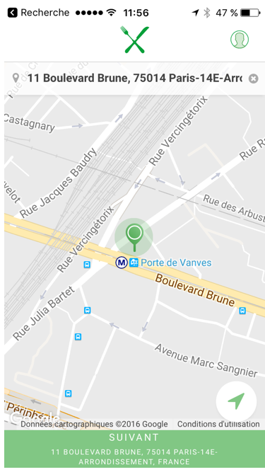
Good points :
- On this screen there are two focal points:
- The geolocation pin,
- The button at the bottom of the page,
The color green distinguishes these two elements from the rest of the page.
- The button at the bottom of the page, does not seem to be a button,
- The wording "following" is not emphasized enough,
- The repetition of the address in the header and in the button is not useful,
- Concerning the concept of affordance, the term "next" lacks clarity on the rest of the process.
Recommendations: Delete the address in the button for:
– Allow better highlighting of the “next” wording,– Improve the clickable effect of the button,– The term “Next” can be replaced by “choose my lunch” to help the user project themselves into the next step.
b) THE SELECTION
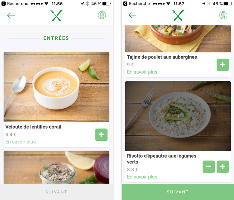
- The menu selection page is clean, readable and allows the reader to focus on the content,
- The text is accompanied by large images which allows at a glance to know the details of the menu,
- The visuals put forward are appetizing which can push the user to order,
- The content is broken up (starters, main courses, desserts) for good readability,
- The colors of the texts allow good readability,
- Affordances adapt to the state of the call to action:
- The small green "+" button has an affordance that allows you to understand that the button is dedicated to adding a product to the cart,
- When no product has been selected, the “next” button (in grey) cannot be clicked. As soon as at least one product is selected, the button becomes green and therefore clickable.
- When I select a product, a dark filter appears on the image. This allows the user to be reminded at a glance which product he has selected and for which quantity.
- One can ask the question if the background/character contrast is not to be put back
in question. The price deserves a better highlight than a light gray,
and “learn more” could settle for a slightly less visible color,
but this may be the subject of a strategic decision. - The user is asked to scroll a lot to know the whole menu. However, one can imagine that the user first becomes aware of the whole menu then goes up the whole of the page to finally go down again to select his choices.
Recommendations: A tab system or a “back to top” button can be solutions. This is also the choice of the American application Munchery who opted for tabs.
c) PAYMENT
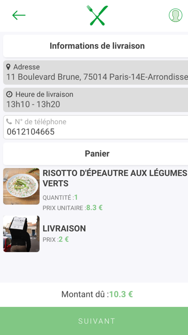
Recommendation: If the button validates the order, it is preferable to use a wording such as “validate the order”.
CONCLUSION:
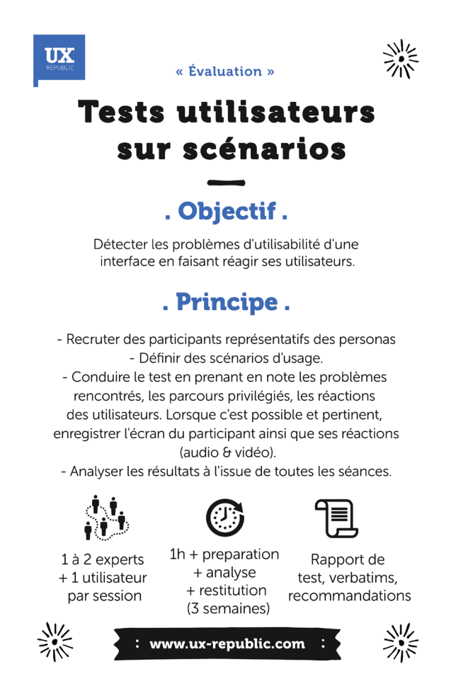
Note also that the analysis is based on expert experience and not user feedback. To know the true effectiveness of a product, it is preferable to carry out user tests. They make it possible to collect the behaviors, reactions and reflections of users and thus to improve the product accordingly.
I'll see you next month for a new analysis of another Food Tech application!
Edna Malka, UX-Evangelist @Edna_UX - UXLab Foundation @UX-Republic
DESIGN SPRINT: INITIATION & FACILITATION # Paris
SMILE Paris
163 quay of Doctor Dervaux 92600 Asnières-sur-Seine
UX-DESIGN: THE FUNDAMENTALS # Belgium
UX-REPUBLIC Belgium
12 avenue de Broqueville - 1150 Woluwe-Saint-Pierre
GOOGLE ANALYTICS 4 #Paris
SMILE Paris
163 quay of Doctor Dervaux 92600 Asnières-sur-Seine
ACCESSIBLE UX/UI DESIGN # Belgium
UX-REPUBLIC Belgium
12 avenue de Broqueville - 1150 Woluwe-Saint-Pierre
EXPERIENCE MAPPING # Paris
SMILE Paris
163 quay of Doctor Dervaux 92600 Asnières-sur-Seine

USER RESEARCH: LEARNING FROM USERS # Belgium
UX-REPUBLIC Belgium
12 avenue de Broqueville - 1150 Woluwe-Saint-Pierre

USER TESTING: LEARN & IMPROVE # Belgium
UX-REPUBLIC Belgium
12 avenue de Broqueville - 1150 Woluwe-Saint-Pierre

WORKSHOP FACILITATION # Paris
SMILE Paris
163 quay of Doctor Dervaux 92600 Asnières-sur-Seine

LEAN UX: DESIGNING THE RIGHT SOLUTION # Paris
SMILE Paris
163 quay of Doctor Dervaux 92600 Asnières-sur-Seine
FIELD EXPLORATION: CLOSER TO YOUR CUSTOMERS’ REALITIES # Paris
SMILE Paris
163 quay of Doctor Dervaux 92600 Asnières-sur-Seine
