I find you today for the act 2 of this series of articles on the choice of typographies in accessibility. In Act 1, I mentioned to you that there was no favorite font and therefore presented the key elements to check when making your selection in order to be as accessible as possible (distinction of characters, size, contrast, families and styles of typography…). If you haven't read it yet, don't hesitate to do a catch-up session, the article is still available 😉
Typography and accessibility act 1: how to choose the right font
Today, we are going to go a little further and talk about typographies developed by teams of researchers to overcome reading difficulties related to specific disorders. We will see in particular the case of dyslexia and visual impairment.
Fonts for the visually impaired
Visual disturbances lead to significant reading difficulties. Beyond the braille specially developed for the blind or very visually impaired people who cannot discern the characters of a traditional font, researchers have looked into the development of specific typographies to facilitate the identification of characters and make reading more fluid.
This is especially the case for fonts. Atkinson Hyperreadable of the Braille Institute and Firefly of the Regional Technical Center for Visual Impairment and the studio typographies.fr.
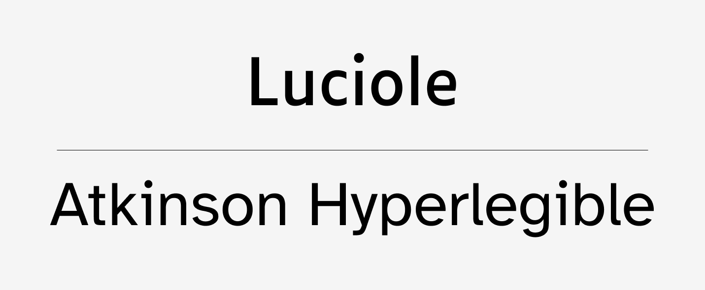
Luciole and Atkinson Hyperlegible are two typefaces specially designed to make it easier for visually impaired people to read.
In both fonts, specific work has been done to optimize characters that are traditionally sources of confusion. The teams relied on key design criteria in typography such as letter structure, serifs, spacing and word clutter to provide the best possible experience for visually impaired readers.
Luciole thus offers more than 700 different characters available in 4 styles (regular, italic, bold and bold italic) allowing you to write in almost all European languages and integrating Greek and mathematical symbols to allow use in science up to the level of bac.
For its part, Atkinson Hyperlegible offers nearly 335 adapted characters available in 4 styles (regular, italic, bold and bold italic) and in 27 different languages.
Of course, even if you decide to use one of these fonts, also remember to pay attention to the sizes, spacing, contrasts and possibilities of adaptation which are key accessibility elements to pay attention to in the event of visual impairment.
Typographies for dyslexia
What is dyslexia?
Dyslexia literally means “difficulty with words”. Linked to a learning disability, it constitutes a written language disorder particularly impacting reading by difficulties in recognizing words precisely and/or fluently (inversion of letters, visual confusion between letters of similar shapes, syllables, or even similar words, addition of letters…). To realize this, here is a simulation of what reading a text can be like when you have dyslexia.
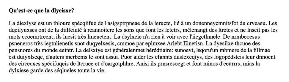
Dyslexia causes reading difficulties, in particular by inversions of letters, decoding difficulties, or even visual confusion. Source: ©Psynap6 – https://psynap6.ch/simulation/
But then how to improve the accessibility of texts for people with dyslexia or more generally reading disorders? Are there solutions to limit these difficulties? Can we even consider eliminating these troubles with the right typography?
Well yes and no. Certainly, there is no miracle solution, however, several teams of researchers have developed specific typographies to counterbalance the effects of dyslexia and thus facilitate reading. Here are two:
Characteristics of dyslexia-friendly fonts
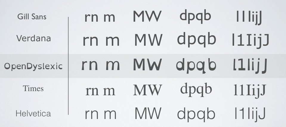
The characters of the fonts adapted to dyslexia are worked to facilitate their differentiation. Source: ©Open Dyslexic – https://opendyslexic.org/about
These two fonts particularly accentuate certain aspects of the characters to counterbalance the confusion typical of dyslexia. In particular, we find the following characteristics:
- Mirror letters : bpqd or even M and W are often a source of confusion and inversion. In order to overcome this, the teams have increased the thickness of the base of the letters to allow better identification of the bottom of the character and therefore its direction.
- Spacings : whether between letters or words, the spacing has been increased in order to limit the risk of confusion between the letters, as for the association rn / m which can lead to confusion as shown in the illustration below above.
- different shapes : all the characters are worked to be different from each other to limit the risk of inversion
- Accent heights : some letters have an upslope or a downslope (i.e. an area that exceeds the height of the x from the top or bottom). In dyslexia-friendly fonts, the height of these descenders has been increased to be more pronounced, always with the idea of making it easier to identify each character.
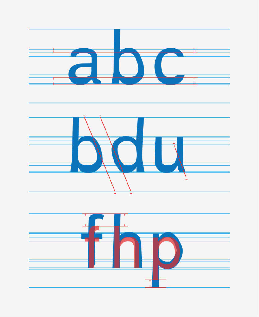
In fonts adapted to dyslexia, the very structure of the letters is worked on to facilitate the identification of each character. Source: ©Dyslexia font – https://www.dyslexiefont.com/en/typeface/
parenthesis for writing
I've been talking about reading from the beginning of these articles, but let's quickly talk about writing, the time to share with you a recently released tool to help people with dyslexia write on the computer.
Ryann Dubois, a young high school student himself suffering from dyslexia, used his free time during the 1st confinement to design a keyboard that makes it easier for people with dys disorders to learn typing.
https://www.youtube.com/watch?v=M3BhZWSalr0
Inspired by the use of stickers by occupational therapists, this self-adhesive keyboard, called KeyDys, is superimposed on the computer keyboard and groups the letters by color in addition to indicating the secondary actions accessible via keyboard shortcuts (copy, paste, etc.). The keyboard, divided into 8 distinct zones, thus facilitates the identification of letters and limits the risk of confusion and inversion frequently encountered in the event of dyslexia.
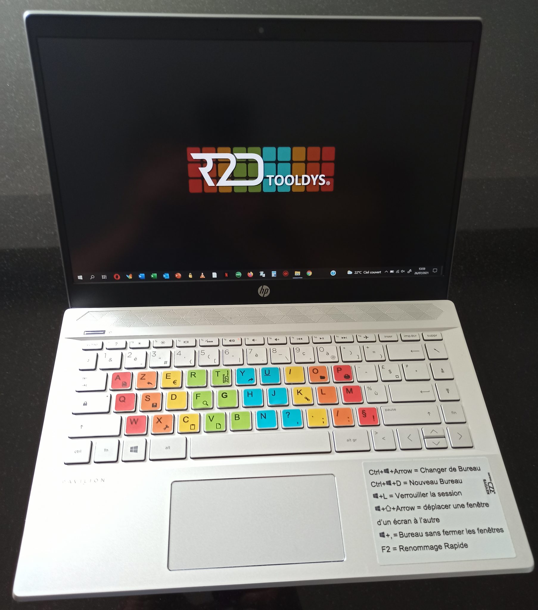
The KeyDys keyboard designed by Ryann Dubois organizes the letters into 8 distinct areas to facilitate character identification and limit the risk of inversion. Source: ©R2DToolDys – https://www.r2dtooldys.fr/
Bonus: for memorization
Clearly not the best from an accessibility point of view, I share with you a last font designed according to the main principles of cognitive psychology: “Sans Forgetica”.
This typography, developed in 2018 by RMIT University in Melbourne in partnership with the Naked Communications agency, deliberately makes reading more complex, in particular by removing areas of certain characters. These “letters with gaps” oblige the reader to monopolize more cognitive resources during his reading and it is precisely this effort which would allow him to better memorize the texts read.
Studies are not unanimous on the influence of this typeface on memory, so whether it's a real good idea or not... to be continued!
In summary
Back to the key points of this article in 2 acts, to choose the typography to use in your future solution:
- There is no miracle typography suitable for all Internet users (that would be too good)
- Favor typographies with clearly distinguishable characters natively integrating several styles (bold, italic, etc.)
- Pay attention to text sizes, spacing, alignments and contrast
- If your solution is international, don't forget the multilingual character
If your solution will be used by people prone to dyslexia, visual impairment or other visual impairment, do not hesitate to dig the track of dedicated typographies
Accessibility is a vast subject that does not only concern typography. If this subject interests you, various tools and repositories are available to go further and support you in the development of optimal accessibility solutions. We find in particular:
- Web Accessibility Initiative (WAI) of the W3C with in particular the WCAG
- General repository for improving accessibility (RGAA) created by the interministerial digital department (DINUM) under the 2005 disability law
- Opquast : although dedicated to web quality in the broad sense of the term, the Opquast repository provides a set of key rules in the field of accessibility.
Justine PISMONT, UX Designer @UX-Republic
Our next trainings


DIGITAL ACCESSIBILITY AWARENESS #Paris
SMILE Paris
163 quay of Doctor Dervaux 92600 Asnières-sur-Seine
DIGITAL ACCESSIBILITY AWARENESS #Belgium
UX-REPUBLIC Belgium
12 avenue de Broqueville - 1150 Woluwe-Saint-Pierre
ACCESSIBLE UX/UI DESIGN # Paris
SMILE Paris
163 quay of Doctor Dervaux 92600 Asnières-sur-Seine
AWARENESS OF DIGITAL ECO-DESIGN # Belgium
UX-REPUBLIC Belgium
12 avenue de Broqueville - 1150 Woluwe-Saint-Pierre

STORYTELLING: THE ART OF CONVINCING # Paris
SMILE Paris
163 quay of Doctor Dervaux 92600 Asnières-sur-Seine


UX/UI ECO-DESIGN # Paris
SMILE Paris
163 quay of Doctor Dervaux 92600 Asnières-sur-Seine
DESIGN THINKING: CREATING INNOVATION # Belgium
UX-REPUBLIC Belgium
12 avenue de Broqueville - 1150 Woluwe-Saint-Pierre


MANAGING AND MEASURING UX # Paris
SMILE Paris
163 quay of Doctor Dervaux 92600 Asnières-sur-Seine

DESIGN SPRINT: INITIATION & FACILITATION # Paris
SMILE Paris
163 quay of Doctor Dervaux 92600 Asnières-sur-Seine
