Text too small, typography difficult to read, spacing between characters too small (or too large), contrast too low… All these elements are important when it comes to the readability and accessibility of texts. But then which typography to choose among the existing multitude to guarantee optimal accessibility for all?
When we talk about accessibility, we think in particular of accessibility for people with reduced mobility, with visual and/or hearing impairment... and this was in particular one of the first angles of attack in the development of the accessibility of buildings. But in the digital age, accessibility has become a major issue in the field and is everyone's business since anyone can be affected by accessibility problems. Take for example the case of Livebox Wi-Fi codes:
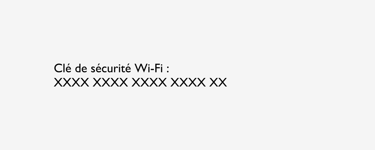
“Is that a capital o or a zero? A capital i, a lowercase L or a 1?” → Wi-Fi keys have become masters in the art of making us lose our heads when it comes to copying them.
In this context, we are all confronted with a problem of readability and accessibility and being in this “disabled” situation does not necessarily mean having a specific disability. An accessibility problem can put us all in this situation and Louis-Pierre Grosbois sums it up very well:
« A disabled (incapable) person becomes an able-bodied (capable) person in an accessible environment. A valid person in an inaccessible environment becomes a disabled person. »
Accessibility is therefore a key digital issue and this notably involves the choice of fonts. I am taking you on a series of two articles to give you some tips and tricks and help you choose the right typography for your digital solution.
Which typography to choose?
Might as well attack the heart of the matter and say it right away, there is no single answer to this question. The variability of Internet users does not make it possible to identify a typography
specific to satisfy 100% of Internet users. Some will be more comfortable with a given font while others will have more difficulty with it.
This is shown by Nielsen Norman's latest study Group on the best typography to use for online reading. On paper, the Garamond font achieves the fastest reading speed on average (result based on the number of words read per minute). Yet only about 50% of study participants actually performed better with this font (for each reader, the fonts tested were ranked from fastest to slowest). In other words, if an interface uses Garamond typography, only 50% of Internet users would be really satisfied with it.
The solution could be to allow users to select the typography they prefer. Unfortunately, this solution is not viable. The researchers indeed showed that the participants were not able to really identify what is best for them since the participants read 14% slower using the font they preferred. A another Nielsen Norman Group study also shows that the majority of users do not use personalization when it is available and just keep the default view.
But then, if there is no particular typography to favor and we do not let Internet users personalize their display themselves, how to choose the right font? Here are some tips to pay attention to when choosing.
Tips and tricks for choosing the right typography
Typography family
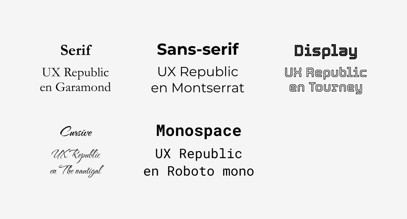
The 5 main typographic families: Serif, Sans-Serif, Display, Cursive and Monospace
There are five major typographic families :
- Serif : fonts with serifs (extensions that terminate the ends of characters). Example: Garamond, Times New Roman, Georgia…
- sans serif : sans serif fonts, more streamlined unlike the previous family. Examples: Arial, Calibri, Helvetica…
- Display : more whimsical fonts, they usually have a rather decorative purpose.
- cursive : fonts simulating handwriting. Examples: Comic Sans MS, Caveat…
- Monospace : fonts with a fixed width for each character (eg the i in a non-monospaced font will be in a thinner area than an m). E.g.: Roboto Mono, Source Code Pro…
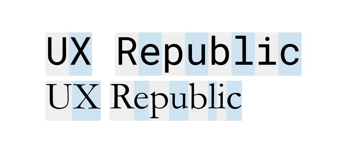
Dn Monospace typography (here at the top), each character is displayed in an area of identical width. Conversely, in a non Monospace font (here Serif at the bottom), the width is adapted to each character.
When developing your solution, the choice of font family will depend on what it will be used for. For the accessibility of text paragraphs, and more generally for the web, it is nevertheless preferable to favor a familiar font with easily identifiable characters of the Sans Serif type.
Serif typefaces will be especially suitable for printed media or for specific highlights on your web content. The other fonts can, for their part, be used more occasionally on titles, for example, provided that all the criteria are met to allow good readability (sufficient contrast, size large enough, etc.)
Different typography styles
To optimize the accessibility, readability and understanding of your texts, one of the keys is to prioritize your content. To do this, choose fonts with several styles that will allow you to highlight your content without having to use 10 different typographies (emphasis, secondary information, etc.). At a minimum, opt for a typography with the following 4 classic styles:
● Regular ● gras
● Italics ● Bold Italic
Some fonts incorporate variations of these intermediate styles. This is the case, for example, of the Raleway font, which exists in 9 different versions and as many versions in italics.
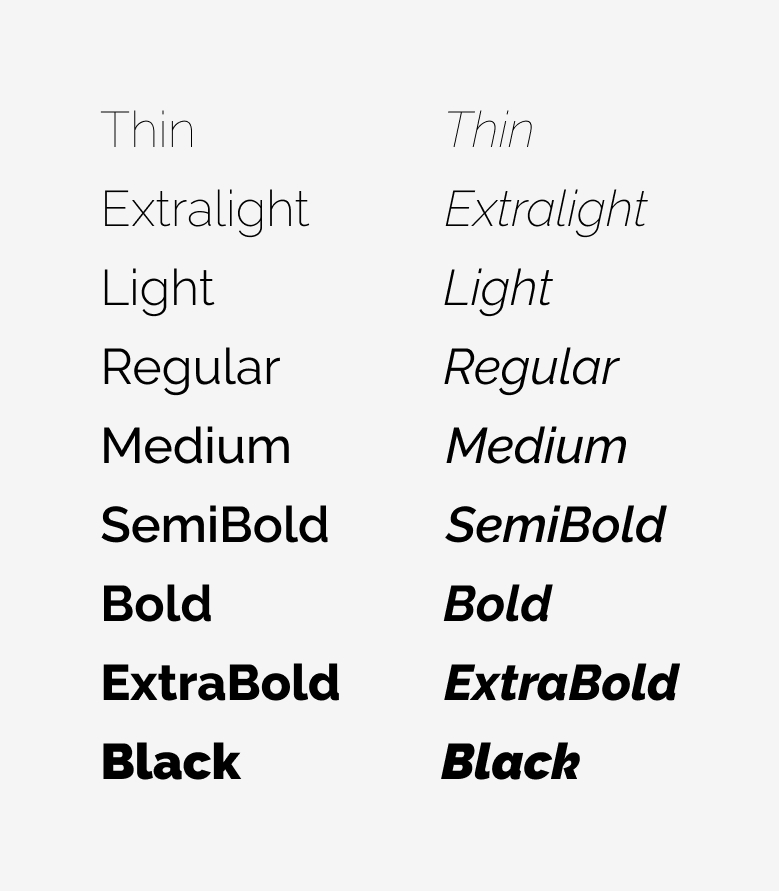
Raleway typography integrates 9 different styles and as many for its italic version
But beware, to use the famous saying “The best is the enemy of the good”, using too many different styles in your content will be more likely to complicate readability than to optimize its accessibility. The “thin” version of Raleway, for example, may not be very accessible since it is (too) thin to have good contrast and good readability.
Multilingual
Is your solution international? Think about planning the multilingual character of your typography. Whether your solution is natively available in several languages or the user uses a third-party tool to translate the content of the pages, the font must adapt and display the translated text well. The risk, if this is not the case, is to see your texts replaced by a set of unreadable characters such as ⍰⍰ ⍰⍰⍰⍰⍰⍰⍰⍰.
Paying attention to this point therefore makes it possible to check that the Internet user will be able to access the content of the solution regardless of the language in which he will display it. Bonus: it will also allow you to check the display of your screens upstream to maintain harmonious interfaces in all circumstances.
Character differences

Prefer a font with all different characters, especially for the lowercase L, the 1, the capital i and the mirror letters.
Similar characters can be confusing. If the letter is in the middle of a word, the Internet user will generally integrate it as a whole and will not be particularly blocked. But as I told you at the beginning of this article, in the case of an alphanumeric code like for Wi-Fi codes, it can quickly become complicated.
To avoid this situation, you must check the differences between the letters lowercase L, uppercase i and the number 1. In "extreme" cases, such as with Gill Sans typography, the 3 characters are exactly the same, which makes them indistinguishable as is. Other fonts like Arial include a differentiation for the number 1, but the 2 letters remain the same. The ideal is to opt for a font like Fira Sans or Raleway which adopts differences between the 3 characters.
Also beware of dbp q mirror letters. In some typographies like Helvetica, Arial or Gill Sans, these letters are exact symmetrical which can easily lead to inversions. Favor a font like Raleway which adds a slight distinction between each character to make them easier to identify.
Use & display of fonts
Beyond the choice of typography, the use you make of it is important. You can choose the most suitable font, if you write in 8 and in white on light gray, it will not work. Here are some tips related specifically to the use of typography.
Size & Spacing
The size of the text is obviously an essential part of the accessibility of the texts. Texts written too small will inevitably be difficult to read. The repositories do not really impose a minimum size provided that relative sizes are used (em, %…). Nevertheless, it is still preferable to have large texts by default. We recommend in particular texts of 14 to 20 px on computer, 13 to 19 px on tablet and 12 to 16 px on mobile. Note that as screens get bigger and bigger, character sizes tend to increase for computers. The 14 px tends to get lost, it is more usual today to find texts from 16 to 20 px.
Beyond the size of the text, the spacing between letters, lines and paragraphs are also to be taken into account. Lines that are too close together, or conversely too far apart, will make it difficult for the eye to move from one line to another. Characters or words that are too close together will complicate the distinction between them. If they are too far apart, conversely, identifying the links between the letters that form a word will be more difficult. Here are the WCAG recommendations for spacing:
- Between the lines: at least 1,5 times the size of the text
- Between paragraphs: at least twice the size of the text
- Between letters: at least 0,12 times the size of the text
- Between words: at least 0.16 times the text size
Alignments
In the same line, favor a left-aligned and unjustified text. While you may think justified text is visually more pleasing, it will actually make it harder to move from line to line. Unequal spaces are also created between words, which creates cracks that are harmful to reading. It is also one of WCAG recommendations which advocates aligning texts on one side only.
In the age of ever-larger screens, avoid full-width text too. The larger the text will be written on, the more difficult it will be to follow its reading line, especially if the text is written in a normal size of 14 to 20 px. Generally speaking, it is best to have a size of around 100 characters per line for smooth reading.

In order to facilitate the reading of your texts, prefer left alignment to justified which complicates the reading.
Contrast
For a text to be readable and therefore accessible, it is important to pay attention to the contrast between its color and that of its background.
Here are the WCAG recommendations for this point :
- minimum contrast (WCAG level AA: texts must have a contrast ratio of at least 4.5 for 1. Exception for large texts for which the ratio must be at least 3 to 1.
- Optimal contrast (AAA level): texts must have a contrast ratio of at least 7 for 1. Exception for large texts for which the ratio must be at least 4.5 to 1. Flat: be careful all the same with excessive contrasts which will be counterproductive by making reading more complex and accentuating eye fatigue. On paper, text written in black (#000) on white (#fff) will have an optimal ratio (21:1). However, this strong contrast can lead to a feeling of movement of the characters or a halo effect, especially for the elderly, people with dyslexia or people who are sensitive to light (Irlen syndrome). To avoid this problem, choose dark gray text on a white background or black text on a light gray background.
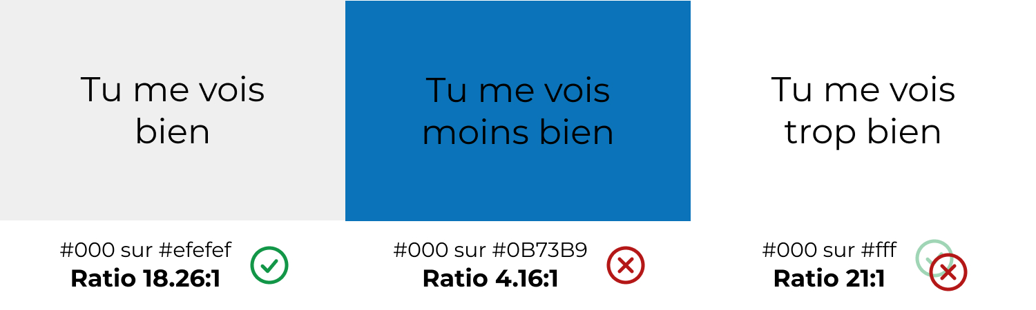
Readability is strongly impacted by the contrast between the text and its background color. For optimal accessibility, opt for a contrast ratio of at least 7 to 1.
You now have the keys to choose the fonts of your future solutions. Be careful not to select too many different fonts. This would be counterproductive and overload your content. Choose two or even three typographies maximum.
Also note that for Web support, it is preferable to use fonts suitable for the Web, in particular to limit the impact on the performance of the solution and allow good display on all supports and browsers. We find for example Google Fonts which provides several hundred free, royalty-free, web-friendly fonts.
Others have also looked into particular cases and developed fonts adapted to overcome specific reading difficulties. But that, I give you an appointment very quickly to make you discover them in act 2 of this series of articles.
Justine PISMONT, UX Designer @UX-Republic
Our next trainings


DIGITAL ACCESSIBILITY AWARENESS #Paris
SMILE Paris
163 quay of Doctor Dervaux 92600 Asnières-sur-Seine
DIGITAL ACCESSIBILITY AWARENESS #Belgium
UX-REPUBLIC Belgium
12 avenue de Broqueville - 1150 Woluwe-Saint-Pierre
ACCESSIBLE UX/UI DESIGN # Paris
SMILE Paris
163 quay of Doctor Dervaux 92600 Asnières-sur-Seine
AWARENESS OF DIGITAL ECO-DESIGN # Belgium
UX-REPUBLIC Belgium
12 avenue de Broqueville - 1150 Woluwe-Saint-Pierre

STORYTELLING: THE ART OF CONVINCING # Paris
SMILE Paris
163 quay of Doctor Dervaux 92600 Asnières-sur-Seine


UX/UI ECO-DESIGN # Paris
SMILE Paris
163 quay of Doctor Dervaux 92600 Asnières-sur-Seine
DESIGN THINKING: CREATING INNOVATION # Belgium
UX-REPUBLIC Belgium
12 avenue de Broqueville - 1150 Woluwe-Saint-Pierre


MANAGING AND MEASURING UX # Paris
SMILE Paris
163 quay of Doctor Dervaux 92600 Asnières-sur-Seine

DESIGN SPRINT: INITIATION & FACILITATION # Paris
SMILE Paris
163 quay of Doctor Dervaux 92600 Asnières-sur-Seine
