The French, major consumers of online fashion
France is a major e-commerce player in the world. Its number of financial transactions now places it 6th in the world and 3rd in Europe behind Germany and the United Kingdom.
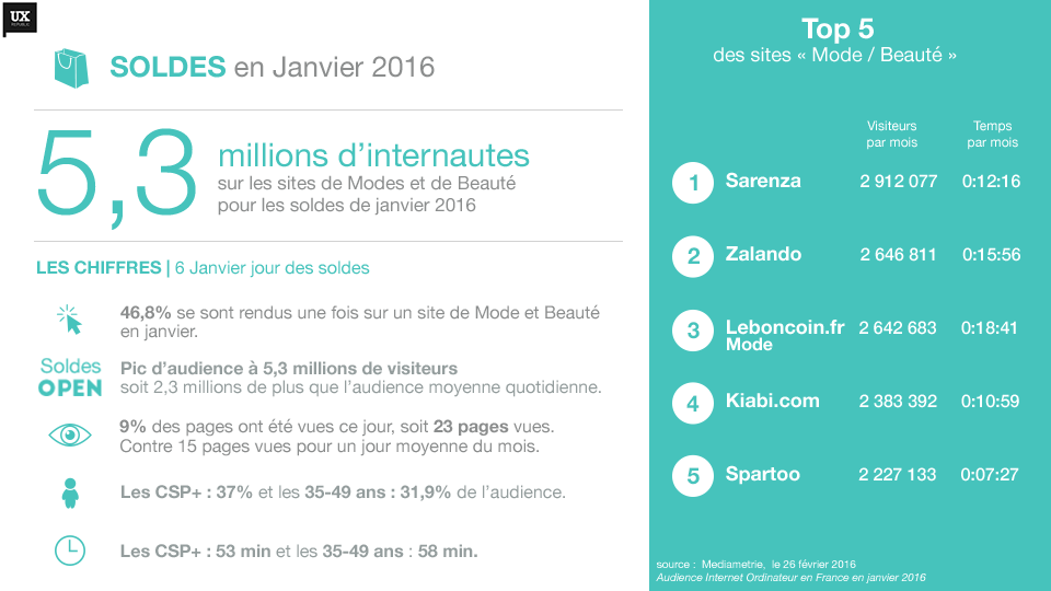
The French use the internet mainly to buy clothes and shoes. In the last 6 months 44% of French people bought a fashion item, 38% booked a trip, 35% a cultural product, 28% a beauty product and 28% a high-tech product.
The favorite fashion sites of the French are Sarenza, Zalando, Leboncoin.fr mode, Kiabi.com and Spartoo. It is in this flourishing context that the major e-commerce sites pay particular attention to their positioning on the web. The competition is very fierce. A single interface error or a few milliseconds of loading can prevent thousands of sales.
To survive in this competitive universe, the major web players are turning to UX – user experience design and e-merchandising, a set of techniques to optimize web interfaces in terms of ergonomics and usability. This approach is one of the key success factors for e-commerce. The optimization of the user experience and the multiplication of advertising campaigns makes it possible to generate impressive flows of visitors and to obtain better conversion rates.
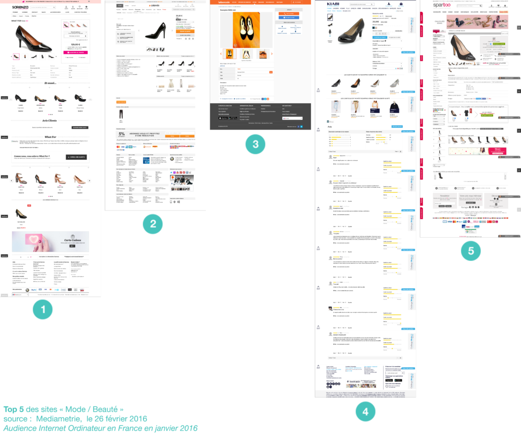
10 tips to improve conversion
(User feedback from the Sarenza, Spartoo and Zalando sites)
- Product visuals must be attractive and contextualized
- Focus on quality and comprehensive content to best describe the size, weight and material of the product
- Highlight promotions significantly via incentive ergonomics.
- Insist and reassure the terms of purchase near the “buy” button
- Place identical items of different colors next to the product (otherwise they are considered cross-selling)
- A space “already consulted” must be placed next to the product sheet (otherwise they are assimilated to cross-selling)
- Put forward inciting arguments such as: “100% leather” and “free delivery”
- Use icons for faster identification and to lighten the text content page a bit
- Avoid vertical and horizontal “double filters”
- To reinforce the feeling of insurance, bet on an aesthetic site, simple and clear
UX design sets up hypotheses and makes it possible to quickly verify, with the help of potential customers, why a customer will favor one interface over another. In a competitive universe, it is the main differentiating element in order to optimize navigation, research and the purchase tunnel of a merchant site.
sources:
- E-merchandising, the real sinews of war? http://www.newquest.fr/eye-tracking/analyses/e-merchandising
- Ecommerce in France http://ecommercenews.eu/ecommerce-per-country/ecommerce-france/
- Mediametrie, February 26, 2016 Computer Internet audience in France in January 2016
Marina Wiesel UX-Designer and Laetitia Sainte-Croix UX-Activist @UXRepublic
STORYTELLING: THE ART OF CONVINCING # Paris
SMILE Paris
163 quay of Doctor Dervaux 92600 Asnières-sur-Seine
UX/UI ECO-DESIGN # Paris
SMILE Paris
163 quay of Doctor Dervaux 92600 Asnières-sur-Seine
DESIGN THINKING: CREATING INNOVATION # Belgium
UX-REPUBLIC Belgium
12 avenue de Broqueville - 1150 Woluwe-Saint-Pierre
MANAGING AND MEASURING UX # Paris
SMILE Paris
163 quay of Doctor Dervaux 92600 Asnières-sur-Seine
DESIGN SPRINT: INITIATION & FACILITATION # Paris
SMILE Paris
163 quay of Doctor Dervaux 92600 Asnières-sur-Seine
UX-DESIGN: THE FUNDAMENTALS # Belgium
UX-REPUBLIC Belgium
12 avenue de Broqueville - 1150 Woluwe-Saint-Pierre
GOOGLE ANALYTICS 4 #Paris
SMILE Paris
163 quay of Doctor Dervaux 92600 Asnières-sur-Seine
ACCESSIBLE UX/UI DESIGN # Belgium
UX-REPUBLIC Belgium
12 avenue de Broqueville - 1150 Woluwe-Saint-Pierre


