We knew that fashion is a cycle that lasts 20 years. Mobile design has a much faster cycle: 7 years!
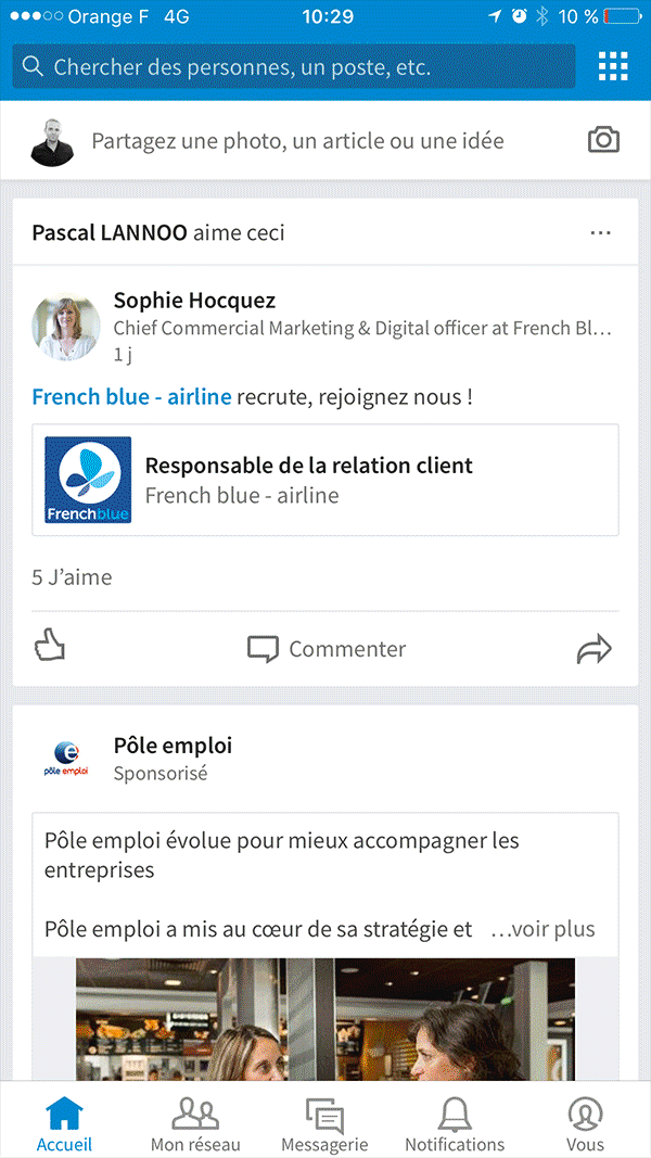
The proof is with the “tabbar” this bar of tabs which was the star of navigation when iOS applications were released in 2008, has once again become the most popular application structure for digital players.
I offer you a retrospective of navigation modes for mobile interfaces over the past 7 years, focusing on 4 major periods of mobile design.
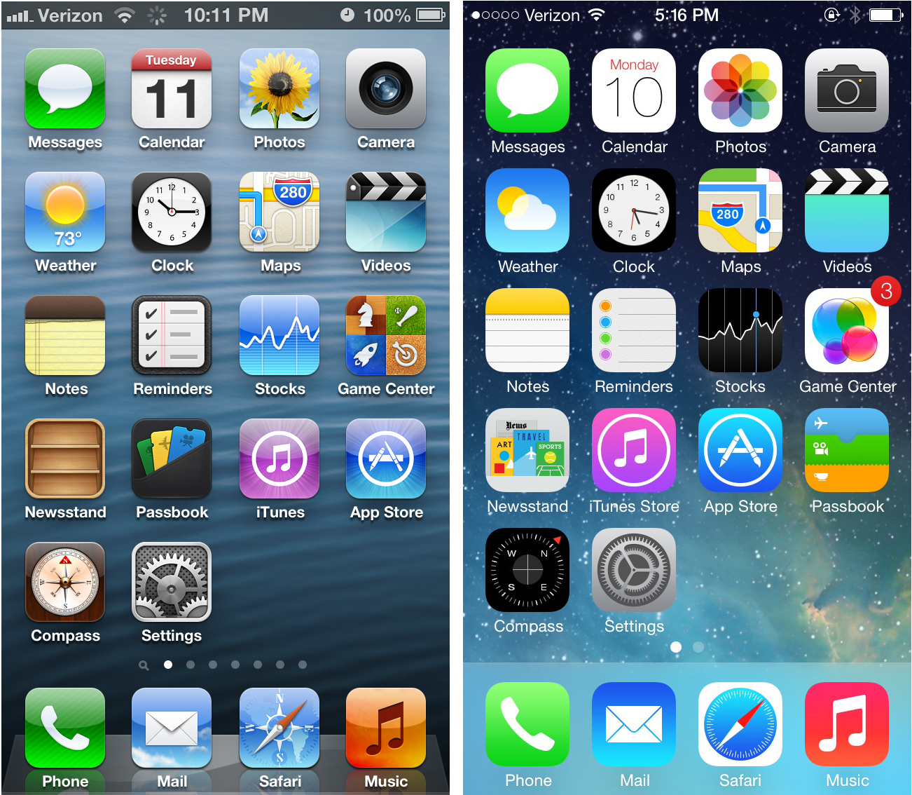
I-time : The “tabbar”
The tab bar was the first great principle of navigation on iOS. This ergonomics has the enormous advantage of being extremely simple:
• aboutn knows its position in the application,
• we have a view of the other accessible sections.
The biggest players on the web had opted for this ergonomics: the Appstore, LeMonde.fr … and of course Facebook. As a mobile designer, the tabbar made it easy to create well-structured and efficient applications!
But this mode of navigation had some major flaws:
• it took up more than 10% of the screen: 49 pixels out of the 480 pixels offered by the iPhone 3G.
• you couldn't customize it. We were condemned to stay on a black base and an active blue icon which caused a strong dissatisfaction for the brands with a dominant red for example…
• The tabbar offered a maximum of 5 slots, which posed a problem for a large or extreme catalog in a simple application where there were only 2 large sections.
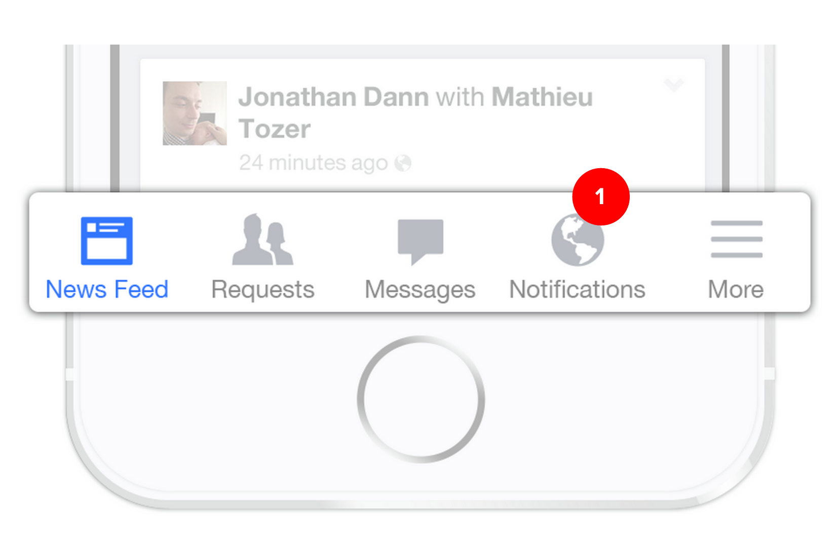
In 2011 Facebook will revolutionize mobile applications by introducing a brand new navigation principle:eHub.
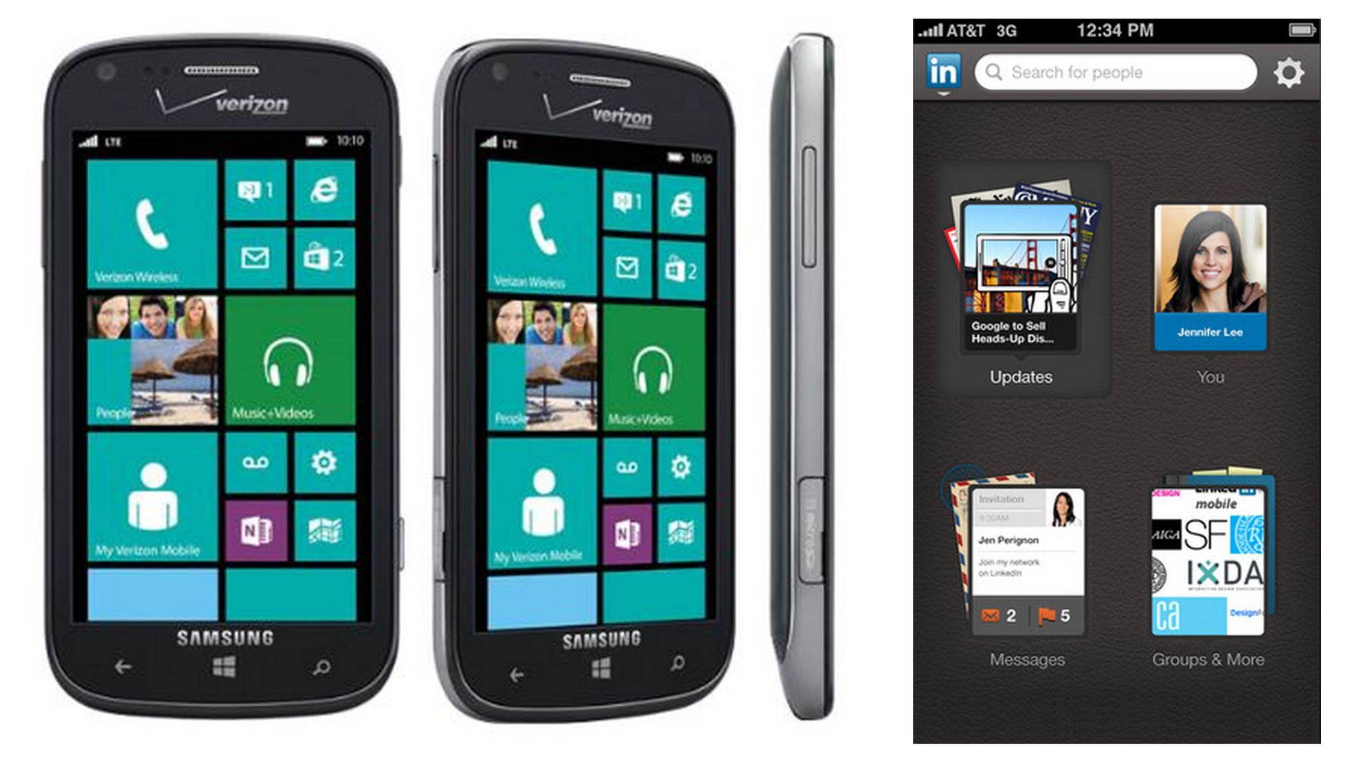
Time II : The Hub
the hub is a continuity of experience of the telephone itself: the interface of the iPhone, for example, is a hub extended over several pages.
It seems quite natural to apply this concept within an application itself.
Facebook will lead the way with its V3. The other major digital players will gradually follow until the Hub becomes the main navigation standard.
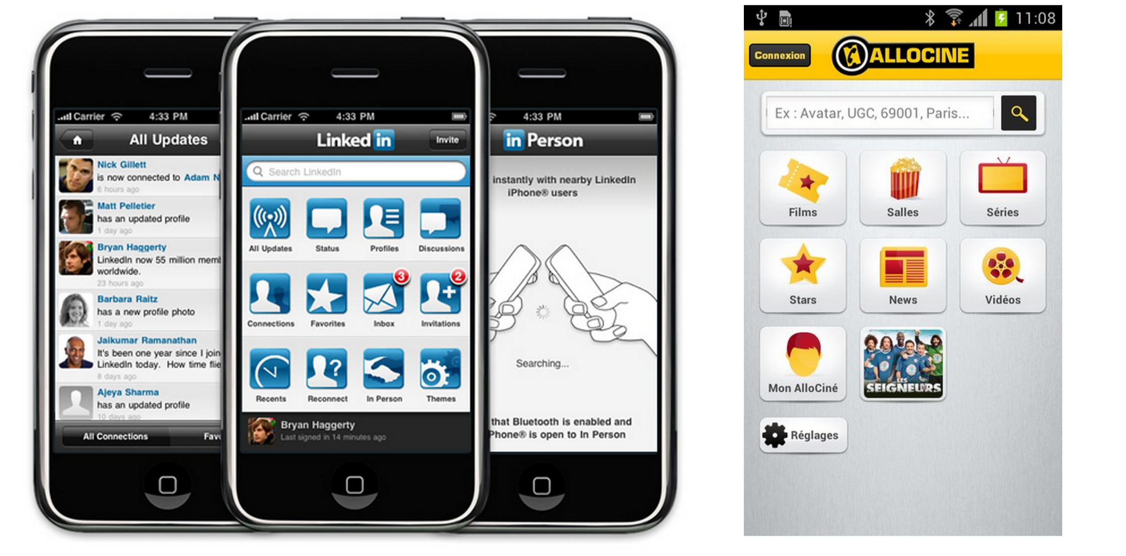
Let us quote the cases of Linkedin, Allociné and almost all French banking applications.
The hub will experience improvements with Microsoft's Metro interface which offered “hot” information instead of icons.

Synthetic :
The advantages of the Hub
- An exhaustive view of my sections
- Ease of use that respects native use of the telephone
The disadvantages of the Hub
- The hub flattens everything without putting focus on the main section of the app.
- Another point the hub is cold: it does not evolve through the news, which gives an impression of immobility and lifeless application.
- Finally the Hub requires a high quality graphic design otherwise we expose ourselves to "the gallery of horrors"
Time III : The Burger Menu
Facebook in its V.4 will completely redesign its iPhone application with the appearance of a hidden menu where we will find all the content, and thus leave the bottom of the screen to the content. For Facebook, which generates more than 85% of its audience with the news feed, this structure takes on its full meaning.
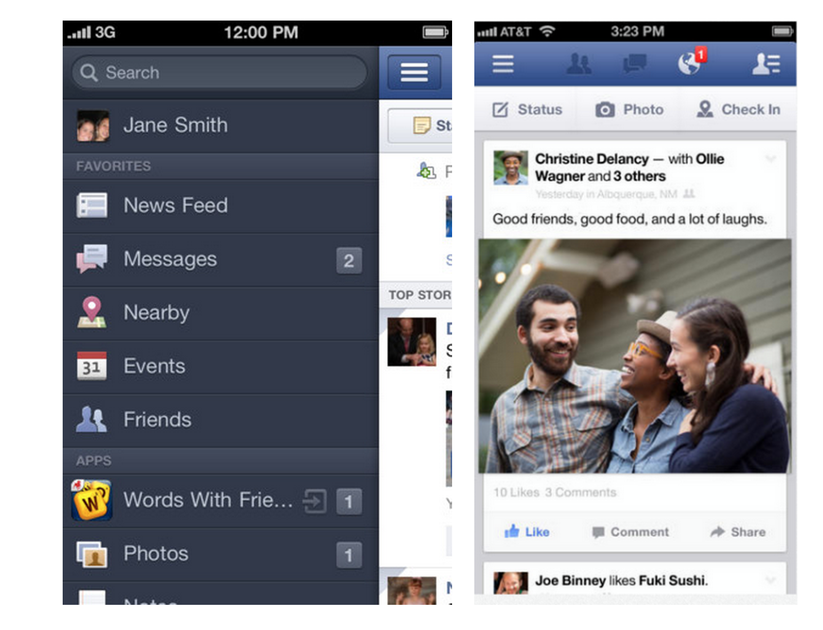
The burger menu was born!
Almost all applications will follow Facebook: Linked-in, Allociné...
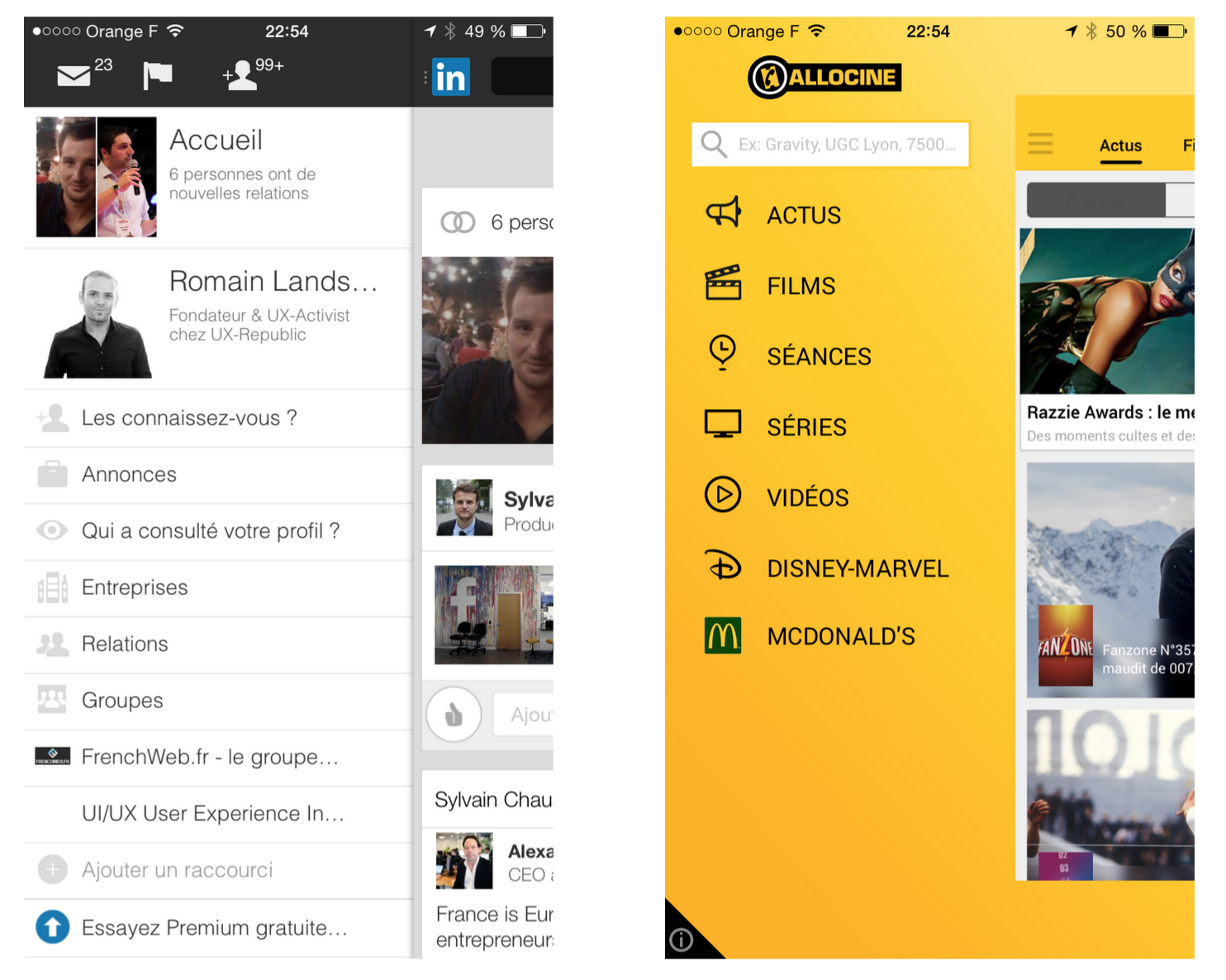
This structure also makes it possible to share the costs of functional designs with the iPad because the side menu on the tablet will be placed like an “L” menu. We find this ergonomics on a lot of sites like amazon.com or facebook.com. among others.
The burger menu structure also has an advantage: it allows you to add an infinite number of categories. The burger menu will be very popular with m-merchants and press actors who have a lot of categories to display.
A problem will quickly appear: users press very little on this burger menu and many categories are neglected and we observe a drop in audiences for secondary sections.
The advantages of the Burger Menu
- Leave as much space as possible for the content,
- Shared ergonomics with tablets,
- Reminder: websites in “L”,
- Allows you to add an infinite number of categories.
The disadvantages of Burger Menu
- The impression that the burger menu is just a carpet where you hide what you don't know what to do with.
To conclude:
Out of sight, out of touch!
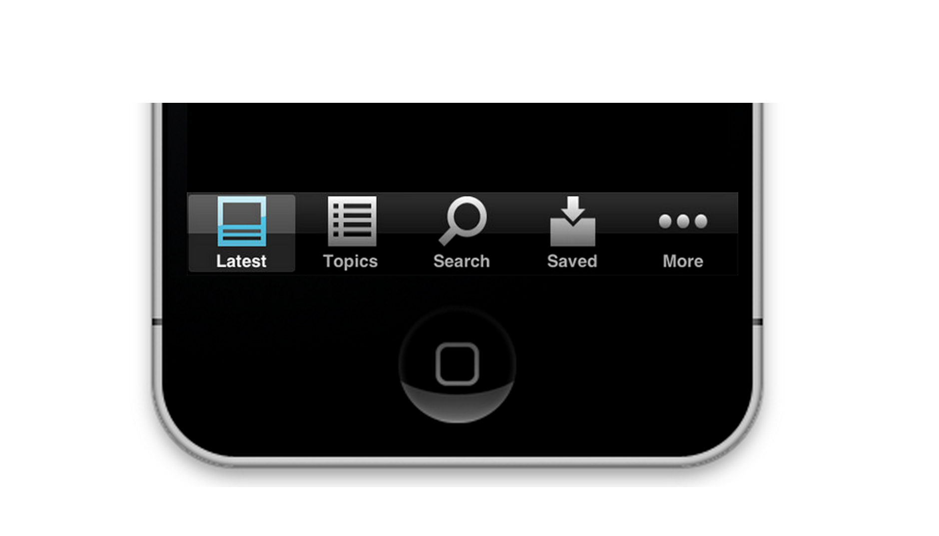
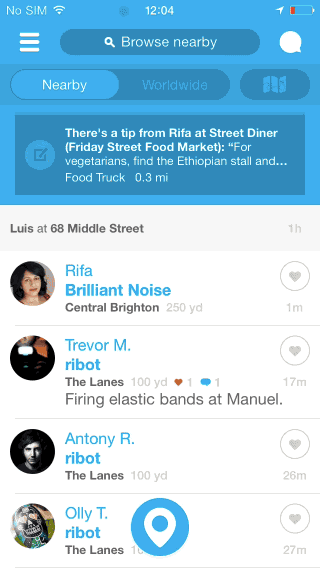
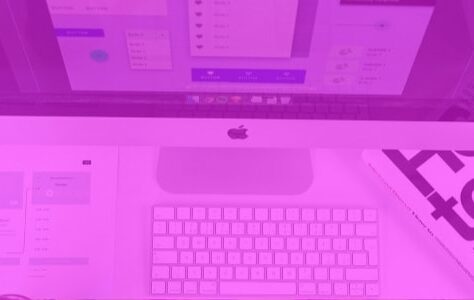
IV time : The Tabbar 2nd generation
As a preamble to this new version of the Tabbar, I invite you to read this article:
– Why We Banished the Hamburger Menu From Our iPhone App –
https://redbooth.com/blog/hamburger-menu-iphone-app
In summary, this BtoC mobile service has migrated from the Menu burger to the Tabbar and has observed the following figures:
+ 70 % app usage time
———————————–
+65% application opening
Facebook will return to the tabbar in 2015, which will allow it, among other things, to showcase its Messenger application.
This tabbar V2 allows you to display notifications on the different sections to highlight them and push to discover them.
We are now free to design it as we see fit and to integrate the colors and fonts of our customers.
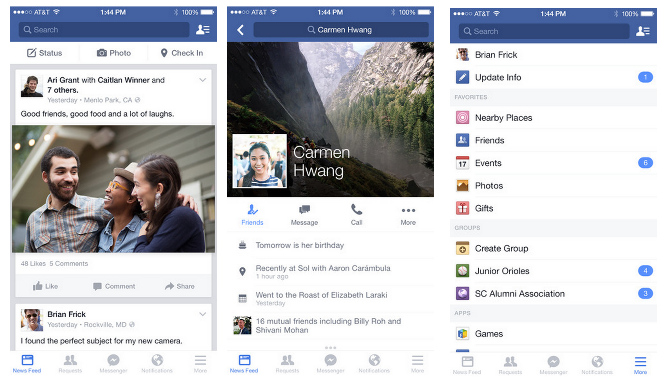
An ideal tabbar only offers 5 starters, but a “burger menu” can be added as the 5th starter, which will display all the remaining categories of the service.
The tabbar will very quickly become the new standard for all applications.
From Airbnb to Allociné, from Linkedin to Voyages SNCF, almost all the major players design their application under this architecture. One of the last bastions of the burger menu has just fallen with Spotify.
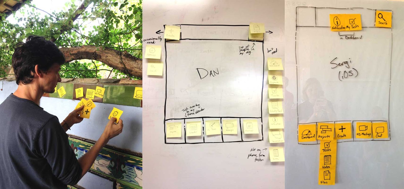
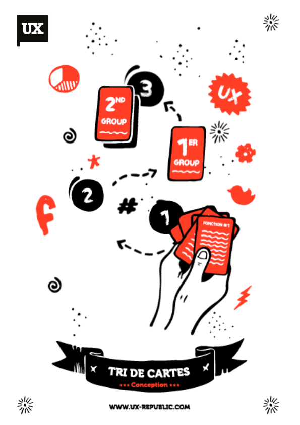
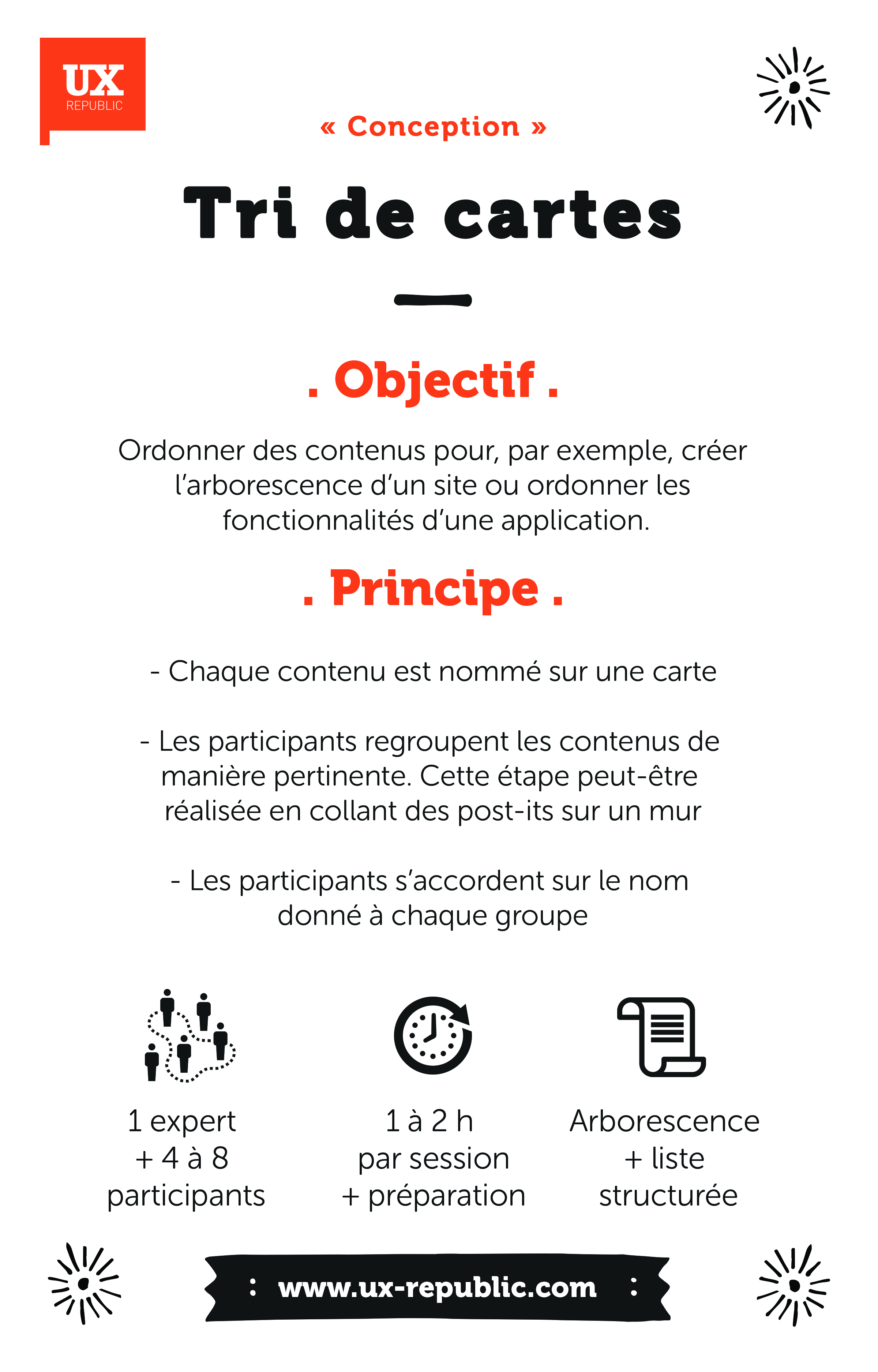
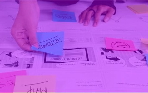
To do this exercise we are conducting a workshop card sorting with our customers .
The advantages of the Tabbar V2
- Shows the main content,
- Allows the user to be attracted to secondary categories via a notification system,
- Ergonomics mastered by a large majority of users,
- The tabbar can support the brand's DNA via colors or pictograms.
The disadvantages of the Tabbar V2
- The back function moves away from the comfort zone for the user,
- The tabbar is not obvious for a “translation” on android because it conflicts with the physical buttons of the phone.
Conclusion : Review and follow-up
As we have seen the Tabbar has once again become a standard. There are obviously still major players who have not been there, and most often for pragmatic reasons. For example Monde.fr decided to keep the burger menu to force the user to see the extent of its content.
We can also often notice the presence of the burger menu in the case of single task applications: the Camera or Slack application which focuses on the general channel.
So next? Well if we follow the logic we should review the return of the Hub, but the failure of Windows 10 and the trend is rather towards a global mix of these structures. There are outsized apps like Snapchat that peck on all of these devices.
One of the novelties that I was able to appreciate is the new version of Parisien.fr which offers navigation by tags linked to hot topics in the news. It's immediate consumption of content: very mobile friendly.
When we observe what is being done on VR and more particularly on the Playstation VR, we find a derivative of HUB in coverflow mode which had made the heyday of the first mobile applications. Is this the return of a trend? To be continued…
Romain Landsberg, Partner & Founder @UXRepublic

STORYTELLING: THE ART OF CONVINCING # Paris
SMILE Paris
163 quay of Doctor Dervaux 92600 Asnières-sur-Seine


UX/UI ECO-DESIGN # Paris
SMILE Paris
163 quay of Doctor Dervaux 92600 Asnières-sur-Seine
DESIGN THINKING: CREATING INNOVATION # Belgium
UX-REPUBLIC Belgium
12 avenue de Broqueville - 1150 Woluwe-Saint-Pierre

MANAGING AND MEASURING UX # Paris
SMILE Paris
163 quay of Doctor Dervaux 92600 Asnières-sur-Seine
DESIGN SPRINT: INITIATION & FACILITATION # Paris
SMILE Paris
163 quay of Doctor Dervaux 92600 Asnières-sur-Seine
UX-DESIGN: THE FUNDAMENTALS # Belgium
UX-REPUBLIC Belgium
12 avenue de Broqueville - 1150 Woluwe-Saint-Pierre
GOOGLE ANALYTICS 4 #Paris
SMILE Paris
163 quay of Doctor Dervaux 92600 Asnières-sur-Seine
ACCESSIBLE UX/UI DESIGN # Belgium
UX-REPUBLIC Belgium
12 avenue de Broqueville - 1150 Woluwe-Saint-Pierre
