The perception of time is an essential KPI (Key Performance Indicator) in the measurement of User Experience.
Both technical and creative, this subject concerns the entire product team. UX-Designer, UI-Designer, Product Owner and Developers combine their talents and creativity to design original experiences. Thinking about the geography of the elements, creating fascinating animations or even developing the most fluid interfaces are their daily lives.

From Material Design to Boring Design
With Material Design, Google has imposed a graphic style and simplified navigation. The goal is to improve performance in order to streamline conversion rates. Thus, we have reached a threshold of design standardization. Google's guidelines are now reproduced until saturation. Emotion has disappeared from User Experiences in favor of efficiency. The era of Boring Design is announced.
However, breaking with this efficiency/emotion antagonism, great references such as Shazam, trainline, Uber, Deliveroo, Snapchat, for example, rely on an original experience.
They consider time as a point of reinforcement of experience. Thus, they make their in-depth knowledge of the user's time an axis of development.
“Very high speed. Upon ticket purchase. Find and pay for your tickets on our site in less time than it takes to lose patience on an ordinary site. That's about 58 seconds. – trainline
To improve their conversion rates, time and emotion have become their major assets. Let’s dive into their approach to time perception…
Without control, Flow is nothing
Back in the 80s, when smartphones were called GameBoy and when Tetris brightened up the journeys in the back of cars….
Tetris, the Grandmaster Flow
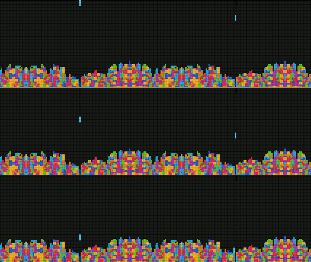
Tetris is undoubtedly the most obvious illustration of the Flow. The satisfaction triggered by aligning the bricks and moving to the next level captivates players for hours.
Similarly, the phenomenon of series triggers this same behavior. From now on, Netflix allows you to watch an entire new season in a single sprint. Fans can then indulge in binge watching without restraint. Again, the Flow is in action.
As a designer of user-centered experiences, we can rely on the Flow to create original and engaging journeys.
What is UX Flow?
UX Flow is the maximum engagement state of a user in an activity.
He is in a total state of concentration, commitment and satisfaction. the Flow was popularized by Mihaly Csikszentmihalyi in his bestseller Flow.
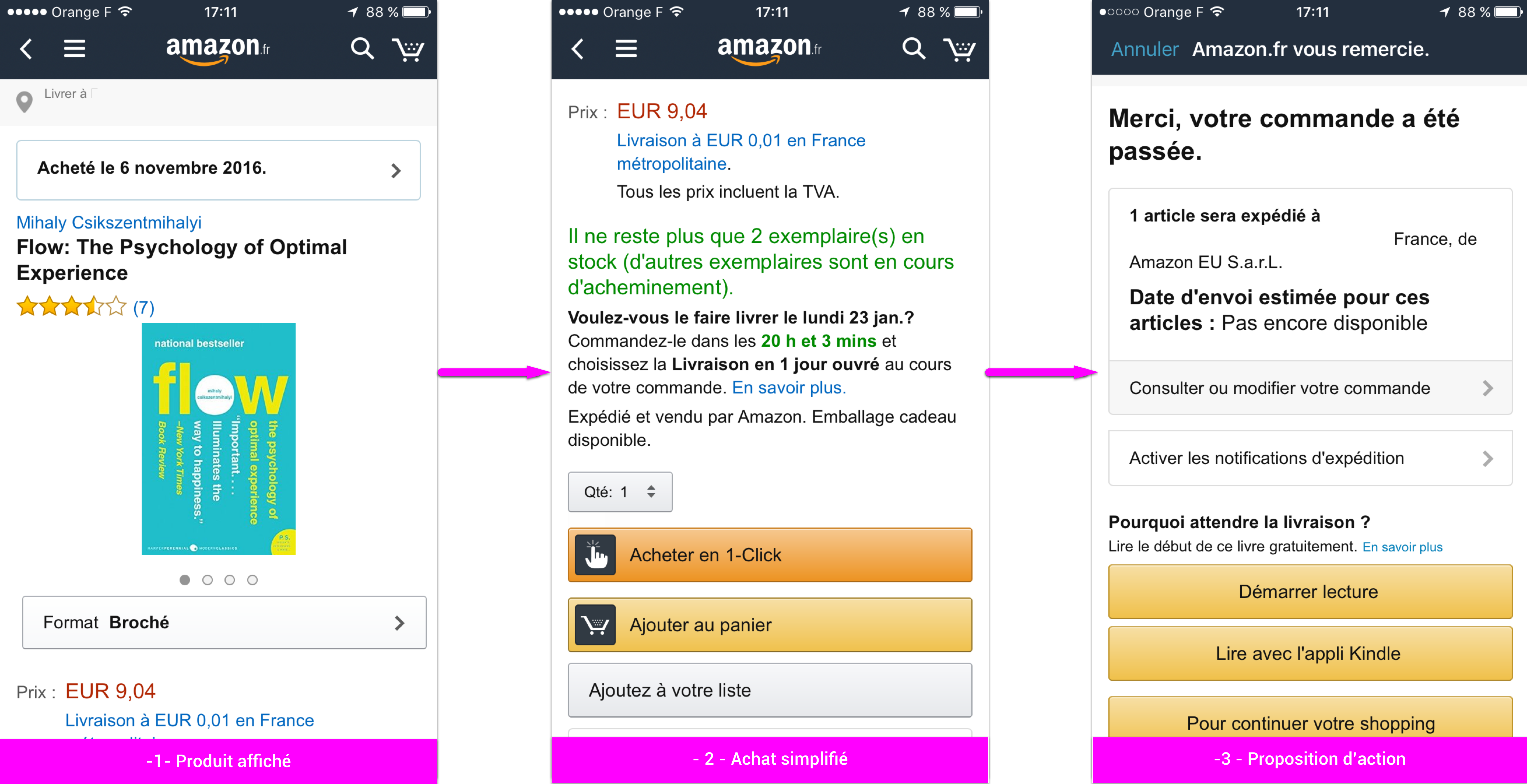
With the button “Buy in 1-click ” and its fluid navigation, Amazon masters the flow. Thus, as a customer, hardly have we finished an order that we already want to make a second! This is the flow applied to e-commerce.
How to improve your Flow ?
The 3 constant times, time constants, Nielsen allow to improve the Flow:
- 0,1 seconds: instant reaction of the system
- 1,0 seconds: continuity of user thought
- 10 seconds: maximum user attention
These response time limits from an interface to a user make it possible to keep the user's attention on an activity.
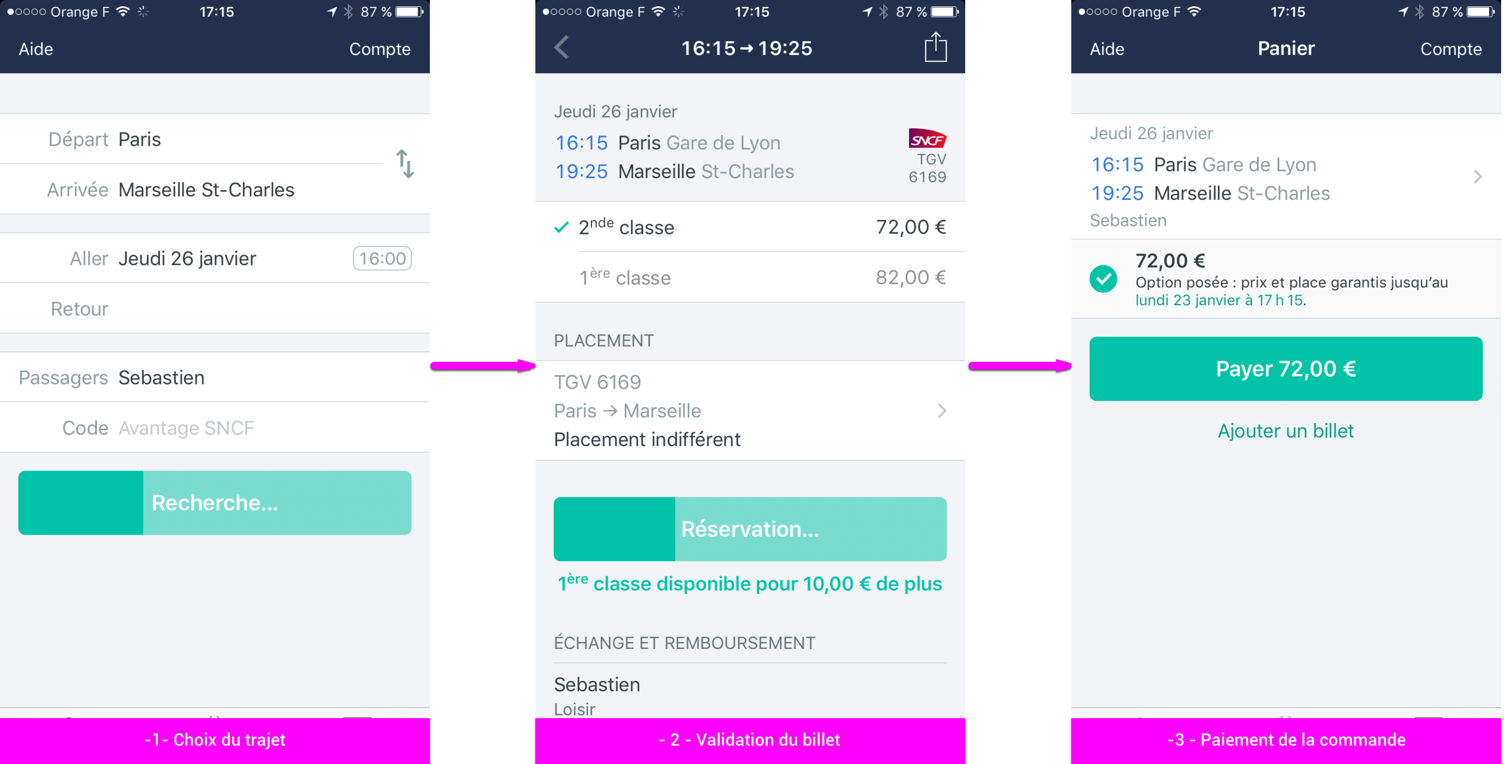
Thus, Trainline simplifies the purchase of train tickets by dividing this activity into simple tasks that give satisfaction to the user.
I choose my destination (10s) then my dates and times (10s). I choose a trip (10s) and I pay with my pre-registered card (10s). And if I want to cancel my ticket, 10 extra seconds are enough for me.
Digitize the conversation without a vocoder
A large number of feedbacks punctuate the exchanges between two individuals: facial expressions, sighs, looks, words. The eyes and ears pick up these signals. They are an integral part of the conversation. Chat bots seek to reproduce these feedbacks.
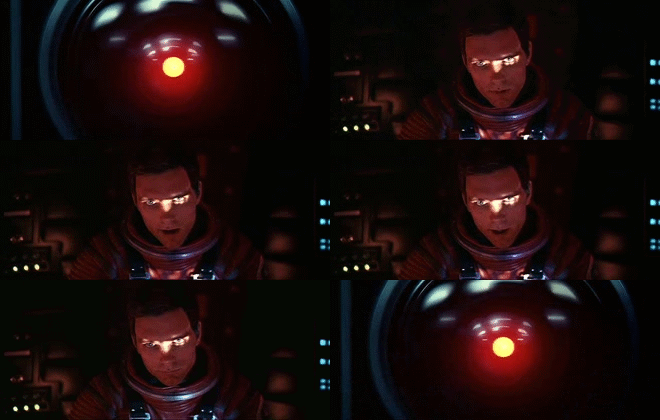
So when in 2001, a space odyssey, HAL goes out and decides not to interact with humans anymore, the astronauts panic…
Snapchat & Deliveroo: conversation at the heart of the experience
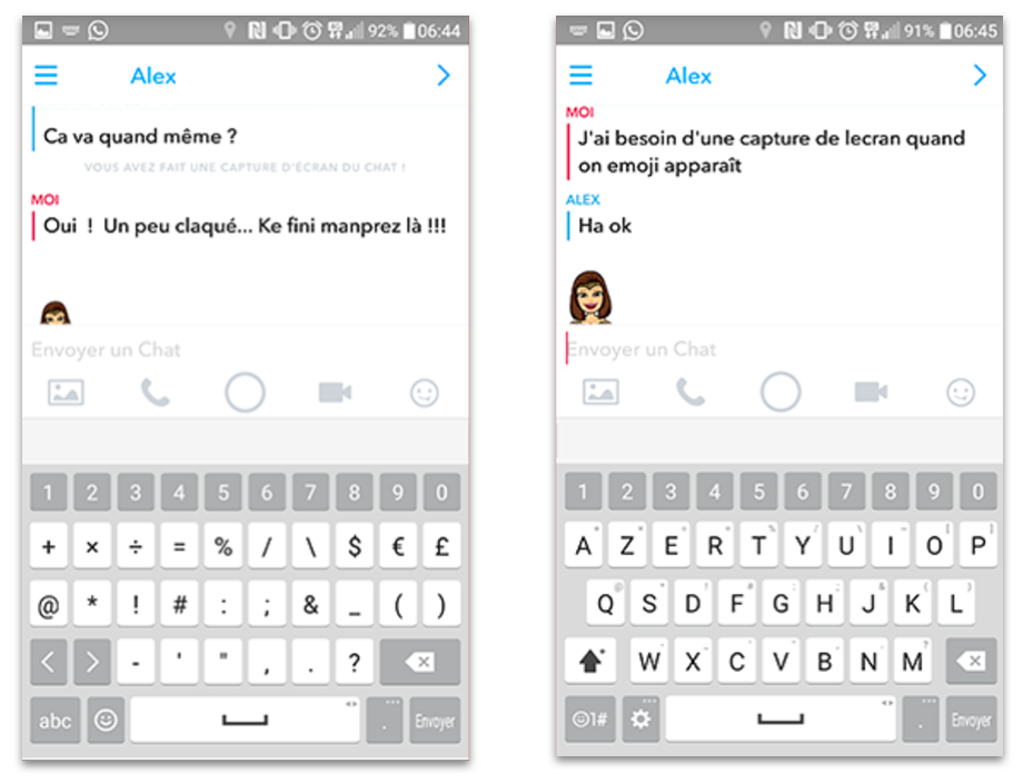
Snapchat uses a Bitmoji to represent the interlocutor. The avatar moves up and down depending on whether the person is reading or writing. Thus, the user gets immediate feedback during the conversation. He is reassured and will wait for the answer of his interlocutor.
Deliveroo pace the user experience with regular notifications on the progress of the order : “Only a few moments left to finalize your order”, “Our delivery person has just picked up your order”…
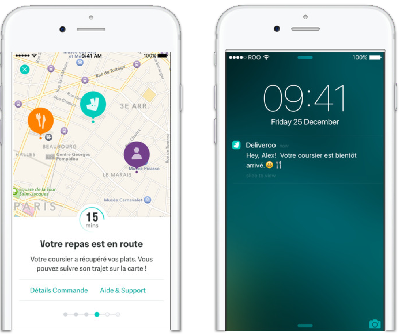
The display of the delivery time reassures the user. He can also track his order live. A notification informs him when the delivery person is approaching. Thus, the experience is prolonged by the emotion linked to the expectation of his meal.
Feedback punctuates the time of the User Experience by reproducing the conditions of a conversation with a real person.
Waiting: from boredom to experience
Waiting is a (positive) emotion
Who hasn't been annoyed by a delay of a few minutes while waiting for their train or metro? Almost everybody. And who's willing to wait an hour in the cold to eat a burger? Lots of Parisians, that's for sure!
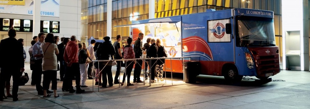
Take the example of Smoking truck. This foodtruck enhances the wait by promising to taste one of the best burgers in the world in Paris !
Arousing desire in the user increases the possibilities of creating an original waiting experience.
Understanding time as an emotion
The perception of time is also linked to emotions. Promising a service or a product with high added value engages the user in a waiting experience.
In addition, a user unlocks his mobile 150 times a day on average: consulting an SMS, reading an email, consulting a notification… So many moments that offer designers the possibility of developing intimacy between the user and his service.
The emotional qualities of the product influence the quality of the overall experience – Don Norman.
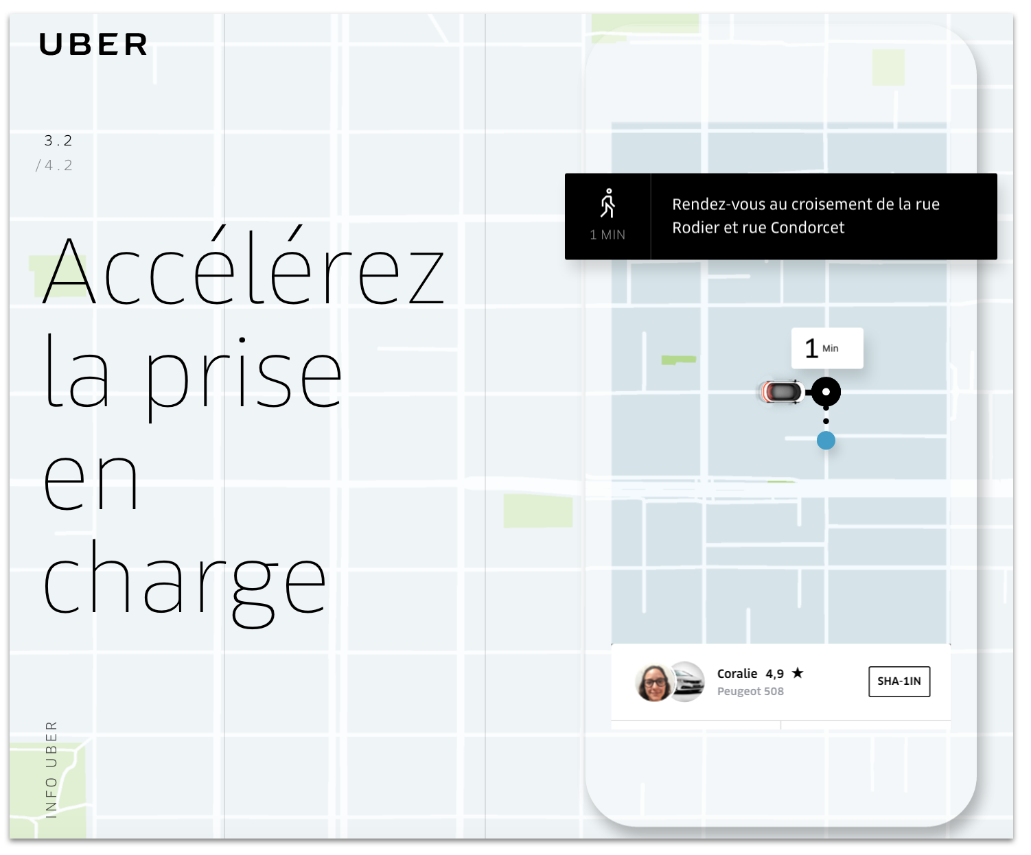
For example, Uber transforms ordering a taxi. Now it's immediate, reliable and simple. The user controls the available vehicles with their arrival time on his screen. He can follow the driver on a map with his arrival time. Notifications announce the next actions to be performed by the user. The sedan arrives and the race continues. The experience is total and of high value emotional added.
Illustrate the passage of time
A phenomenon well known to athletes, the perception of time varies according to the activity and the context. Running on a treadmill in an air-conditioned room often turns out to be a more painful experience than running in the forest on a cold January day! Why ?
Divert the user's attention
Outdoors, athletes can project themselves onto various visual cues. Indoors, he does not advance and yet he runs. There is a paradox.
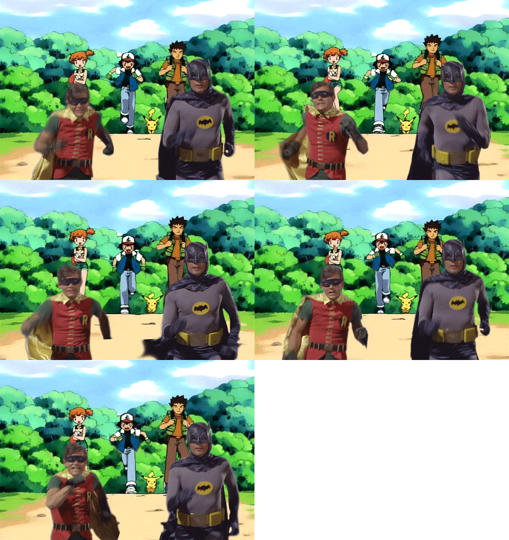
In every situation, the human brain expects an accurate representation of time. As a designer, we have to learn how to distract the user's attention with the right indicator.
Classification of time indicators
For each situation, the user expects a typical response. These are cognitive patterns that we cannot influence.
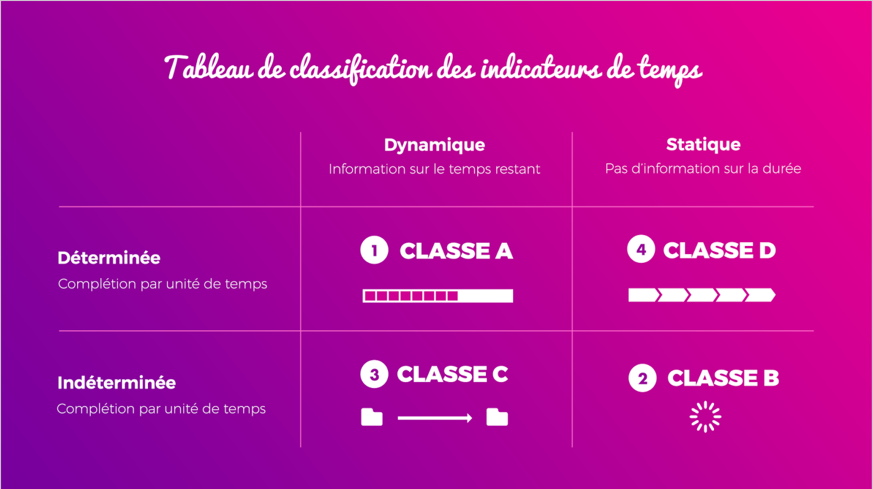
On the other hand, as a designer, we can work on the routes and the objects of representation. Steven C.Seow categorizes time indicators according to the following scheme:
Design opportunities
To conclude, with the Virtual Reality development, Artificial Intelligence and Phygital, the perception of time by users will become a central subject of the User Experience.
Take away
- Check the Flow of his routes
- Take the time for a discussion
- Waiting is also an experience
- Illustrate time
Some references
- Powers of ten, Charles and Ray Eames.
- emotional design, Don Norman
- Designing and Engineering Time in Software, Steven C. Seow
Sébastien, Learning & Development Manager@UXRepublic
STORYTELLING: THE ART OF CONVINCING # Paris
SMILE Paris
163 quay of Doctor Dervaux 92600 Asnières-sur-Seine
UX/UI ECO-DESIGN # Paris
SMILE Paris
163 quay of Doctor Dervaux 92600 Asnières-sur-Seine
DESIGN THINKING: CREATING INNOVATION # Belgium
UX-REPUBLIC Belgium
12 avenue de Broqueville - 1150 Woluwe-Saint-Pierre
MANAGING AND MEASURING UX # Paris
SMILE Paris
163 quay of Doctor Dervaux 92600 Asnières-sur-Seine
DESIGN SPRINT: INITIATION & FACILITATION # Paris
SMILE Paris
163 quay of Doctor Dervaux 92600 Asnières-sur-Seine
UX-DESIGN: THE FUNDAMENTALS # Belgium
UX-REPUBLIC Belgium
12 avenue de Broqueville - 1150 Woluwe-Saint-Pierre
GOOGLE ANALYTICS 4 #Paris
SMILE Paris
163 quay of Doctor Dervaux 92600 Asnières-sur-Seine
ACCESSIBLE UX/UI DESIGN # Belgium
UX-REPUBLIC Belgium
12 avenue de Broqueville - 1150 Woluwe-Saint-Pierre


