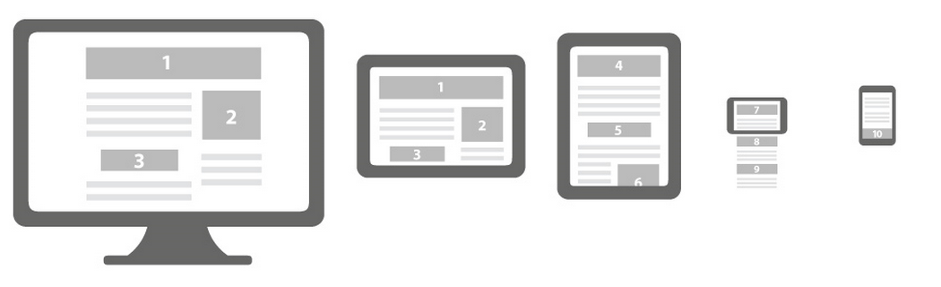
Responsive Web Design (RWD) consists, in a few words, of designing and developing a unique site that will adapt to several screen resolutions while optimizing its content. The design of this process will allow you to optimize your browsing experience, creating a responsive and flexible web page, optimized for the device that accesses it.
SEO (Search Engine Optimization), on the other hand, is a strategy for optimizing the content and structure of your website. It allows, among other things, to promote the understanding of the content of your web pages by search engines, and to achieve a high ranking in search results.
In order to improve its presence in Google search results, the essential steps will be to design quality content, manage site tags and metadata, as well as backlinks. The purpose of search engines being to provide relevant results for users, it is important to know how to optimize your website.
The Internet user spends on average 4 times less time on Internet from his mobile than on his desktop computer. The information must therefore be quickly visible, clear, and offer fluid navigation/adapted to the medium. Solutions to offer unique experiences to users on their terminals are therefore on the rise, but must be as interesting as possible to meet the needs of users, as well as SEO.
Knowing how to take advantage of the opportunity when necessary
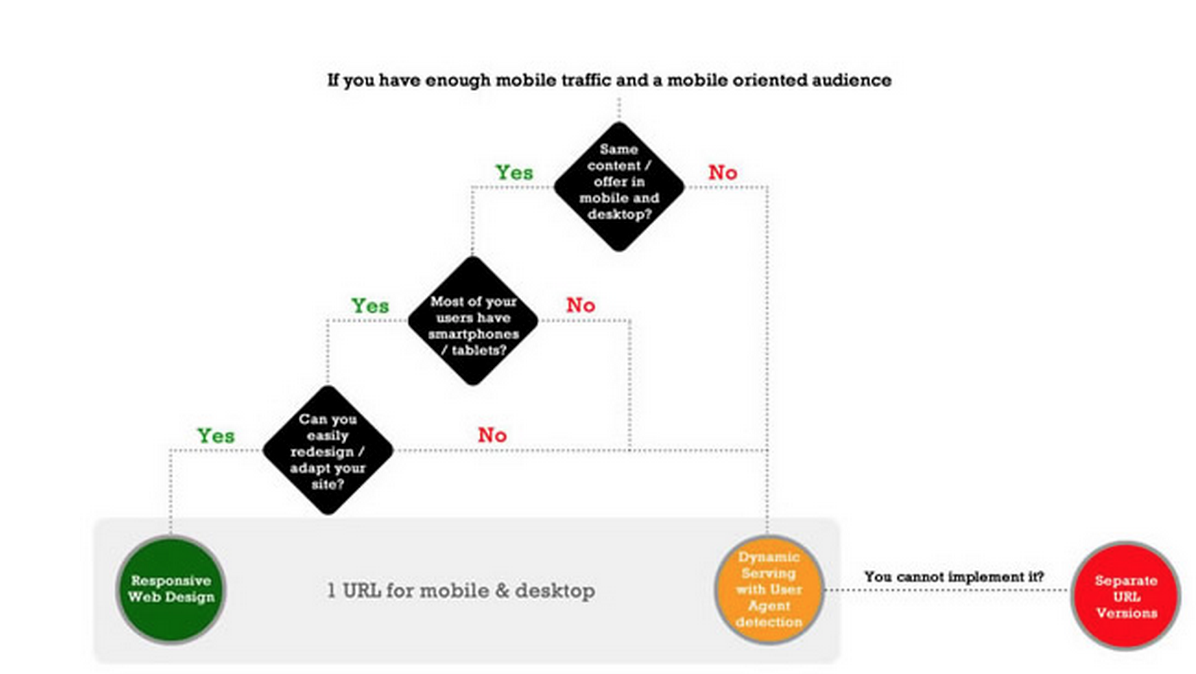
There are currently three methods to respond to this all-media adaptation trend:
- The Responsive Web Design presented previously,
- Dynamic Serving, which on the same address will look for a dedicated file depending on the terminal,
- The dedicated site, where here the goal is to develop another site, dedicated only for mobile devices.
Responsive will therefore be based on a single type of content, formatted only by the style sheet and the size of the viewport, while Dynamic Serving and the dedicated site will offer different pages depending on the terminal.
In general, Google advocates the use of Responsive, highlighting the practical side of maintenance.this and speed of access. In addition, with regard to the content of your site, the responsive tends to respond and to generalize on the request/need of users. But what about eis there visibility and access to your url on search engines?
S(e)o Responsive

Positioning yourself well in the positioning of search engines amounts to titillating it, giving it what it expects, and precisely, Google is fond of Responsive. It not only recommends it, but also promotes it in its search results for sites wishing to be optimized for smartphones (in particular via the Hummingbird algorithm, proceeding to the principle of semantic search).
Moreover, as the ResponsiveWeb Design focuses on a single URL for the mobile and desktop versions, so it will benefit from all the backlinks and internal links, and will therefore not be dispersed to another URL (dedicated to a mobile version, type m.ux- republic.com).
NOTE: In addition, dedicated mobile sites can sometimes cause problems in search indexing. The most concrete example would be that of well-known e-tailers in France, who would have seen only part of their catalog indexed on a mobile version. The user could launch a request, and end up on a site not optimized for mobile, heavier to load, thus degrading the user experience.
Finally, the responsive will help to lower the bounce rate in search engines, and guarantee Internet users to receive the information they are looking for in the most suitable form. The bounce rate is taken into account in the good positioning of your site.
A responsive site therefore brings significant advantages in terms of user experience, SEO, and development cost. However, is a responsive solution always preferable to a dedicated mobile site?
“Make it work, make it right, make it fast” (Kent Beck)
Before making a strategic decision, you must first ask yourself the most important question: What does the Internet user want to do on my site, from their mobile? It is important to focus your priorities on the interest of the user.
For example on a food ordering site, I will want to order as close to home as possible, as quickly as possible. I will in no way need to know the history of this company or its creation date before achieving my goals.
On a booking site I won't need anything other than being able to book easily and quickly on the mobile site.
A dedicated site is therefore sometimes much more relevant and much more targeted to the main needs of users than a responsive site which, even if we consider the redesigned layout for mobile, will be less efficient in terms of processing information. And Internet users will give it back to you.
Conversely, we can therefore define that, if the functional needs are the same on desktop and mobile, the choice of responsive seems appropriate and may even be inevitable today to meet the requirements of the Internet user.
But what if some content needs to be dynamically generated depending on the type of medium?
"Houston, We've had a problem" (Jack Swigert)
To answer this question, we can have several different approaches, depending on the need and usefulness of an SEO:
- Generate all content (mobile, tablet, web) upon bot detection. Of course, we cover all the possibilities, but unfortunately we offer Internet users irrelevant search results depending on the medium used.
- Generate the content of a media type by default. Mobile First drift, we could tell ourselves that the robot will only handle mobile SEO. We can get by, but we could do better for the users. It seems incompatible today not to respond exactly to what a user wants and to have a good bounce rate.
- The use of Webkit browser, such as PhantomJS. Solution advocated in most projects using new frameworks such as AngularJS or Backbone. This is one of the references currently to overcome the SEO problem, with Varnish in addition (cache server).
Only problem: In the case of a project with high traffic, already having a rendering engine (and therefore the possibility of injecting data during robot detection), which has a complex architecture, we might fear having to modify the infrastructure to add these new tools, and fear the latency time. - The HTTP Vary Header: Here is another concrete possibility, commonly used to hide the same resource several times in different forms, it could intervene in the redirection to specific content depending on the User Agent of the Robot. The problem is to know all the User Agents for the robots, to make exceptions and therefore to prepare a database, maintainable and updated for each search engine and with each new version. Warning: If you offer different content between users and robots, you risk being blacklisted.
Each of the proposals therefore presents good ideas, but also significant flaws. From these, we might ask ourselves: “What really meets my needs?”
If none of the proposed approaches suits you, you can decide to return to the first step of this article, and opt for another solution.
The choice of priority
Because yes, a responsive site is fashionable, inexpensive, and really useful. But you have to know how to use it wisely, and for the right type of project.
Your mobile optimization strategy should not be independent of your overall strategy. It must be determined how the content should be interpreted on the different terminals. If you need to offer completely different content depending on the medium, it will be preferable to opt for example for a separate mobile site which will have its own URLs, different from those of the other formats. If the content is dynamically generated, if you don't want to embed a whole server-side terminal recognition system, or User Agent recovery, maintenance, updates, and SEO is essential for you, then it would be better to opt for a dedicated site.
However, if the scope of this same project is limited to the Responsive option...
So the watchword for SEO should be: Compromise.
More info on good mobile practices?
http://www.etourisme-feng-shui.com/2014/06/17/smxparis-les-bonnes-pratiques-a-retenir-pour-sa-strategie-mobile/
Internet usage figure:
http://ookawa-corp.over-blog.com/2014/05/tous-les-chiffres-2014-sur-l-utilisation-d-internet-du-mobile-et-des-medias-sociaux-dans-le-monde.html
http://www.servicesmobiles.fr/services_mobiles/mobile_chiffres/
http://www.blogdumoderateur.com/chiffres-internet/
http://www.blogdumoderateur.com/top-20-sites-applications-mobiles/
Responsive and simple SEO:
http://admaker.fr/blog/infographie-top-5-des-raisons-dadopter-le-responsive-web-design/
http://www.searchenginejournal.com/4-seo-benefits-responsive-web-design/92807/
http://www.mostlytruestuff.com/benefits-responsive-web-design/
http://searchengineland.com/the-importance-of-responsive-web-design-for-b2b-sites-179358
http://www.intelligentpositioning.com/blog/2014/06/2-reasons-need-responsive-designed-website/
http://www.journaldunet.com/solutions/seo-referencement/responsive-design-et-seo.shtml
Dynamic Content:
http://searchengineland.com/when-responsive-web-design-is-bad-for-seo-149109
http://fr.slideshare.net/telezent/responsive-design-vs-dynamic-serving-vs-separate-mobile-website
General:
http://www.webmasterworld.com/google/4669157.htm
https://developers.google.com/webmasters/smartphone-sites/details
http://blog.hubspot.com/insiders/how-to-follow-googles-mobile-rules-for-awesome-seo
Romain Maury – UX Scientist @UX-Republic

STORYTELLING: THE ART OF CONVINCING # Paris
SMILE Paris
163 quay of Doctor Dervaux 92600 Asnières-sur-Seine


UX/UI ECO-DESIGN # Paris
SMILE Paris
163 quay of Doctor Dervaux 92600 Asnières-sur-Seine
DESIGN THINKING: CREATING INNOVATION # Belgium
UX-REPUBLIC Belgium
12 avenue de Broqueville - 1150 Woluwe-Saint-Pierre


MANAGING AND MEASURING UX # Paris
SMILE Paris
163 quay of Doctor Dervaux 92600 Asnières-sur-Seine

DESIGN SPRINT: INITIATION & FACILITATION # Paris
SMILE Paris
163 quay of Doctor Dervaux 92600 Asnières-sur-Seine
UX-DESIGN: THE FUNDAMENTALS # Belgium
UX-REPUBLIC Belgium
12 avenue de Broqueville - 1150 Woluwe-Saint-Pierre


GOOGLE ANALYTICS 4 #Paris
SMILE Paris
163 quay of Doctor Dervaux 92600 Asnières-sur-Seine

ACCESSIBLE UX/UI DESIGN # Belgium
UX-REPUBLIC Belgium
12 avenue de Broqueville - 1150 Woluwe-Saint-Pierre
