During our UX-DAY XIX, we set up a workshop with our collaborators on a UX method: The Graphic Jam.
Kesako?
This game is inspired by an eponymous activity created by Leslie Salmon-Zhu, co-founder of the international Forum of Visual Practitioners.
" Less a word is literal, the more difficult it is to VIEW "
> The goal of the game
The terms computer et neckwear offer an immediate image of the object to which they relate. On the other hand, the words strategy et Justice are more abstract and can give rise to a wide variety of visual interpretations.
The graphic jam is a visualization game with various functions, which can be used as a warm-up before moving on to other activities or as a useful game on its own. The ability to visualize abstract concepts facilitates the development of logos, the creation of presentations, the design of websites, the use of metaphors in e-learning, etc.
> Number of attendees
5 to 15 participants
> Duration of the game
30 min to 1 hour. We animated it for 12 participations in 1h15 which was quite comfortable.
> Preparation
The essential post-its, pencils and an empty wall.
> Rules
-
Reserve for this activity a large white and empty surface such as a wall. put post-its and index cards available to players.
-
Give them 1 to 2 minutes to write on the index cards the words they struggle with. conceptualize and represent: “quality” and “teamwork”, for example. They must write down one word or expression per card.
-
Then collect the cards, shuffle them, draw a card and read it to the group. Tape it to the wall.
-
Ask players to think about the displayed word and draw a representation of it visual on a post-it so that it can be hung on the wall. This step should not last more than three minutes.
-
Invite participants to approach the wall to attach their post-it notes to it, below of the abstract word to be represented.
-
Repeat steps 3-5 times until almost all of the words have been revealed. If you pull identical terms or synonyms, choose another card proposing a new word.
-
At the end of the game, the wall will be filled with visual concepts. Group members should then consider how their colleagues interpreted the different words.
-
Using the post-it notes displayed, lead a group discussion and ask for explanations on certain images as well as their relation to the illustrated word. What were the easiest words to represent and why? Finally, ask participants what the application of such skills would produce visuals in their daily and professional lives.
> Why is it important?
The business world is getting more complex and the ability to use one's visual senses to detect and point out different problems (and their solutions) becomes a skill much sought after.
Why did we do this workshop?
At UX-Republic we make commitments to our customers that are based on the values that we carry on a daily basis.
These core values are four in number:
Customer intimacy, sharing, quality and pragmatism.
The objective of this workshop was to be able to graphically and visually represent our values and what better way to do this than with its collaborators!
For this workshop we have changed a few rules. So that each person had a clear idea of the definition of values, we went around the table and noted the synonyms or other words on a board. This allowed us to better visualize the different representations for each word and to widen the field of possibilities.
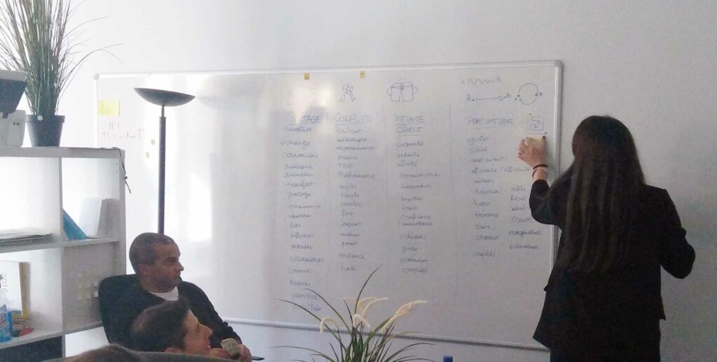
We then gave participants 4 minutes per word to produce the different visual proposals in the form of sketching. It is normally advisable not to exceed 3 minutes for this phase. At the end of the allotted time, we asked participants to come and display their post-its associated with the values.
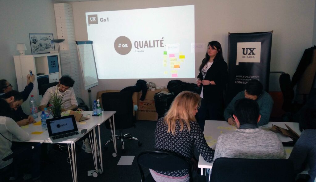
Giving users the choice to choose the best representation for them allows them to be involved and invested more. As we had a large number of participants per group, we decided to go get the post-its ourselves to avoid creating a mass movement and confusion. Once all the post-its are displayed, they must be sorted by relevance.
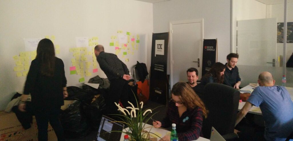
We realize that many proposals are similar, which makes it easier to group them. In each case you must have a representation that will stand out, if this is not the case we discuss it to find a solution and have only one representation in the end. It is a show of hands that will designate the winner among all the proposals.
At the end of the workshop we managed to have a representation by value!
We end this workshop with a group discussion to check that everyone agrees on the final proposition of each value.
> The big winners!
1 group

2 group

Note that we did two workshops in a row and that on the two groups of participants we found most of the time the same visuals with a few variations and two similar visuals were selected for #Quality #Sharing.

Nothing beats good teamwork! This workshop allowed us to test a methodology that we did not know at first but also to compare everyone's ideas to have only one result at the end.
Thank you to all UX-Republic participants.
Wendy Berton UX-Activist and Laetitia Sainte-Croix UX-Activist
STORYTELLING: THE ART OF CONVINCING # Paris
SMILE Paris
163 quay of Doctor Dervaux 92600 Asnières-sur-Seine
UX/UI ECO-DESIGN # Paris
SMILE Paris
163 quay of Doctor Dervaux 92600 Asnières-sur-Seine
DESIGN THINKING: CREATING INNOVATION # Belgium
UX-REPUBLIC Belgium
12 avenue de Broqueville - 1150 Woluwe-Saint-Pierre
MANAGING AND MEASURING UX # Paris
SMILE Paris
163 quay of Doctor Dervaux 92600 Asnières-sur-Seine
DESIGN SPRINT: INITIATION & FACILITATION # Paris
SMILE Paris
163 quay of Doctor Dervaux 92600 Asnières-sur-Seine
UX-DESIGN: THE FUNDAMENTALS # Belgium
UX-REPUBLIC Belgium
12 avenue de Broqueville - 1150 Woluwe-Saint-Pierre
GOOGLE ANALYTICS 4 #Paris
SMILE Paris
163 quay of Doctor Dervaux 92600 Asnières-sur-Seine
ACCESSIBLE UX/UI DESIGN # Belgium
UX-REPUBLIC Belgium
12 avenue de Broqueville - 1150 Woluwe-Saint-Pierre


