The recommendations on UX-Wording are mainly inspired by the UX reference book 100 Things every designer needs to know about people, written by Susan M. Weinschenk doctor in behavioral psychology.
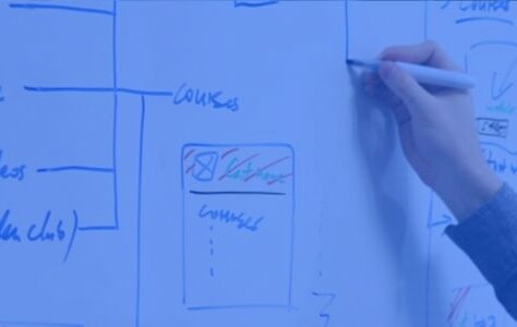
Organization of user interface content and labels

Did you know that we read on average 25% slower on a screen?
To improve the user experience, it is essential to know the basics of web editorial and to ask the right questions.
- How to write a UX wording who encourages our user to browse and use our main features?
- Is it possible to hold a user's attention for more than 2-3 minutes?
- To what extent can we play with text styles so as not to interfere with reading?
- How to establish a natural dialogue between the interface and the user?
Here are some tips to improve the understanding of content and the wording of the user interface.
What is UX-Wording used for?
It makes content more accessible. The user thus understands the message of the site more easily. Moreover, a good wording on an action button also significantly improves the conversion and monetization of a site. Finally, relevant and clear information improves the natural referencing of a website on search engines.
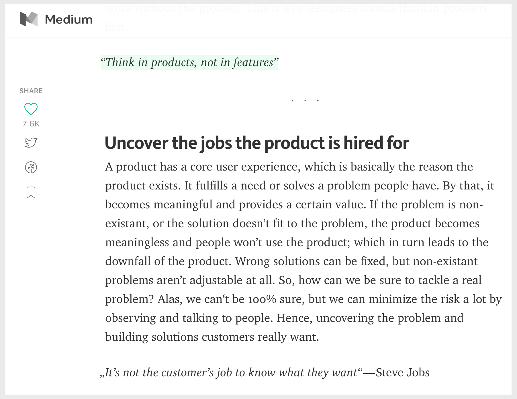
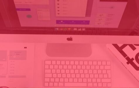
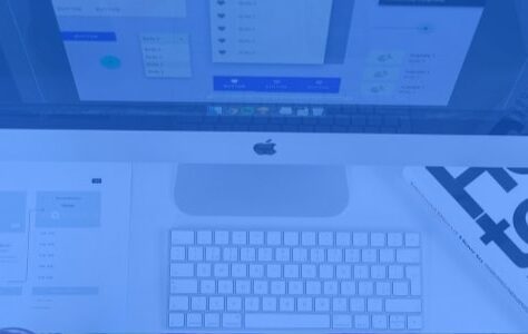
Example of a good UX-Wording: splitting paragraphs and highlighting quotes on medium.com
A reader likes to know they have a choice, even if they won't read the whole UX-Wording. Information is addictive.
Exploratory behavior releases dopamine.
Simplify and cut the UX-Wording for a better understanding of the message
For the user to find information quickly, it is better to split the text into several points, in short paragraphs and add illustrations. The objective is to facilitate fluidity in reading, understanding and memorizing the message. A page usually consists of 3 to 5 paragraphs with one idea per paragraph. The hook of the paragraph makes it possible to synthesize the idea of the paragraph.
On the other hand, an average article is between 500 and 1 words. A sentence between 500 and 15 words. The syntax is simple, direct and concise: subject, verb, complement.
It may be interesting to set a maximum number of characters per line. While the maximum reading speed is 100 characters per line, studies show that people are used to and prefer to read between 45 and 72 characters per line.
Hold the user's attention and display a strong message

The attention of an online user lasts a maximum of 7 to 10 minutes
To improve the visibility, attractiveness and image of the company, it is better to convince in complete transparency, without emphasis, in a word, with sincerity and truth. For this, the ideal is to use a clear and concise editorial style. The purpose of the site is objective and does not include hyperbole of the type (“read the excellent article”, “this sublime piece”). Indeed, to improve understanding of the message, it is better to avoid rhetorical effects, puns, exclamatory punctuation and promotional emphasis.
We all have different sensitivities to the same message. Depending on our experience and our opinions, we understand and retain information differently. To help the reader memorize specific information, you can tell him a story.
“The stories are entertaining. They facilitate understanding, interest and memorization of a statement.” Susan M. Weinschenk
Concrete examples or anecdotes also make it easier to retain a message. Moreover, studies show that anecdotes are more convincing than data. Indeed, empathy triggers an emotion and thus remains more easily in memory.
Prioritize readability over aesthetics to improve UX-Wording
A few simple rules can improve the visibility of his speech and the clarity of his positioning:
- In a text, do not hesitate to highlight important key expressions using bold.
- Classic hyperlinks always work with the underlined and/or blue aspect
- Italics are reserved for book titles or words of foreign origin.
- Even if we generally prefer sans serif typefaces on screen, it seems that readability is equal with or without serif.
Capital letters should be used sparingly. They are more difficult to read than lowercase letters.
Moreover, more than one typography is decorative and the more UX-Wording seems difficult to interpret by the reader. Finally, the font size is very important. To improve reading comfort for all ages, it is best toenlarge font.
Improve interface messages for conversion and online help
Internet users like to be reassured before carrying out an act of purchase or an act that invites them to share their personal data. Action button messages, form field labels or even error messages improve the company's image of quality and trust.
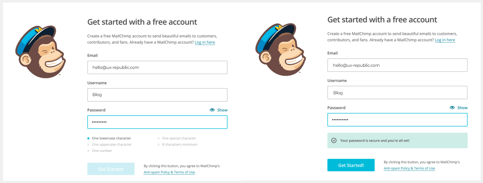
First, a user likes to be talked to. Eric Sharp observed thatan Internet user would much rather click on a button where he says “my” rather than “your” (+ 90% clicks). Triggering a conversation and translating technical business vocabulary into “general public” vocabulary improves understanding of the service and encourages the user to take action.
On the other hand, a main action button must correspond to the action that the user will trigger by clicking on it. Do not hesitate to do A/B Testing to check that the message is clear. The veeam.com site has slightly modified the title of a button. “Request a quote” became “Request pricing”. Thanks to this minimal change, he noticed a 161,66% increase in trafficStrolling along the wording on the action buttons improve the understanding of navigation for and thus boost the monetization of the site.
Contextual help is also an excellent way to reassure the user. Be proactive and anticipate offline messages, loading messages and error messages. Rather than saying “The questionnaire contains errors”, rephrase to “It seems that your credit card number is not complete (16 digits)”. Susan Weinschenk explains that a good error message should:
- Show the person what they have done
- Show problem
- Explain how to solve the problem
- Be written in active and not passive form as in a conversation
- Give an example to help understanding.
TAKE AWAY
To conclude, to make your UX Wording more accessible and friendly, be explicit in your titles, simplify as much as possible, avoid jargon and anticipate interface messages. Do not hesitate to test, in the form of A/B Testing and qualitative user tests to verify that your message is clear.
Books and articles to perfect your UX wording
- 100 things every designer needs to know about people, Susan Weinschenk
- Microcopy: Tiny words with a huge UX impact, Nick Babich
- UX versus accessibility, Stephane Chilton
- 9 states to anticipate for optimized navigation, Marina Wiesel


UX/UI ECO-DESIGN # Paris
SMILE Paris
163 quay of Doctor Dervaux 92600 Asnières-sur-Seine
DESIGN THINKING: CREATING INNOVATION # Belgium
UX-REPUBLIC Belgium
12 avenue de Broqueville - 1150 Woluwe-Saint-Pierre

MANAGING AND MEASURING UX # Paris
SMILE Paris
163 quay of Doctor Dervaux 92600 Asnières-sur-Seine
DESIGN SPRINT: INITIATION & FACILITATION # Paris
SMILE Paris
163 quay of Doctor Dervaux 92600 Asnières-sur-Seine
UX-DESIGN: THE FUNDAMENTALS # Belgium
UX-REPUBLIC Belgium
12 avenue de Broqueville - 1150 Woluwe-Saint-Pierre
GOOGLE ANALYTICS 4 #Paris
SMILE Paris
163 quay of Doctor Dervaux 92600 Asnières-sur-Seine

ACCESSIBLE UX/UI DESIGN # Belgium
UX-REPUBLIC Belgium
12 avenue de Broqueville - 1150 Woluwe-Saint-Pierre
EXPERIENCE MAPPING # Paris
SMILE Paris
163 quay of Doctor Dervaux 92600 Asnières-sur-Seine
