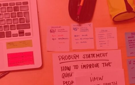
Take the time to ask a few questions about accessibility around you and you will quickly find that people mainly associate disability with people with reduced mobility. If you ask the same question to your client, he will tell you that this will generate additional development costs for a very low ROI. Finally, as for Designers (UI & UX) and Developers, we still pay too little attention to these issues.
RECEIVED IDEAS ABOUT DISABILITY IN FRANCE
Out of 65 million inhabitants in France, 20% are disabled within the meaning of the law.
13 million French people with disabilities in 2016
A priori, you should already tell yourself that 13 million is a lot! And therefore, not designing a site or an application for this population seems irrelevant.
This figure doubles if we count temporary disabilities, i.e. 26 million French people!
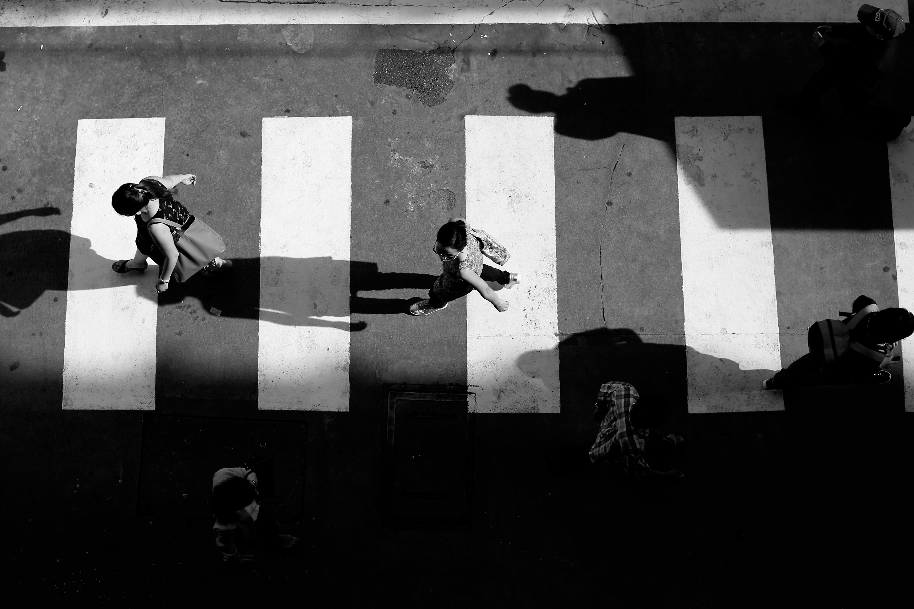
Now you are beginning to see that we are not talking about a handful of individuals. But you say to yourself that 20 or 40% is significant and that it's quite strange not to have realized it before. Imagine that this is normal since 80% of disabilities are said to be invisible.
SPECIALIZED APPLICATIONS
There are more and more applications that come to help specific populations. They have the particularity of addressing specific disabilities.
Example 1
Aipoly vision makes it possible to recognize colors or objects for the visually impaired thanks to Augmented Reality already offers perspectives. Thus the Aipoly Vision application makes it possible to give colors or objects to visually impaired people.

Example 2
Street Co allows people with reduced mobility to move around the city taking into account all obstacles. Application therefore very useful in our urban environments.

ACCESSIBILITY IS NATIVE
Apple offers tweaks to make accessibility easier. Thus, each new version of their OS sees its share of new features.
You can access it from Settings -> General -> Accessibility.
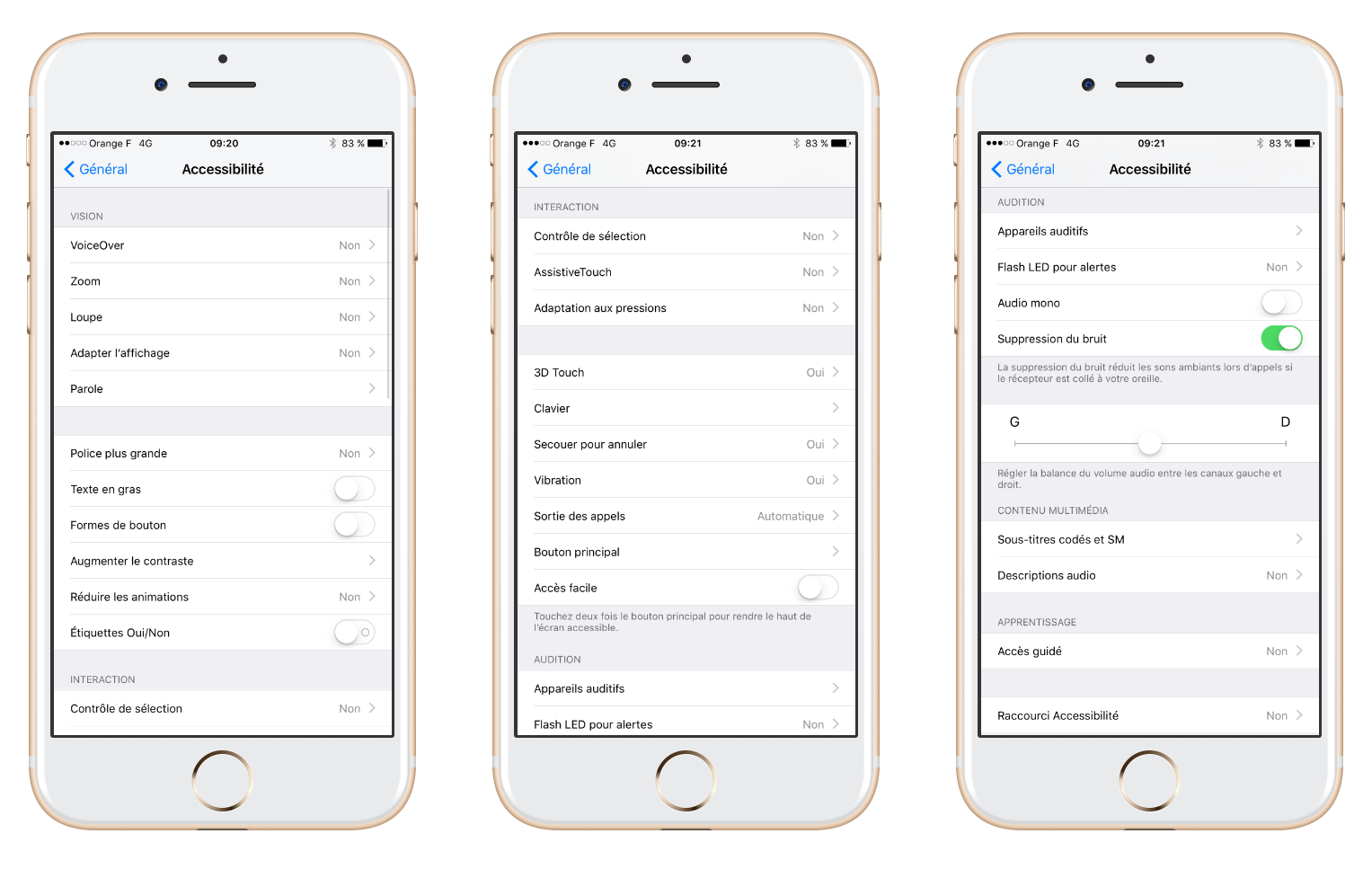
As you can see, there are many features. What's quite funny is that some of them are mainly used by able-bodied people.
The example of the flash
It is possible to make it flash when receiving a message, a call, an alert... If the basic objective was to signal something to a hard of hearing or deaf person, today many people without hearing problems also activate this feature.
VoiceOver: THE feature
This is THE flagship feature on which Apple has invested heavily.
It lets your iPhone read aloud what's on your screen. In theory you should be able to browse and consume apps with your eyes closed. In reality, good luck because few applications are VoiceOver friendly.
Font: change in size
The UX-Designer produces wireframes, the UI-Designer makes mock-ups and the team codes the application… So far so good. Except Robert, 74, who can't see very well, has set the font to its largest size. Your beautiful home page, which was one screen, becomes scrollable and all the elements are unstructured.
Too bad, nobody wanted to think upstream that the user has this power, natively, to play on the size and the weight of the font.
What was aesthetic becomes indigestible.
EXAMPLES OF ACCESSIBILITY
Visuals and criticism, here are some examples of applications to follow or not...
WE ARE NOT ALL EQUAL BEFORE COLORS
If the FNAC application is a reference in e-commerce, the rating page is obviously not designed for people with visual impairments.
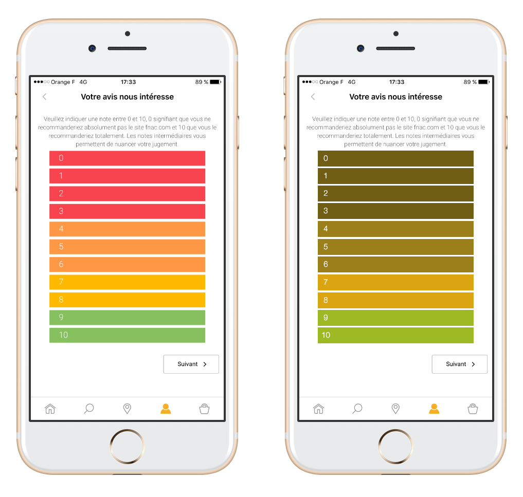 On the left the FNAC application, and on the right the FNAC application seen by a person with, for example, color blindness. Difficult to associate a color with a note. Fortunately, there are the associated numbers, even if they are particularly small.
TO BE VISUAL OR NOT TO BE
Because a successful data visualization is often worth dozens of words, do not hesitate to illustrate rather than explain.
Banking is a very good example. For a few years, graphs of all kinds have been illustrating all types of expenses in applications.
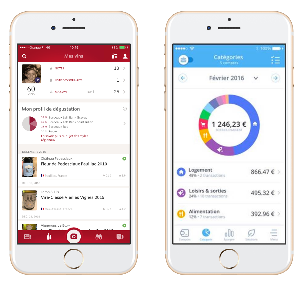
On the left, the Vivino application which illustrates the distribution of the cellar of the profile in the form of a pie chart. This allows me to see at a glance that three categories of red wine represent almost half of my cellar.
On the right, an example of a banking application with Bankin which also allows you to see very quickly the main items of expenditure for the period.
ASSOCIATE ACTIONS AND CONTEXT
The concept is that the action that the user is asked to be associated as much as possible in terms of cognitive logic with the element in question (don't worry, the example is clearer than the previous sentence). To illustrate this I will take a web page from the ux-republic.com site displayed on mobile (our site is the visual in the middle).
Here are three visuals where only the “research” part located in the middle differs.
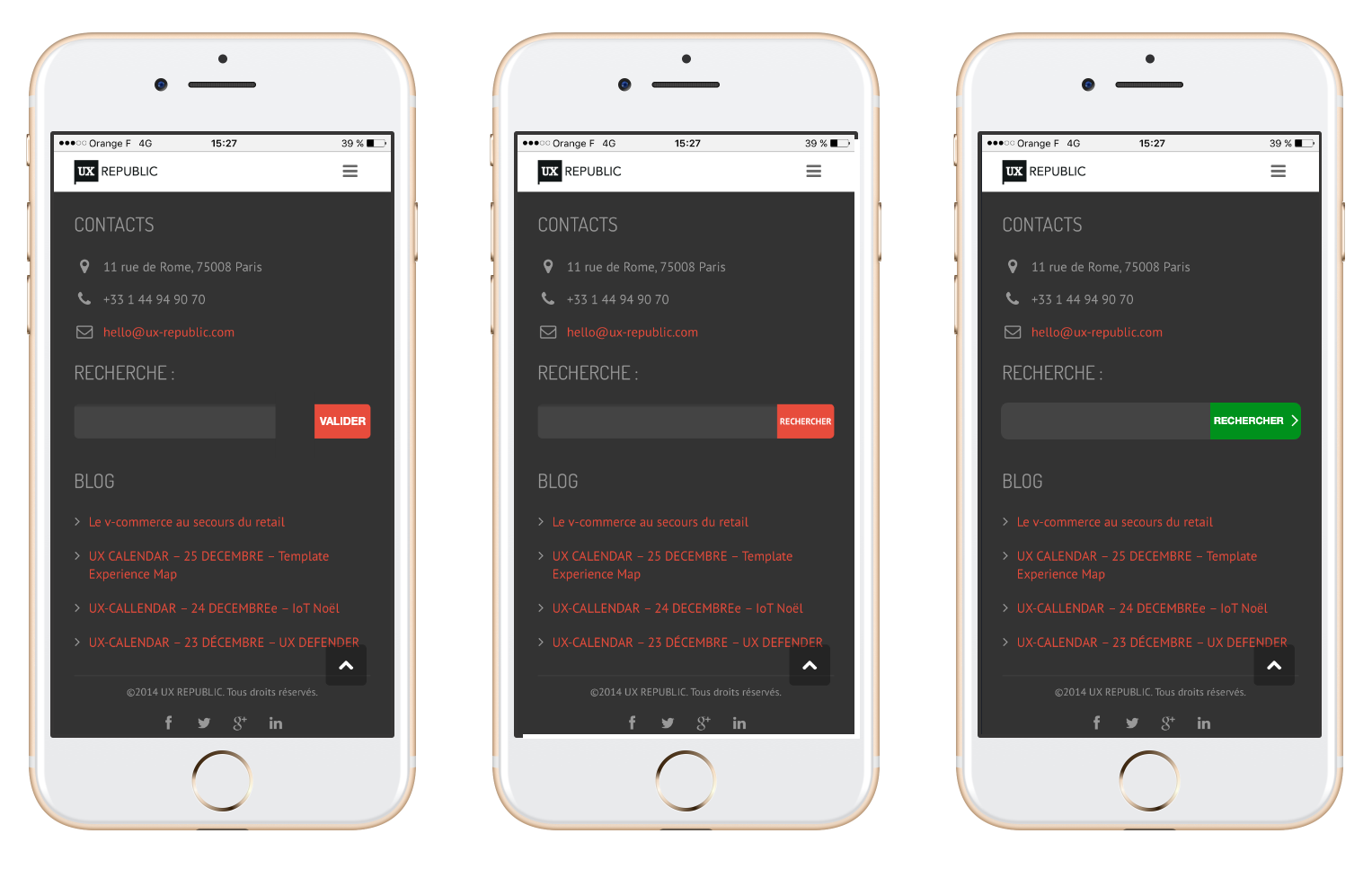 The first visual shows a search field with a button that is not clearly linked, whose wording is not associated with the action and whose color is confusing.
The second visual is already more “accessible” since the button is more clearly linked and the wording perfectly describes the action.
The third visual favors a color linked to the validation of an element and the launch of a search, which is confirmed by the chevron.
CONTRAST AND SPACE
Whether they are people with visual or motor impairments, if information, buttons, actions are too close and / or too fine, it becomes blocking. Here is an example of the application adopting a guy on the left visual. This page is animated and the rendering is really good and qualitative.
On the other hand, in terms of accessibility it is much worse. The chevrons are before the text, the buttons small and sticky, and the animation with the stars moving and twinkling add difficulty to reading.
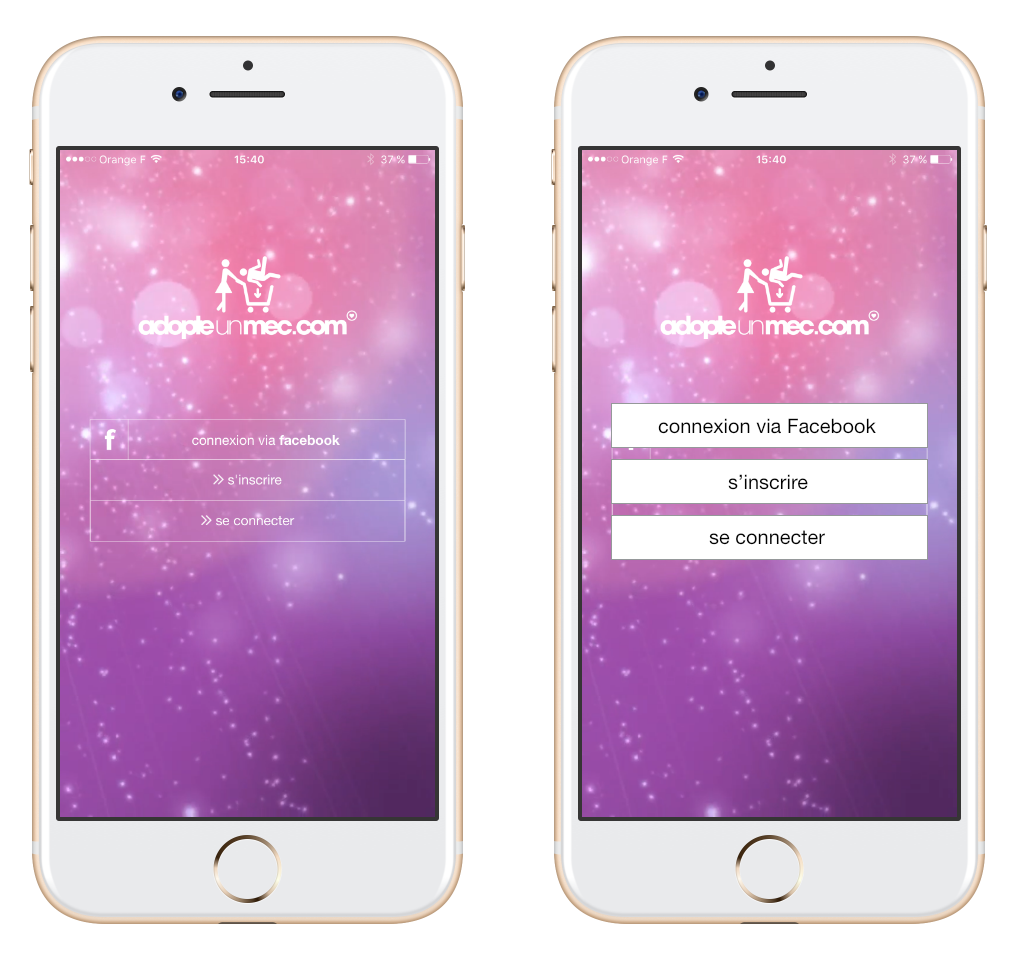 A very ugly but more accessible solution would have been to separate the buttons and remove or at least greatly reduce their transparency.
Again, the page of this application is really beautiful, but you have to know how to place the cursor between aesthetics and accessibility, depending on the target you are looking for. Without forgetting that accessible does not mean unattractive.
SHOW PASSWORDS
Here we enter into serious fault. This is the level of password security that an application or site requires. It is more and more complex to create passwords with a capital letter, numbers but different, a symbol... and it is even more complicated to know if the password corresponds to the criteria. Here is an example from Linkedin:
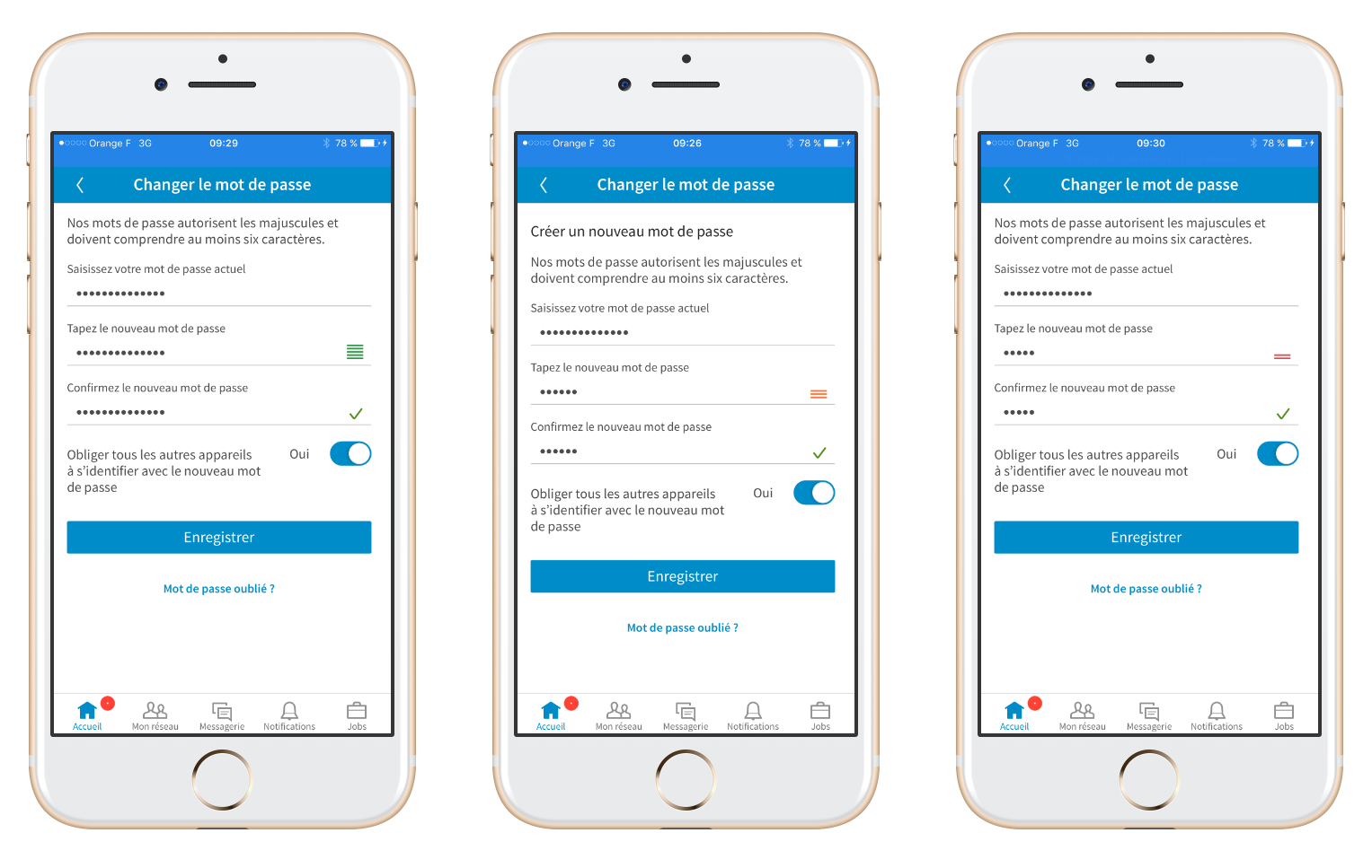
It is especially difficult to understand that the level is indicated by size and color this kind of little burger menu they put on the password line. As a reminder, we don't all see the same colors (if you forgot, go back to part A of this article). It would have been easier to put a gauge or something more visual that doesn't require color.
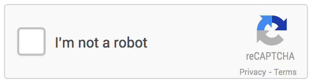
FORGET CAPTCHAS
There we enter into gross negligence (it is still above serious negligence legally). It is increasingly necessary to prove that one is not a robot when one registers. And no one thinks about accessibility at this stage. This is how to “prevent” thousands or even millions of people from registering. Because of a simple captcha like the ones below:
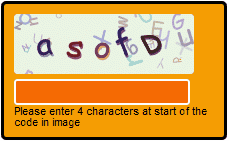
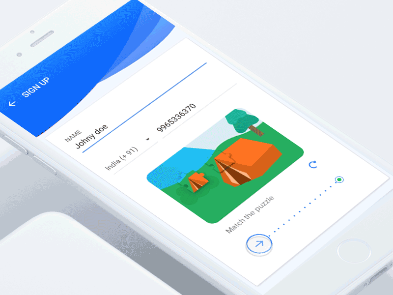
We regret the simple captchas like the one below which was much more accessible:
TAKE AWAY
If you had to remember only one thing, it's to be flexible. Accessibility is not an exact science defined by precise rules. It's before all a sensitivity that must be had when designing and creating an interface. You have to be flexible and offer different means.
Do not impose a single way of doing things. If what is developed is not accessible, it may suffice to simply offer an alternative.
This is the case, for example, of Amazon. The order via swipe is not considered accessible, but the person with a disability can add to the basket and finalize their order elsewhere. Two different means, two uses and two satisfied populations.
UX/UI ECO-DESIGN # Paris
SMILE Paris
163 quay of Doctor Dervaux 92600 Asnières-sur-Seine
DESIGN THINKING: CREATING INNOVATION # Belgium
UX-REPUBLIC Belgium
12 avenue de Broqueville - 1150 Woluwe-Saint-Pierre
MANAGING AND MEASURING UX # Paris
SMILE Paris
163 quay of Doctor Dervaux 92600 Asnières-sur-Seine
DESIGN SPRINT: INITIATION & FACILITATION # Paris
SMILE Paris
163 quay of Doctor Dervaux 92600 Asnières-sur-Seine
UX-DESIGN: THE FUNDAMENTALS # Belgium
UX-REPUBLIC Belgium
12 avenue de Broqueville - 1150 Woluwe-Saint-Pierre
GOOGLE ANALYTICS 4 #Paris
SMILE Paris
163 quay of Doctor Dervaux 92600 Asnières-sur-Seine
ACCESSIBLE UX/UI DESIGN # Belgium
UX-REPUBLIC Belgium
12 avenue de Broqueville - 1150 Woluwe-Saint-Pierre
EXPERIENCE MAPPING # Paris
SMILE Paris
163 quay of Doctor Dervaux 92600 Asnières-sur-Seine
