About RALUCA BUDIU
Translation of the Nielsen Norman Group article (see the original article)
"Abstract: Smartphones have intrinsic constraints such as the small screen, short sessions, having only one window open at a time or even a variable connection. But these constraints can also turn out to be unique opportunities. Mobile design principles highlight these limitations and strengths."
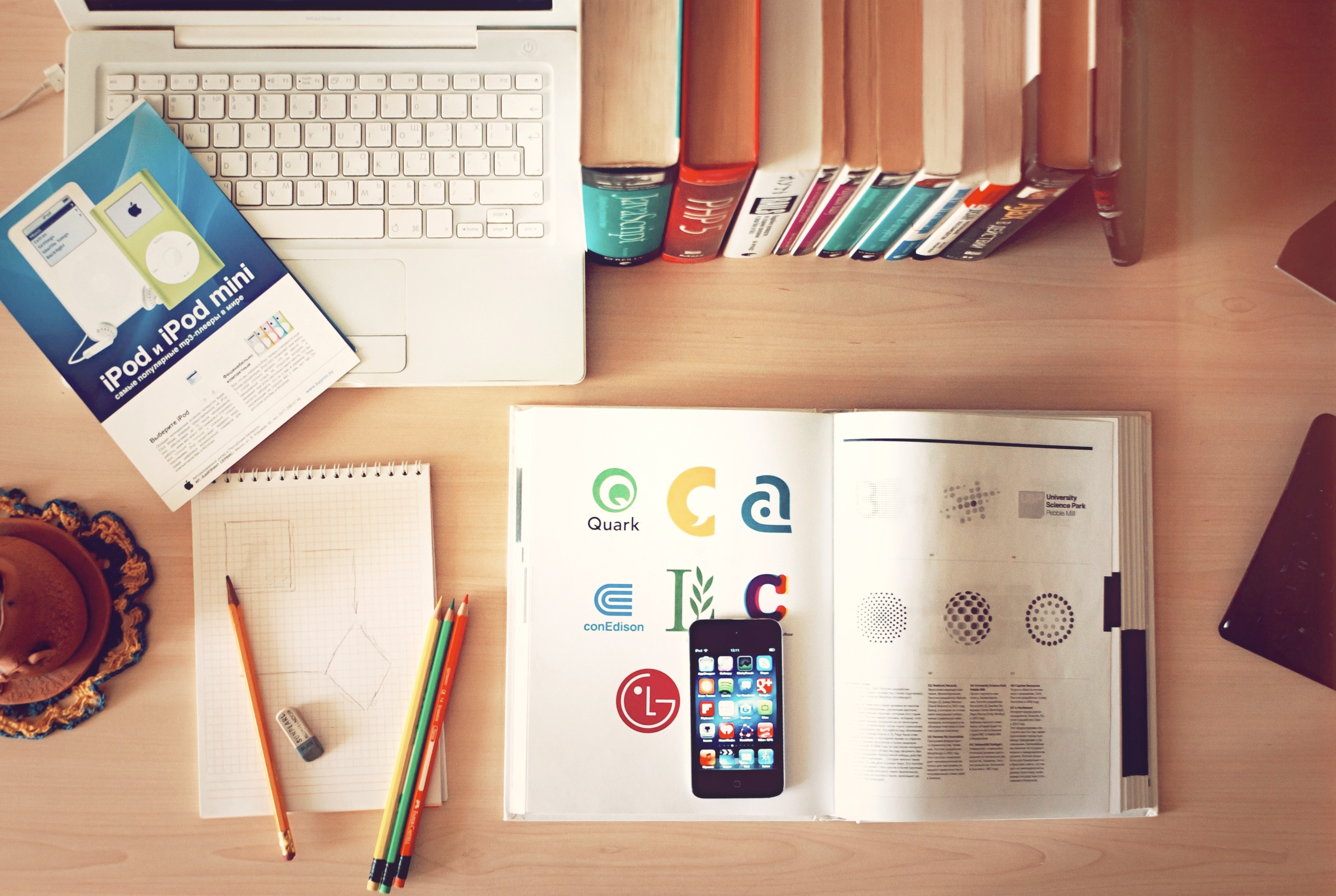
Mobile devices have transformed the way we live and perform our daily activities. Today, we can not only view almost all content on mobile, but deposit checks, manage credit cards, order food and pay online, electronically sign documents and even lock our front door. through our phone. Some of these actions have even become simpler with the existence of this new technology that is the smartphone.
Mobile Research Project
For 7 years, we have been carrying out, in the background, a self-funded project around mobile usability which has led us to carry out several series of user tests on a wide range of mobile sites or applications. Overall, 151 participants took part in the project, the majority from the USA but we also set up sessions in Australia, Hong Kong, the Netherlands, Romania and the United Kingdom. In all cases, the participants brought their own mobile phone to our labs.
While our first sessions included all types of phones (from touchscreen phones to non-touchscreen smartphones to “feature phones“), the latest tests conducted focus exclusively on touch screen phones, to stick to the reality of current market penetration. In addition, our last study was carried out on “phablets” only (touchscreen smartphone whose screen diagonal exceeds 5,3 inches). Where possible, we asked participants to show us the apps they had installed on their smartphone and then we gave them a list of tasks to complete asking them to use either their apps or the corresponding website.
Besides user testing, we also used other research methods like “diary studies” and expert reviews. We have also tested a wide variety of mobile websites and applications in client projects, for which we cannot publish the results. We nevertheless rely on these confidential results to feed and support our regular publications.
This research on mobile which we have just spoken about differs on the other hand from our research on the User Experience on tablet. Although there are similarities (they are both pocket touch screens), tablets and phones are used differently and have slightly different constraints in terms of interaction design, which implies specific guidelines when designing for one or other of these devices.
Mobile Strengths and Limitations
Mobile phones represent real assets but also have limitations. Knowledge of these two components plays an important role in achieving a good user experience on mobile.
The small screen
Despite the modern trend of ever larger screens, what makes mobile phones so practical and “portable” is their small size. Compared to desktop computers or even laptops, phone screens can accommodate much less content. The screen of a mobile phone therefore represents a serious limitation in this sense. The content displayed above the fold line of a 30 inch screen is 5 times the total content of a 4 inch mobile phone screen.
Thus, a mobile user must:
- face an interaction cost (i.e. the sum of the efforts, physical and intellectual, that a user must deploy in his interaction with a site to achieve his objectives) much more important on mobile to access the same volume of information;
- rely on short-term memory to remember information not visible on the screen it is on.
Each time one adds a new design element or content in a mobile screen, another is automatically popped out (or goes under the fold line of it). This implies that we must really ask ourselves the question of the opportunity cost of each new element: What does it mean for the user to take out element A to incorporate element B? Is item A more important than item B? Prioritization of content and features is key. Although we provide guidelines in this report, the answer you are looking for still depends on the type of user in front of you as well as the tasks you have to make them do.
The term "chromium" designates the elements of an interface which contribute to the use of this one, which are the instruments for using an interface or an application. Users come to a site to find the information they need or to accomplish a task, not to contemplate the beauty of the buttons, navigation, menu or any other design element. Content is always the focus (whether desktop or mobile), while there is always room for content items et chrome elements on a computer screen, the designer often needs to reduce the prominence of chrome elements to give more room to essential content elements on mobile.
That's not to say chrome elements should go away on mobile. In fact, it is even very difficult to design a “usable” interface without chrome elements. On the other hand, designers must accept a high chrome/content ratio on the mobile screen.
Portable = Interruptible (capable of being interrupted)
Mobile phones are portable: most fit in a pocket or purse and tend to follow us everywhere. Because we use our phones in a wide variety of contexts or situations, we are more likely to be interrupted in their use: an external event in our environment may require our immediate attention and require us to stop what we are doing on the small screen.
It follows that theattention on mobile is very often fragmented and sessions on these devices are often very short. In fact, the average session time on mobile is around 72 seconds. In comparison, our study shows that on a computer, the average session is 150 seconds, more than double.
Short sessions mean that we have to design with interruptions in mind : Save user progress and allow them to pick up where they left off.
Designers should save context and allow the user to find it easily in order to continue where it left off. Mobile applications or sites should continually save progress of the user and be prepared for such interruptions. They should also try to make the return to the application as seamless and smooth as possible so that the user doesn't have to redo an action they had already done before the interruption.
In addition, mobile users do not always make their final decisions on the phone but may want to return to certain content in the context of higher bandwidth or larger screen. It is therefore necessary to allow users to save their history as well as to share this information with themselves or with others. They also need leave the possibility to access their data on another medium and to find all the actions they have already carried out on their mobile.
Butdesigner for interruption” does not just mean “save progress”. It also involves prioritize the essentials and simplify tasks and interactions. The fact that attention is fragmented forces us to do our best to show the user what he needs as quickly as possible. Drowning him in details or asking him to analyze kilometers of text before finding relevant information is not compatible with the notion of interruption. The essential point must always appear before the minor detail. A simple task is more easily accomplished quickly. It is also easier to resume than another that would have several stages or different alternatives..
single window
Although some manufacturers are trying to offer multi-windows, the limited size of a mobile screen makes this objective almost impossible, even with today's largest screens. The vast majority of users only see one window at a time (and therefore only one application or one website), and cannot split their screen (like on their computer) and work on two applications simultaneously.
The single window constraint implies that the design should be self-sufficient : any mobile task should be easily accomplished within a single app or site. Users should not have to leave the application (or the site) to find information that the application needs but does not provide. Remember that pen and paper, even if available, are difficult to use on the move. If users have to move information from one application to another, it is as if they had to copy and paste it (or worse, to use their memory and therefore increase their cognitive load, that is say the volume of mental resources needed to perform a task); the interaction then becomes more complex and errors more likely to occur. Applications and sites must therefore be self-sufficient and must not require external accessories, whether physical or virtual..
Touch screen
Touch screens are, by nature, as interesting as they are compelling. Gestures represent an alternative user interface and hidden which, when constructed according to good affordances (ability of an object to suggest its own use, therefore without instructions), can provide fluidity of interaction and efficiency that guarantee and sublimate the properties of the screen. But it also suffers from a lack of memory or discovery capacity. On the other hand, it's hard to type effectively on a tiny virtual keyboard without accidentally hitting the wrong key.
Perhaps the most important problem with touch is typing, the act of “typing”. On a virtual keyboard, the user's attention is continuously divided between the content he is typing and the area where he is actually typing. Touch typing is impossible without haptic feedback, especially since the keyboard areas are small and the keys are plentiful.
Another notable difference between touch and other types of input devices, such as a mouse, is that the size required for a target area to guarantee its correct use and reduce the number of errors is considerably greater for a virtual key than for a mouse. The mobile screen is therefore not only much smaller than that of a laptop (or desktop) but the buttons or “target areas” must also be much larger than those on a normal monitor.
As there can be many target areas on a touch screen, accidental errors of “touching” the wrong place are big. Some can even confuse the user completely and leave them unaware of what happened. The “undo” is one of the top 10 usability heuristics and it is especially true on touch screens.
The variable connection
Even in the era of ultra-fast cellular networks and ubiquitous wifi, network coverage is not universal or equal across the entire territory. Phone users frequently complain about network or connection issues. Each new page load can then turn into significant waiting time when the network does not want to cooperate.
If you want your users to finish their task on your app or mobile site, pay attention to the loading time. Think lightweight pages, still containing as much information as possible, to avoid going back and forth between client and server. Minimize the number of steps and finally, the number of page loads.
GPS, camera, accelerometer, voice and other phone features
Phones can have a number of limitations but also have many unique features – some only available through apps, others also available on mobile sites. Camera, microphone and GPS are conveniently built into the device and can facilitate entry points to the phone, or circumvent some typing issues. Photographs can convey nuanced information that's hard to convey through text (think of how you might describe a product you're looking at). Notifications allow users to be immediately informed of events that interest them. Touch ID allows the user to log in with their fingerprint without using a password. Apple Pay and Google wallet offer the possibility of using your phone to pay in the physical world or online, without taking out your credit card.
If the phone has a camera, do not ask the user to type in a barcode or part number. If the phone offers GPS, the user should not have to enter a postal code. Use native phone features as much as possible to minimize user work.
New research report
Our many research results on mobile usability are brought together in a new report: User Experience on Mobile (available here: Mobile user experience). This third edition is completely new and therefore revised. Several guidelines refer to current mobile models and interactions; the old guidelines that we have chosen to keep have been enriched and illustrated with new examples.
Quentin BOUISSOU – UX-Evangelist @UX-Republic

UX/UI ECO-DESIGN # Paris
SMILE Paris
163 quay of Doctor Dervaux 92600 Asnières-sur-Seine
DESIGN THINKING: CREATING INNOVATION # Belgium
UX-REPUBLIC Belgium
12 avenue de Broqueville - 1150 Woluwe-Saint-Pierre
MANAGING AND MEASURING UX # Paris
SMILE Paris
163 quay of Doctor Dervaux 92600 Asnières-sur-Seine
DESIGN SPRINT: INITIATION & FACILITATION # Paris
SMILE Paris
163 quay of Doctor Dervaux 92600 Asnières-sur-Seine
UX-DESIGN: THE FUNDAMENTALS # Belgium
UX-REPUBLIC Belgium
12 avenue de Broqueville - 1150 Woluwe-Saint-Pierre
GOOGLE ANALYTICS 4 #Paris
SMILE Paris
163 quay of Doctor Dervaux 92600 Asnières-sur-Seine
ACCESSIBLE UX/UI DESIGN # Belgium
UX-REPUBLIC Belgium
12 avenue de Broqueville - 1150 Woluwe-Saint-Pierre
EXPERIENCE MAPPING # Paris
SMILE Paris
163 quay of Doctor Dervaux 92600 Asnières-sur-Seine
