To be effective, a data visualization must inform visually, simply and quickly. Rendering data in graphical form aims to offer a simplified reading that will allow better understanding and decision-making serenely, faster and more simply.

Available technologies
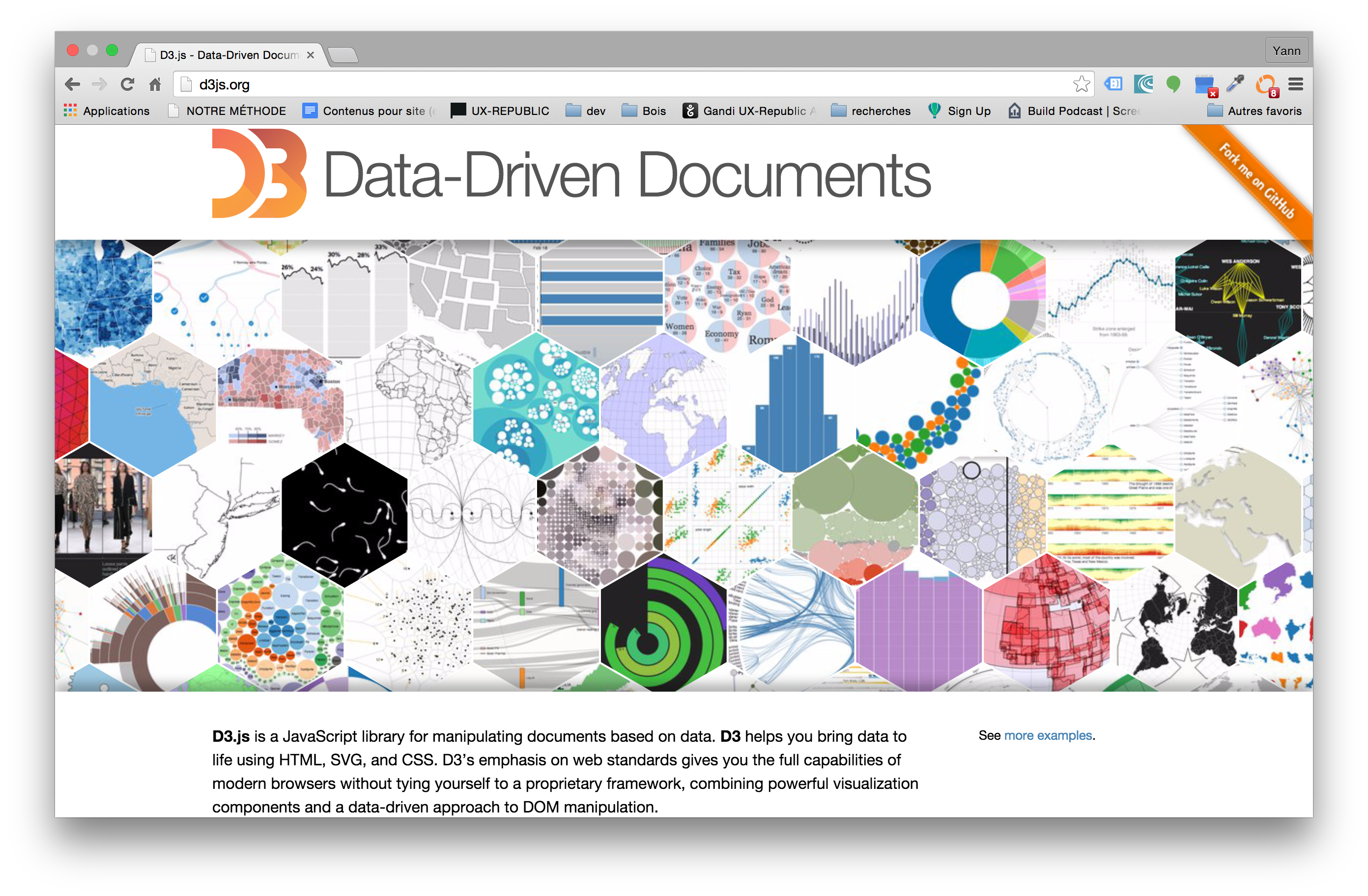
Data visualization is a discipline particularly suited to web technologies and HTML5 subsets. Today, there are two main families among the technologies most often used: graphic representations based on SVG technology and those using CANVAS technology. If both present interactive possibilities, these two approaches are based on different philosophies that should be studied upstream.
![]()

![]()
The right choice strongly depends on your need itself, the desired coverage, the park and the public concerned. SVG frameworks offer you so-called vector renderings, that is to say that they are built from graphic elements drawn between identified points. The .svg type image file is actually a file containing code describing the junction points and the way they will be joined together to draw an identical image in proportion whatever its size. Frameworks based on CANVAS technology manipulate pixels.
The construction of an effective and adapted dashboard
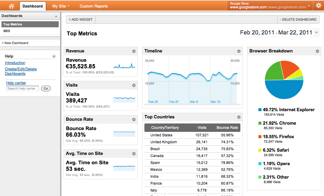
Building a good dashboard requires significant thought before development. Who is the data intended for? What are the motivations for making this information available? What are the messages to convey? What is important? The data itself? Its volume? His evolution ? Its value today or its average over a given period? Does its representation need to be to scale? Sometimes, distorting the space and its proportions will draw the visitor's attention to the part of the graphic to highlight.
The importance of color choice
The meaning to be given to the data displayed is based on the volume it represents but also on the color used to convey the message. For example, on a pie chart representing the sales volume of several products, it is obvious that the largest share will undoubtedly be the best performer and will probably be illustrated in a positive color such as green. We can also use metaphorical images to further increase the clarity, for example the bars of a graph by small cars to stay in the previous example. The bigger the sales, the more small cars there are.
On the other hand, if a pie chart represents the number of absences of employees of a company, the most important part will also be the most worrying and in fact, will motivate the use of a color carrying this connotation such as red or orange for example.
Either way, an effective dashboard is a clear dashboard. The data illustrated in the graphical representations must be clearly captioned and each representation must include a title allowing the user to understand what he is looking at. The representation must be the element put forward. If too much text illustrates the why of the graph, the user will tend to pay attention to the explanations much more than to the message conveyed by the data and their representation. Similarly, the use of pictograms can provide an additional layer of information by allowing users to quickly understand the material exposed.
The dashboard target
The data to be displayed is therefore directly related to the message to be transmitted, which is also directly related to the target audience. We generally do not try to say the same thing in the same way when we address the general management of a company, its shareholders or its employees.
Interactivity
Another very important advantage of graphical representations versus data tables is most certainly the possibility of simply adding interactivity. Being able to make a datum disappear and restart the calculation of the proportion of each of the remaining ones can allow a detailed comparison and a simple analysis. Furthermore, one can even consider allowing the user to specify the type of graphical representations they wish to use for such or such type of data. In other words, offering the user to slightly modify his dashboard in order to adapt it perfectly to his use is also a rich feature!
Moreover, several graphic representations can work together and inter-operate, ie a change of state and proportion of a first representation will modify a second which will be automatically updated. By this method, we will understand the impact of one piece of data on another which is not or does not seem to be necessarily linked to the first.
Represent a mastered set of data. The more data there are, the less well they are understood.
Even if a graph may display a large number of items, it is preferable to divide the whole into several screens, or rather several reports. For example, if we represent the sales of cars in the world, the majority of users will be interested in the charts of the top 5 or 10. Probably much less by more local and therefore less widespread brands. We will choose here to represent a first pie chart with the 9 best scores, then a 10th slice which will combine all the remaining results in relation to the overall mass.
However, if the user is interested in a greater granularity, he will be offered to click on the “other” slice (the 10th slice) and this click will have the effect of allowing the user to “enter” the graph, c i.e. the representation will be redrawn but this time the entire pie chart will only represent the volume initially contained in the 10th slice. The user will thus see the second level of the graph appear, namely the shares from 10 to 19 and the 20th will once again represent the cumulative volume of remaining data.
As you will have understood, building an effective dashboard is based on a lot of common sense. This type of interface is also based on the same rules as a more classic interface.
Some recommended frameworks:
D3.js (open source), HighCharts (paid), ElyCharts (open source), iCharts etc.
By Yann Cadoret
Partner @UXRepublic
[actionbox color=”default” title=”” description=”UX-REPUBLIC is an agency specializing in user-centered design. We are also an approved training center. Find all our training courses in UX-DESIGN and Front Development (HTML/CSS/JS) on our website training.ux-republic.com” btn_label=”Our training courses” btn_link=”http://training.ux-republic.com ” btn_color=”primary” btn_size=”big” btn_icon=”star” btn_external=”1″]
