Introduction
For the start of the school year, I offer you a small comparative article on the various existing applications dedicated to taxi booking. The idea came to me when I returned from vacation because I used this mode of transport a lot during my travels, whether in Istanbul or Beirut. There, the user experience is strong because the pedestrian is king. It is constantly solicited even if it does not need it. He negotiates (it is strongly recommended) the price in advance, and the transport is pleasant (in most cases).
Back in Paris, I tried the Beirut method in Paris and the result is no surprise:
- They don't always stop;
- Impossible to negotiate the price;
- Drivers not always friendly.
In short, a bitter failure. Conclusion: in Paris, no app, no taxis! This allowed me to wonder about the role of an application offering such a service.
Before any brief reminder of the user's objective: quickly find a taxi to enable him to reach a specific destination, obtain a price, have a time estimate and incidentally, ensure that the journey will be pleasant. To help you make your choice, I suggest you test the 5 main applications (Uber, Taxi G7, Le Cab, Private driver, TaxiBleu) according to 3 criteria:
- Fonctionnalities : the range of services offered by the application
- Usability : are the services offered easily understandable and usable by the user?
- Design : Is the experience pleasant for the user in terms of design and interactivity?
Uber
Features
What makes <span style="font-family: 'arial black', 'avant garde';">inlingua</span> different
- function scanner for CB;
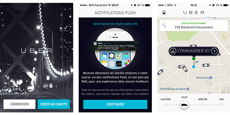
- the possibility of selecting kind of taxi (shared, sedan, single);
- la representation of taxis on the map. Indeed they are represented in the form of small green cars which move in real time on the map. It's really more “friendly” than the classic color dots;
- the possibility of activating the Google Voice functionality to place an order;
- sending notifications push-type;
- la geo-location and the real-time movement of the taxi on the map;
- a feature “Add a favorite destination".
The -
The increase
Uber is very well established, but how many users have stopped using it following a rather unpleasant experience linked to the increase in the price of their journey? Why ? Because Uber charges a markup. What is the increase will you tell me? It is a price increase when demand is greater than supply within a limited perimeter. Uber still warns the user who must be vigilant not to find himself trapped.
Impossible to order a taxi in advance
The application does not allow the user to order a taxi in advance.
Feature rating: 6/10
Usability
What makes <span style="font-family: 'arial black', 'avant garde';">inlingua</span> different
A smooth journey
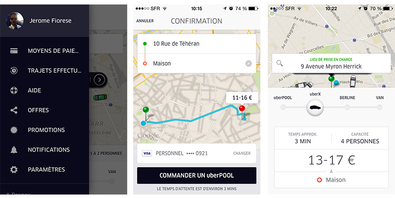
I find this application successful because the user journey is very fluid. All good practices in terms of ergonomics are respected: the positioning and size of the buttons in particular. Whether in the registration or order phases, the user paths are very short and perfectly understandable. Once the creation of the account is finalized, the order is really done in 2 taps. First choice: my destination, second choice: my mode of transport. It's simple it's effective. The application fulfills its role: informing the user about the waiting time, the price and the time required to reach his destination.
Usability rating: 9/10
Emotional design
What makes <span style="font-family: 'arial black', 'avant garde';">inlingua</span> different
An immersive video
From the first moments as a user, you are literally seduced by the design. It is understated and chic. The immersive video on arrival on the application with the use of a black and white treatment worthy of an American super production immediately puts us in the mood. On this application the user is at the heart of the device.
A very successful waiting spinner
The presence of a waiting spinner on loading reassures the user. Moreover, the design as well as the animation are successful.
Efficient design
In terms of UI, I find this application perfectly mastered because the design fades into the profile of the service. It is the same for the animations, here no superfluous effect, they are reduced to their simplest expression and consequently, are therefore meaningful.
Design score: 9/10
Final score: 8,3/10
Taxi G7
Features
The -
A single-service app
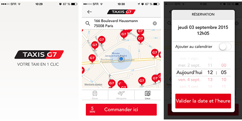
The main thing is there to allow the user to create his profile and to be able to quickly find the taxi closest to him. Here, no need to fill in your bank details, a simple creation of an account allows you to place an order and know the time needed for our nice (or not) taxi driver to receive us.
An application that offers a unique feature: the command
The application offers us a taxi ordering service but without an estimate of the price and the time of the race, which is a bit frustrating as a service offer.
What makes <span style="font-family: 'arial black', 'avant garde';">inlingua</span> different
An application that allows you to order a taxi in advance
One of the strengths of Taxi G7 is that it allows you to order a taxi in advance.
Feature rating: 6/10
Usability
The -
A badly used scanner function
The scanner functionality is present on the application but unfortunately, it is poorly exploited. Let me explain: she is active to scan her identity card (subscription to a commercial offer), but this functionality has not been deployed to scan her credit card, too bad.
A rather disappointing user experience on providing banking information
The absence of this functionality makes the crucial step of creating an account laborious. After having taken my courage in both hands to report all the figures of my credit card in the form, a very last question (go a last for the road) written in a size of characters too small making it unreadable was asked to me. I answered, but I must not have given the right answer, and there… Failure: the creation of my account was not validated. Everything had to be redone.
Affordance default on button elements
The graphic treatment of the buttons and the ergonomics of the interface do not allow the user to identify them clearly. For example, the application presents a list of quick accesses but we are entitled to wonder about their usefulness if geolocation is activated? These buttons are only used to inform the user about the location of G7 taxi ranks in certain key locations (stations, airports, museums).
Usability rating: 6/10
Emotional design
The -
A design that lacks subtleties
I find the design of this application not successful enough. Taxi G7's brand identity (based on strong red, black, white color contrast) was used without considering the medium. Result: the user is faced with a design that uses the three colors in 100% solid color for all the elements of the UI. But I find that this graphic bias lacks subtleties to prioritize the information. Here, the user is confronted with screens presenting a visual load far too great to provide a good hierarchy of information.
Not optimal readability
The readability of the information is not good. The user must make an extra effort to read certain texts because they are used on the one hand in a font that is too small and the contrast with the background is not strong enough. The screens have too strong a visual load, thus provoking a rather negative emotion in the user.
What makes <span style="font-family: 'arial black', 'avant garde';">inlingua</span> different
An interactive side menu animation
The only somewhat fun thing is being able to swipe between the pane menu and the main screen, and thus being able to have fun with this transition effect. The problem is that this “pane” screen is practically empty. Indeed, it contains only 4 hyper-text links. So why set up a screen that takes more than half of it to include only four links? Generally, the use of this type of interaction is justified when you have a large number of links.
Design: 5/10
Average: 6/10
The Cab
Features
What makes <span style="font-family: 'arial black', 'avant garde';">inlingua</span> different
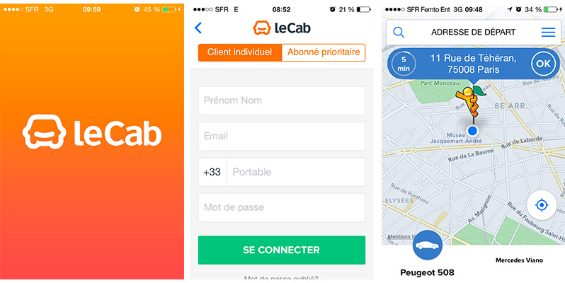
A phase of On boarding
I think it's always welcome because it allows the user to have an overview of all the features and instructions for use of the application as soon as it is launched.
Access to the address book to retrieve those of our friends
The application offers access to our address book allowing you to enter addresses (departure addresses, favorite destinations). It's the only application that offers these features and I find it very clever of them. We immediately see the advantage in terms of user experience, if I want to take a taxi to a friend's house, I just have to search in my favorite addresses and validate to get there, rather practical as functionality.
Feature rating: 9/10
Usability
What makes <span style="font-family: 'arial black', 'avant garde';">inlingua</span> different
Easy handling
This essential step is favored thanks to the use of small animations which indicate to the user the actions to be carried out. It is well seen because they exist to serve the use while being very subtle. Here, no “wow” effects, we are in a material design spirit that makes sense for the user.
An optimized user experience
I find that in terms of user experience, it's really successful. For example: the order of arrival of the elements is rather well seen. Here, the user enters his bank details (laborious experience) only once the route is proposed and not before as with competing applications. It deserves to be underlined because we know that any laborious task for the user has a much better chance of succeeding if it takes place once the latter is engaged. Nothing has been left to chance, the registration phase and the ordering process are very easy.
The -
Credit card validation problem
Once the user has scanned his credit card, the application does not validate this step to finalize the order. It's really a pity.
Usability rating: 7/10
Emotional design
What makes <span style="font-family: 'arial black', 'avant garde';">inlingua</span> different
I find it very successful because it is neat and very current. We feel the influence of material-design and it is very well thought out. The use of colors is reserved for information pushes and buttons. The use of a warm color palette helps to make the emotional experience pleasant. Nothing to say about the readability of the information: everything is perfectly well controlled.
Design: 7/10
Average: 7,66/10
Private driver
Features
What makes <span style="font-family: 'arial black', 'avant garde';">inlingua</span> different
The application includes a very valuable On boarding phase to help the user get started with the application.
- the scanner function for the BC
- the possibility of selecting kind of taxi (shared, sedan, single)
- la geolocation
- the possibility of order a taxi in advance
Feature rating: 8/10
Usability
The -
The form contains a design issue. Indeed, the form fields located at the bottom of the screen are no longer visible when the user fills in their information (especially the postal code). Result: he does not see what he informs and that is rather embarrassing.
What makes <span style="font-family: 'arial black', 'avant garde';">inlingua</span> different
A unique experience
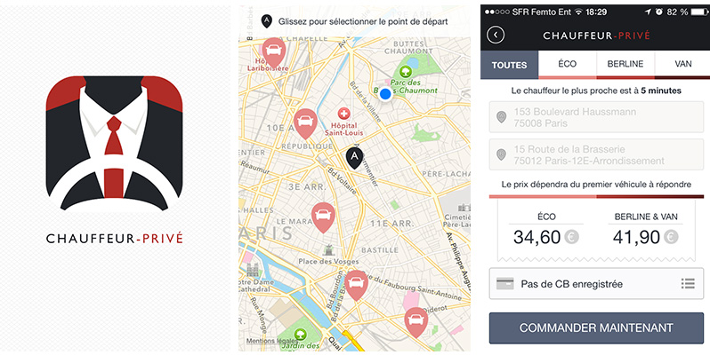
What I really like is the principle of navigation on the map. As soon as you keep your finger on the map to select a destination, the map view is in full screen mode and the user only has to move the map to specify his position. When you release the pressure, the navigation reappears and the place is selected. The user only has to validate using a button. I find this navigation principle rather well seen because this step becomes a user experience that is both practical and immersive.
A well-thought-out user journey
In terms of user journey, nothing to complain about. The application is well thought out because the information of banking information takes place once the order has been placed. Points on the map that represent taxis move in real time. In terms of ergonomics, the application has been well designed because the buttons have a size adapted to mobile use.
Usability rating: 8/10
Emotional design
The -
First of all, I find that the application has some readability problems on several texts and that for a service application is rather annoying. In addition, the design seems too conventional to me and without a strong identity. This one will not survive the test of time as it will quickly become outdated. It is quite representative on the logo of the application. Indeed, it materializes a man with a tie supposed to represent the taxi driver. It is on the one hand, not too successful, and on the other hand, not really in the current trend. Personally, I find that the brand embodies a somewhat outdated image while the service is very good. Strongly a redesign of the visual identity.
What makes <span style="font-family: 'arial black', 'avant garde';">inlingua</span> different
Despite everything, this design (admittedly a bit old) is rather successful because it gives off an emotion of strong confidence. The use of a range of raster colors for the materialization of points on the map makes it possible to have a low cognitive load, thus contributing to making the user experience pleasant.
Design rating: 7/10
Average 7,6
blue cab
Features
What makes <span style="font-family: 'arial black', 'avant garde';">inlingua</span> different
A phase of On boarding
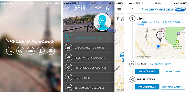
In this phase of On boarding, the Taxi Bleu application is committed to a promise: the maximum price, we will see if it is kept.
A la carte payment
The application offers the possibility of choosing its mode of payment (Carte Bleue, payment on board by card, payment on board in cash).
The presence of information such as weather and date
Taxi-bleu is the only application that offers the possibility of informing the user about the time of day and the date. Rather well seen, because even if it's a bit of a gadget, the application stands out from its competitors by providing this service.
Feature rating: 7/10
Usability
The -
A registration form with blocking errors essential for ordering. After having tried several times to create my user account, it was impossible to validate and be able to place my order. The error message is not precise which does not allow the user to easily modify his input error.
Usability rating: 5/10
Emotional design
The -
A “low-cost” design with no surprises
The design is a bit rough, some points could be improved in order to include the application in a more accomplished aesthetic. The resulting impression is of being faced with a somewhat low-cost design. An example: the color palette used in duotone is very classic and without subtleties. The layouts are not always consistent: for example, on the login form, the input fields, the titles are aligned to the left while the validation button is centered. Not really aesthetic, and not ergonomic.
Design score: 5/10
Average rating: 5,66/10
Ranking and verdict
1/ UBER: 8,3/10
2/ THE CAB: 7,66/10
3/ Private driver: 7,6/10
4/ TAXI G7: 6/10
5/ Taxi-bleu: 5,66/10
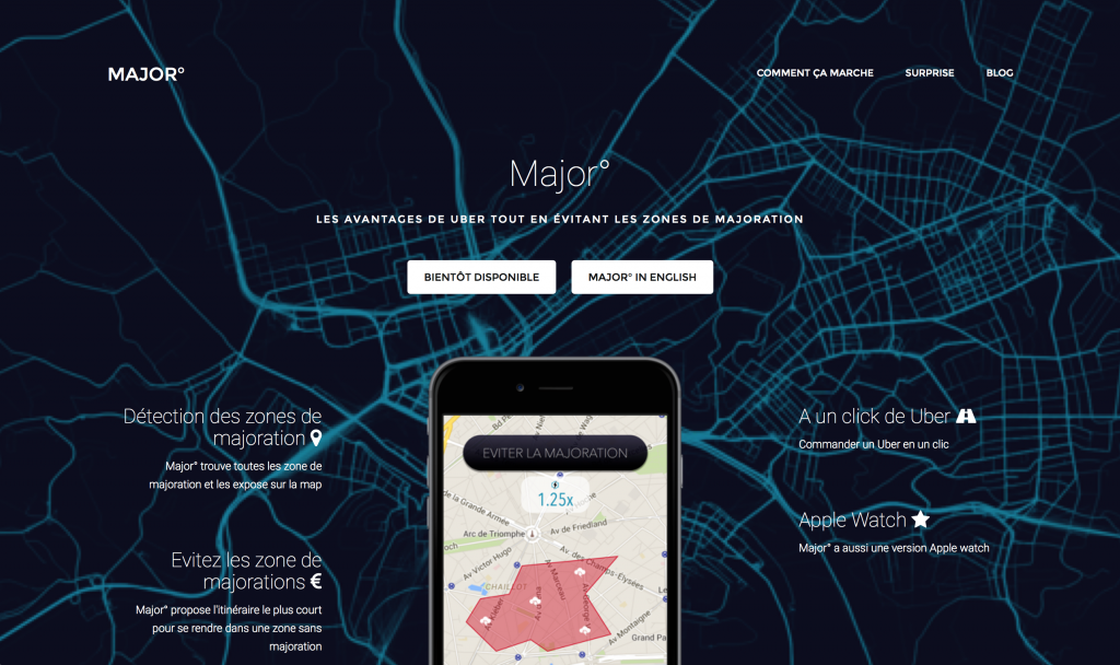
After this panorama of applications dedicated to taxi ordering, the verdict: CAB, UBER, private driver come far ahead, with even a small preference for CAB. On the other hand, a new application will come to overcome the main defect of UBER it is MAJOR which takes into account the problem of the increase.
Jérôme FIORESE / UX-Activist
UX/UI ECO-DESIGN # Paris
SMILE Paris
163 quay of Doctor Dervaux 92600 Asnières-sur-Seine
DESIGN THINKING: CREATING INNOVATION # Belgium
UX-REPUBLIC Belgium
12 avenue de Broqueville - 1150 Woluwe-Saint-Pierre
MANAGING AND MEASURING UX # Paris
SMILE Paris
163 quay of Doctor Dervaux 92600 Asnières-sur-Seine
DESIGN SPRINT: INITIATION & FACILITATION # Paris
SMILE Paris
163 quay of Doctor Dervaux 92600 Asnières-sur-Seine
UX-DESIGN: THE FUNDAMENTALS # Belgium
UX-REPUBLIC Belgium
12 avenue de Broqueville - 1150 Woluwe-Saint-Pierre
GOOGLE ANALYTICS 4 #Paris
SMILE Paris
163 quay of Doctor Dervaux 92600 Asnières-sur-Seine
ACCESSIBLE UX/UI DESIGN # Belgium
UX-REPUBLIC Belgium
12 avenue de Broqueville - 1150 Woluwe-Saint-Pierre
EXPERIENCE MAPPING # Paris
SMILE Paris
163 quay of Doctor Dervaux 92600 Asnières-sur-Seine
