Simplicity above all
Web and mobile applications are taking an increasingly important place in our daily lives. We are now accustomed and demanding users in terms of the functionalities, design and ergonomics of the interfaces we use for personal and professional purposes.
This user requirement is understood and studied in the design of an application intended for end customers, where a certain seduction of the user is sought.
The same cannot be said for the work applications available in companies, which are very often aging, not very intuitive and require several hours, even days of training.
However, offering applications designed around the user is a real advantage, both for the collaborator of a company and for the company itself. The gains in speed, satisfaction and understanding can be enormous and generate real added value.
How to recognize a good interface from a bad one?
The user does not need to think about his actions on a well-worked interface. He must intuitively know what to do with little or no knowledge of the tool without ever feeling lost.
Conversely, a bad interface is complex. The user does not know where to go, where to start, it is not intuitive. Learning will go through failures which will lead to frustration, a waste of time and in the long term, to a definitive diversion of the application.
Best practices for effective design
How to create a simple and easy to use interface? Here are some principles to follow.
The interface must be consistent
The user must know how to perform an action and deploy it throughout his request.
Actions and functionalities must be consistent and consistent across all application screens.
Relevant information should be easily accessible
The UI should be designed to place important information at the user's fingertips. We like to personalize our tools so that we have recurring content available when we need it. Having to search for an element in the infinite corners of the application is often dissuasive for the user.
Screens should not be overloaded
Highlight the most important information for the user. Unnecessary information is a waste of everyone's time. The designer will waste time creating these elements, the user will waste time sorting them.
The interface must be customizable
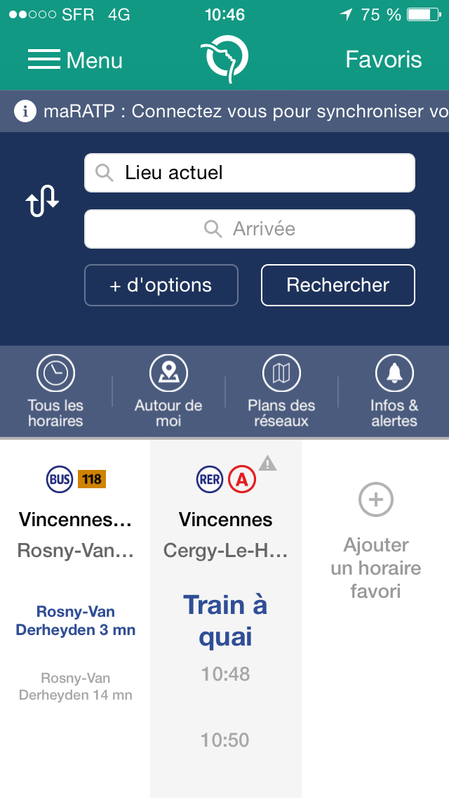
By creating an application, the designer tends to make everything available to future users. However, each user has their own habits and should be able to modify the interface in such a way as to satisfy their own use. For an interface to be clear, it needs to be customizable. Thus, the user will have a tool corresponding to his habits. This is the case of the Ratp application which allows you to record your daily journeys to quickly obtain the timetables associated with them.
The design should be attractive
A beautiful interface makes the user want to work on it. A link is created with the application which facilitates the learning of the tool.
Pay attention to typography
Typography is one of the basics of interface design and an often overlooked aspect. Good typography facilitates reading and accessibility. It can help reduce eyestrain caused by long-time use.
Take feedbacks into account
 Successfully having an easy-to-use interface also involves collecting user feedback, before and after the design.
Good design is both iterative and agile. When designing a product, we start by creating the base, taking into account business expectations. Then, we recover the various internal returns. Finally, we study user feedback. Everyone comes out a winner since the user has a product that suits him while allowing project teams to detect flaws during design.
After the launch of the product, the analysis tools allow us to study the habits of the user. We then know the most used features and those that are not. In addition, users can make suggestions on what to improve based on their uses and habits.
Added values
An interface is perceived in different ways by users.
For end users, a good interface greatly reduces the learning curve. It must require a very short period of training for a largely optimized daily use. For the company's internal tools, the return on investment is characterized by improved productivity, reduced or even eliminated training time, and a more attractive work environment for the employee.
Moreover, when an interface is visually attractive, it creates an emotion and will make the user want to use it more often and become familiar with its use more quickly.
Surprise the user with unexpected features
Another way to improve the design of an application, while being careful not to fall into the heavy or the complex, is to provide functionality that the user did not realize he might need.
If we take the example of Gmail, there are various small features that make life easier for the user. While typing from:sender name you can search for emails that come from this sender. Another example, has:attachment allows you to search for emails that have attachments. These are small features that are implemented to make life easier for the user without adding complexity to the interface.

Conclusion
Users need an easy to use tool. Business applications need to be functional. However, when an interface is well done, everyone benefits from it. When people find pleasure and not frustration in using a tool, it improves their daily life and increases their efficiency. In other words, providing a studied and aesthetic UI does not only improve the productivity of the people who use it, it also improves their quality of life.
Translation of the article Designing a UI to generate real business value.
Thierry Andrianalisoa – UX-Activist @UXRepublic
[actionbox color=”default” title=”” description=”UX-REPUBLIC is an agency specializing in user-centered design. We are also an approved training center. Find all our UX-DESIGN training courses on our website training.ux-republic.com” btn_label=”Our training courses” btn_link=”http://training.ux-republic.com” btn_color=”primary” btn_size=”big” btn_icon=”star” btn_external=”1″]
