After a few years of redesigning digital services using solid colors, more refined designs, in short by simplifying, here is Google, and its new recommendations which again upset the rules of ergonomics and design: "Material Design" (http://www.google.com/design/spec/material-design/introduction.html).
If at first glance, things do not seem fundamentally transformed for the Front-End developer, it is mainly on the animations and the meaning to give them that we must concentrate our efforts.
(http://www.google.com/design/spec/animation/meaningful-transitions.html#meaningful-transitions-visual-continuity)
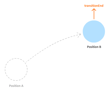
Producing effects allowing animated transitions to tell a story to visitors on their own is based on one principle: being able to chain animations at key moments chosen by the digital team.
For several years now, modern browsers and their respective rendering engines (often based on Webkit) have provided us with the technical element necessary for this achievement: triggering events.
And more particularly the transitionEnd event which marks the end of an animated change of state of one or more elements.
Example:
Let's say we want to make an element appear and then lengthen it before finally enlarging it.
If a “classic” animation, that is to say a change of states, is set up, all the changes will take place at the same time. The element will appear, then take height and lengthen in a single movement. The TransitionEnd event allows you to wait for the end of the previous animated state change before starting the next one.
We can therefore think in terms of a succession of states, a transition scenario.
:
1. CSS classes are defined
.initial-state-element-invisible { transition: all ease-out 250ms; -webkit-transition: all ease-out 250ms; -moz-transition: all ease-out 250ms; -o-transition: all ease-out 250ms; opacity: 0; height: 100px; } .state-number-two-element-visible { opacity: 1; } .state-number-three-highest-element { width: 100px; height: 300px; } .state-number-three-widest-element { width: 300px; height: 300px; }
2. A bit of JavaScript (JQuery) to listen for the event trigger and apply the new CSS properties at the right time.
$('.state-initial-element-invisible').click(function(){ $(this).addClass('state-number-two-element-visible'); $(this).one("transitionend webkittransitionEnd otransitionEnd MStransitionEnd", function(){ $(this).addClass('state-number-three-highest-element'); $(this).one("transitionend webkittransitionEnd otransitionEnd MStransitionEnd", function(){ $( this).addClass('state-number-three-largest-element'); }); }); });
State 1
Our element is invisible
State 2
Our element is visible
State3
When our element has finished appearing, it then begins to gain height…
State4
…then he lies down.
En conclusion
This simple example, which meets the animation intent recommendations, demonstrates that it is possible to help understand the usability of an interface solely through its animations using the transitionEnd event.

UX/UI ECO-DESIGN # Paris
SMILE Paris
163 quay of Doctor Dervaux 92600 Asnières-sur-Seine
DESIGN THINKING: CREATING INNOVATION # Belgium
UX-REPUBLIC Belgium
12 avenue de Broqueville - 1150 Woluwe-Saint-Pierre

MANAGING AND MEASURING UX # Paris
SMILE Paris
163 quay of Doctor Dervaux 92600 Asnières-sur-Seine

DESIGN SPRINT: INITIATION & FACILITATION # Paris
SMILE Paris
163 quay of Doctor Dervaux 92600 Asnières-sur-Seine
UX-DESIGN: THE FUNDAMENTALS # Belgium
UX-REPUBLIC Belgium
12 avenue de Broqueville - 1150 Woluwe-Saint-Pierre


GOOGLE ANALYTICS 4 #Paris
SMILE Paris
163 quay of Doctor Dervaux 92600 Asnières-sur-Seine

ACCESSIBLE UX/UI DESIGN # Belgium
UX-REPUBLIC Belgium
12 avenue de Broqueville - 1150 Woluwe-Saint-Pierre
EXPERIENCE MAPPING # Paris
SMILE Paris
163 quay of Doctor Dervaux 92600 Asnières-sur-Seine
