Data in the development of a UX strategy
Having become essential today, it makes it possible to understand the overall navigation of users, to interpret the areas clicked, in particular…How are the elements of your site consumed by your users? Which pages are performing well? How can you optimize traffic? So many questions, which your analysis tool should allow you to answer.

Several competing and complementary tools
Many analytical tools exist on the market such as Google Analytics, Adobe, AT Internet, for example. Their strength lies in the exhaustiveness of the possibilities in terms of analysis.
For its part, ContentSquare has become the fashionable tool in the UX / analytics sphere thanks to data visualization, accessible to all trades. The French startup created in 2012 by Jonathan Cherki is used in various sectors of activity: retail, banking insurance, luxury, tourism, mass distribution, etc.
This solution offers an innovative approach for the analysis of user journeys thanks to a panel of modules that couple data to the user experience.
A modular tool
One of ContentSquare's differentiating axes is its modular approach. Review of three very useful bricks in data management.
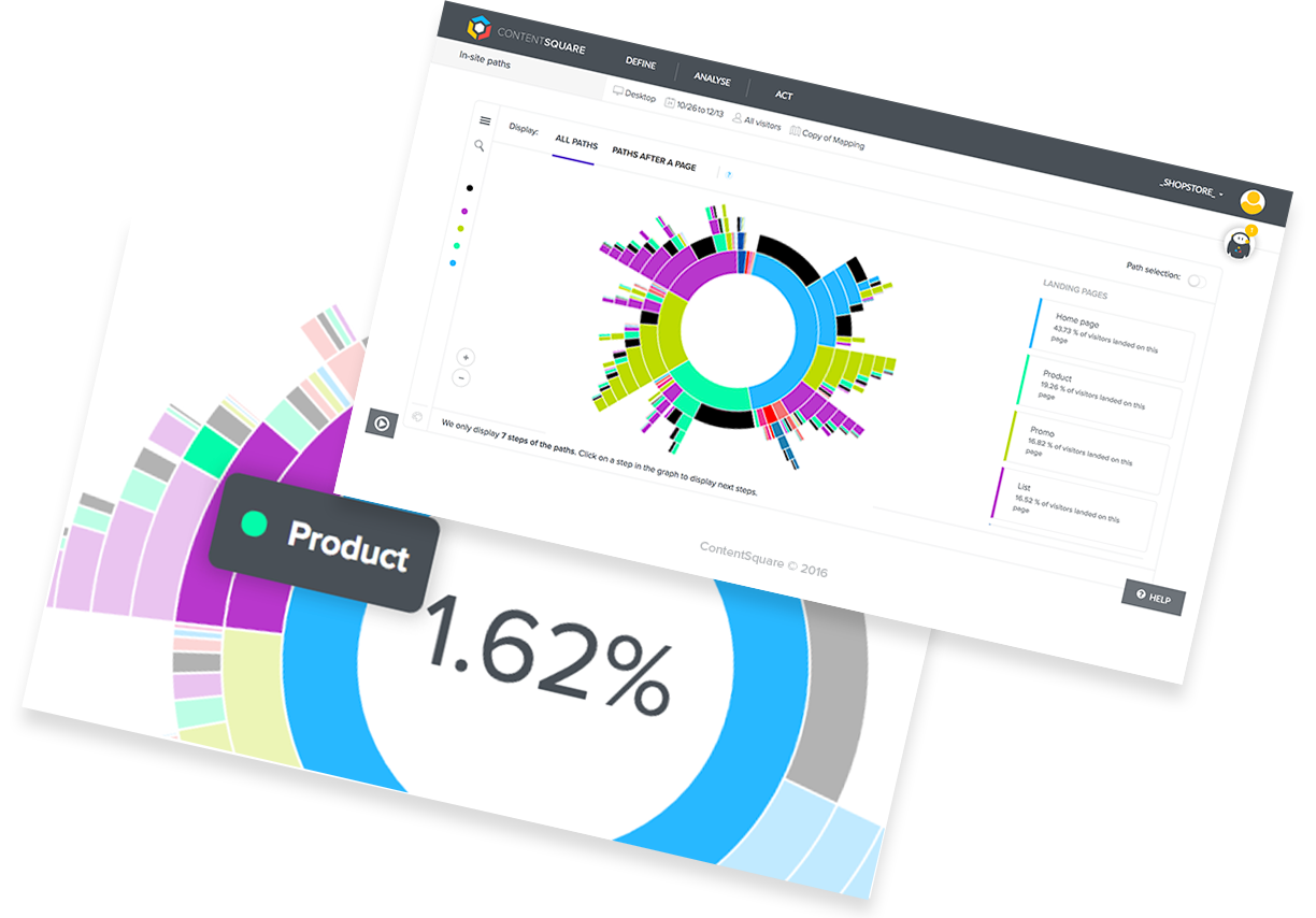
The sunburst

Know that the success of sunburst attracts other tools on the market: AT Internet will launch its first beta version in a few weeks.
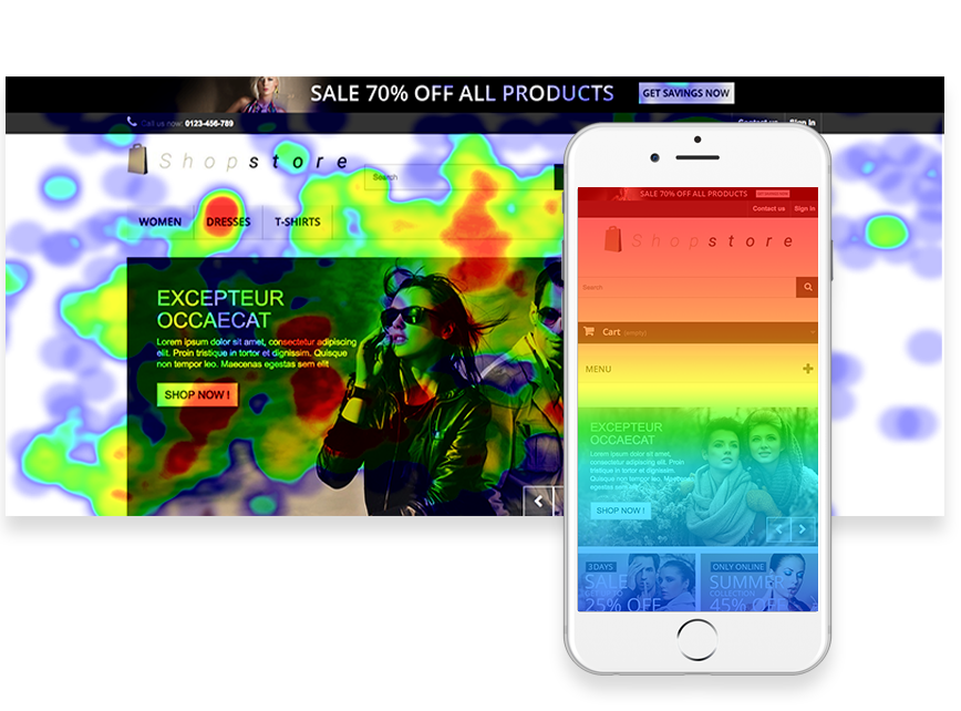
Heat maps

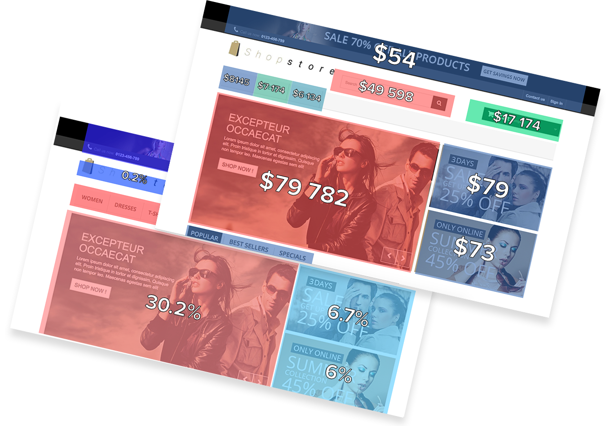
Zone data

These three associated modules will help you carry out relevant analyzes and guide your UX strategy.
Added values
A user-friendly software that speaks to businesses outside of data: the various reports of the tool are very visual and intuitive, which gives you a clear overview of user behavior. Getting started is fairly quick and accessible thanks to the support of a support team.
Little extras: for having used it, their internal ticketing tool will make your technical teams dream. The implementation only requires the installation of a single tag for the simplest sites. Count an additional tag if your activity includes an ecommerce, or pop-ups that you want to track.
Limits
ContentSquare is not yet deployed to apps. However, the solution is in the process of being created and the tool is already delivering its first beta versions.
At present, the tool samples the analysis of your traffic at 20%. But this is not a significant limit for its use in the sense that the added value lies in the overall study of navigation, and not the course of a single user.
TAKE AWAY
ContentSquare is truly dedicated to UX. If you want to rely on both quantitative and qualitative methods, the tool meets your needs very well. ContentSquare is growing and developing its offer more and more. A tool full of promise, to follow in our professions!
UX-Republic
FOR FURTHER
[actionbox color=”default” title=”” description=”Get trained in Analytics & UX during an exceptional training in collaboration with the Nielsen Norman Group ” btn_label=”view the Program” btn_link=”http://training.ux-republic.com/ux-certification-nielsen-norman-group/” btn_color=”primary” btn_size=”big” btn_icon=”star” btn_external =”1″]
[row] [one_third]

[/one_third] [two_third]
UX-CERTIFIED®
by Nielsen Norman Group
From 12 to 16 November 2018
UX-Republic – Paris Saint-Lazare
For the first time in France, UX-Republic Digital Training Center offers you, in its premises in Paris, a new training in collaboration with Nielsen Norman Group.
[/two_third] [/row]
