Our brain works in such a way that we process the visual information we receive in the form of blocks, simplified sets, without immediately perceiving the detail in these sets:
● We see a cabinet and not assembled boards
● We see a forest and not earth, leaves, branches
● We see a dotted line and not several small lines…
We see the whole rather than the sum of the parts ; this is what the different laws of the Gestalt bring to light. Many people have already heard of the laws of the Gestalt, few know what they correspond to and above all that they are confronted with them every day. Have you ever played the game of spotting shapes in the clouds? It is a typical example of the principles that govern the way we see and interpret our environment. These laws explain the mental scheme of Man, the way he perceives the world.
As far as we are concerned in UX, the application of these laws makes sites more readable and intuitive. Each website is designed with rules so ingrained that they are automatic: the elements that go together will be brought together on the page, we respect a certain alignment to fit into known shapes (square, rectangle, etc.)… Moreover, when these laws are not respected, we are immediately lost in the site and very often we leave the page. These laws, when they are respected, guarantee comfort to the user, they facilitate the usability of the interface.
To illustrate the 6 fundamental laws, I took a quick look at the UX-Republic website :
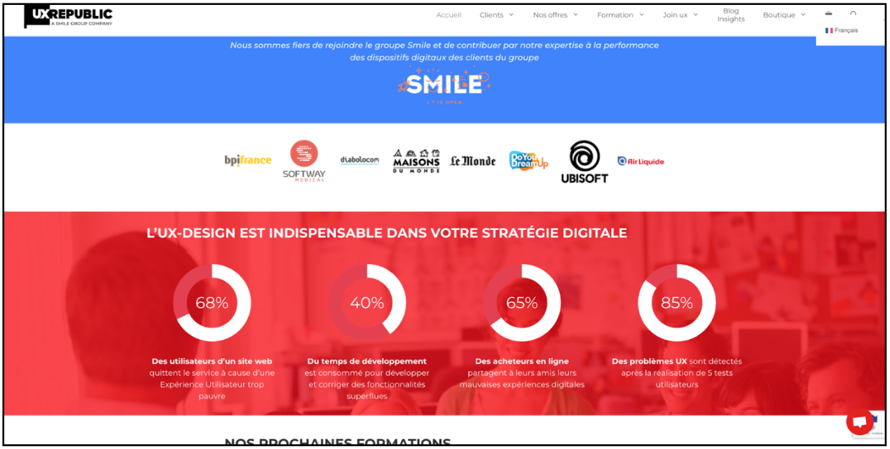
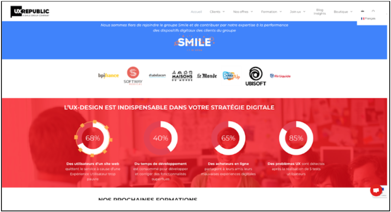
On the UX Republic site, we can take the example of statistical visualizations: do you see circles? Our brain links the red part of the circle with the white part of the circle to perceive only one shape (more or less filled).
Law of proximity
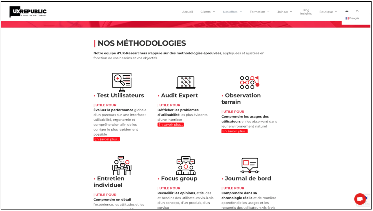
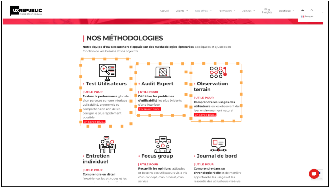
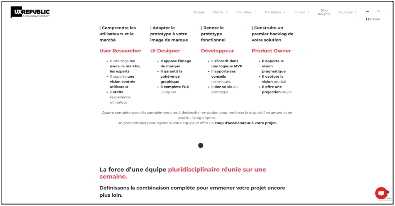
When we identify a form that only exists thanks to the differences in spacing between several elements, we are under the influence of the law of Proximity! Here, the different methodologies are presented without being explicitly delimited, yet we clearly distinguish them independently.
law of continuity
In connection with the law of proximity, the law of continuity implies that the bringing together of elements leads to an illusion of continuities between them. This is what allows us to identify sentences as lists, to read back to the line rather than to search further. For example here, we identify the text relating to the title “User Research” by reading the 3 points, before moving on to reading the “UI Designer” part. If we were not subject to the law of continuity, we could read “He questions the He affixes the image He is inscribed in He brings the”.
The law of common destiny allows us to identify a form by its trajectory, breaking with the trajectory of other sets.
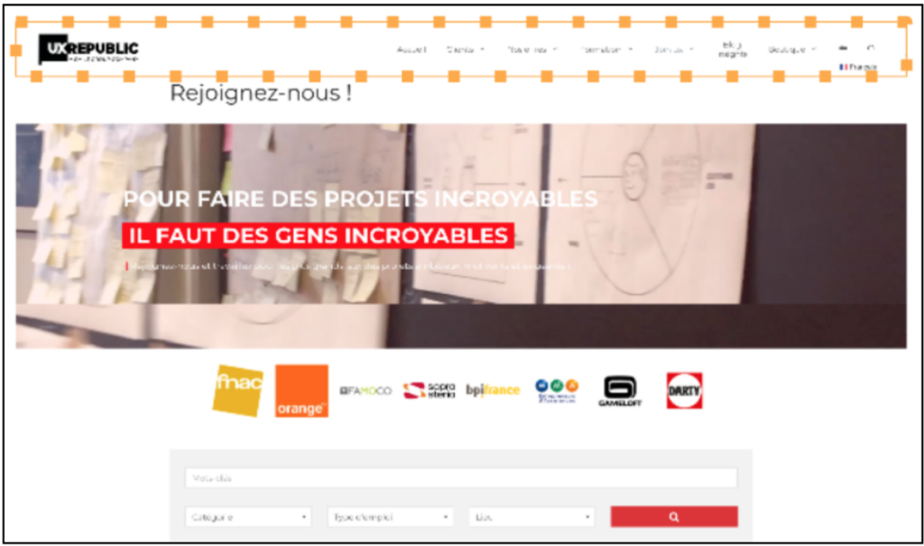
When scrolling in the page, the menu becomes a “sticky menu”: it does not move, while the rest of the page scrolls… 2 forms are therefore identified: the page which contains all the articles, and the motionless menu that always remains visible. These 2 sets of elements are interpreted as 2 different forms thanks to the law of common destiny which applies to the scroll.
law of closure
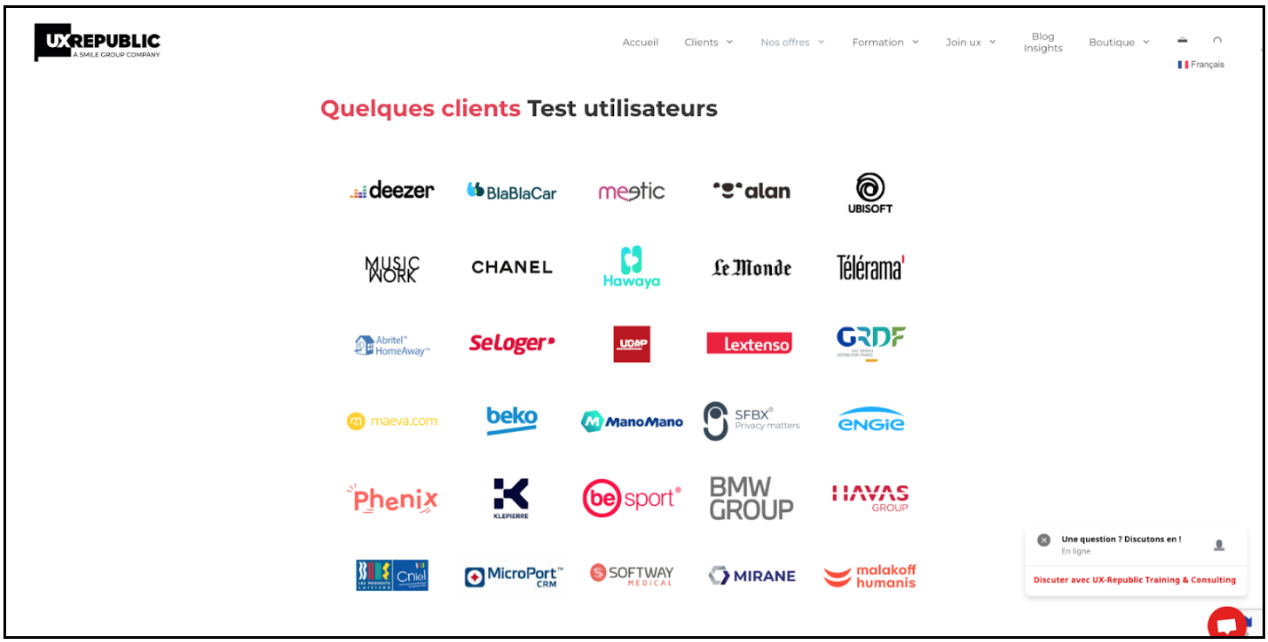
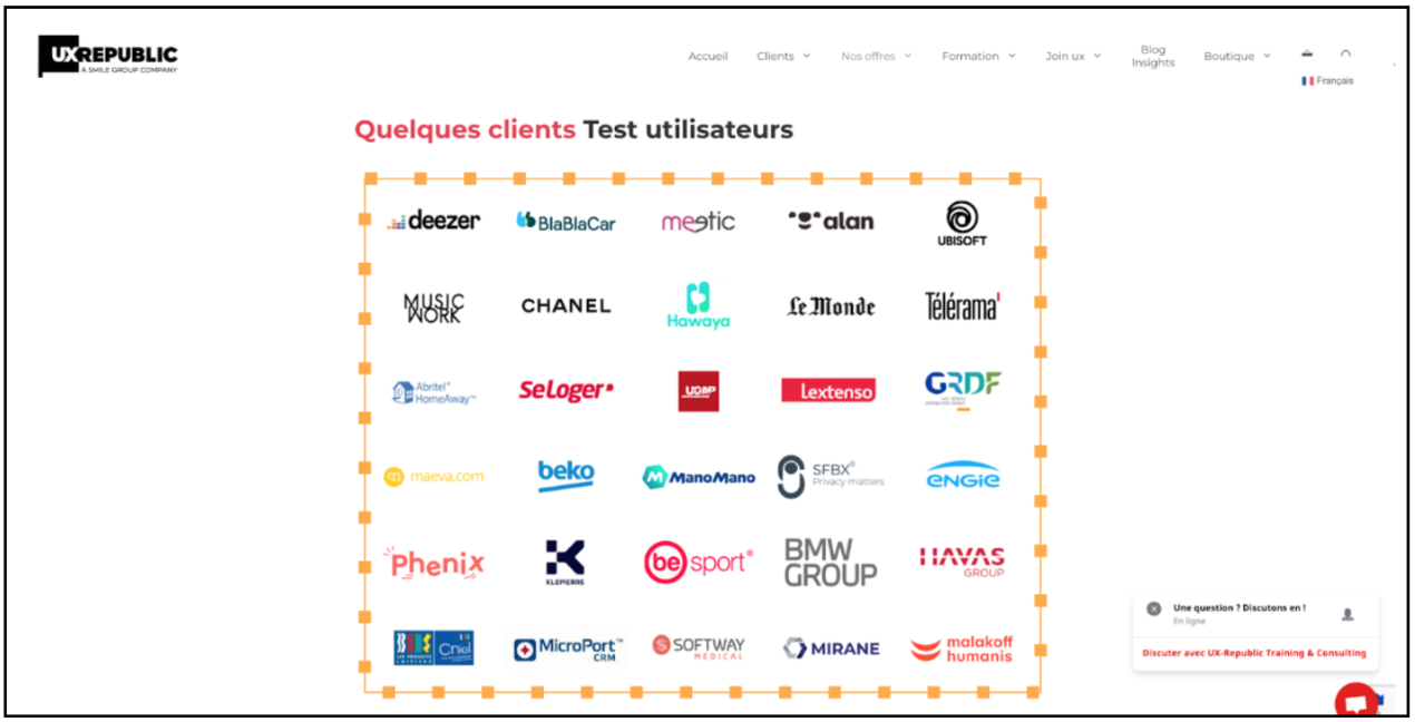
When we identify a set by assimilating it to a known shape (circle, rectangle, rhombus, …) we put into practice the Law of Closure.
On the UX-Republic site, the clients who have asked us for user tests are arranged in such a way that one could think of them in a square, while no explicit external delimitation appears.
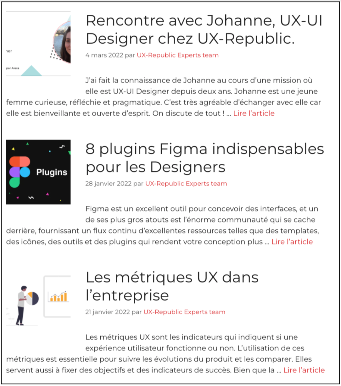
Law of similarity
Finally, the law of similarity is the application of the famous adage “like attracts like”: elements that resemble each other are expected to have the same behavior or the same objective.
Here, on the UX-Republic blog, all the articles are presented in the same way: the image on the left, the title bigger and bolder, the date in gray and the author in red. Our identification of the different articles is thus facilitated.
To conclude, I invite you to take a look at your favorite sites and applications to identify how these laws are put into practice (or not!).
Florine AUFFRAIT, UX Researcher @UX-Republic
Our next trainings


DIGITAL ACCESSIBILITY AWARENESS #Paris
SMILE Paris
163 quay of Doctor Dervaux 92600 Asnières-sur-Seine
DIGITAL ACCESSIBILITY AWARENESS #Belgium
UX-REPUBLIC Belgium
12 avenue de Broqueville - 1150 Woluwe-Saint-Pierre
ACCESSIBLE UX/UI DESIGN # Paris
SMILE Paris
163 quay of Doctor Dervaux 92600 Asnières-sur-Seine
AWARENESS OF DIGITAL ECO-DESIGN # Belgium
UX-REPUBLIC Belgium
12 avenue de Broqueville - 1150 Woluwe-Saint-Pierre

STORYTELLING: THE ART OF CONVINCING # Paris
SMILE Paris
163 quay of Doctor Dervaux 92600 Asnières-sur-Seine


UX/UI ECO-DESIGN # Paris
SMILE Paris
163 quay of Doctor Dervaux 92600 Asnières-sur-Seine
DESIGN THINKING: CREATING INNOVATION # Belgium
UX-REPUBLIC Belgium
12 avenue de Broqueville - 1150 Woluwe-Saint-Pierre
MANAGING AND MEASURING UX # Paris
SMILE Paris
163 quay of Doctor Dervaux 92600 Asnières-sur-Seine

DESIGN SPRINT: INITIATION & FACILITATION # Paris
SMILE Paris
163 quay of Doctor Dervaux 92600 Asnières-sur-Seine
