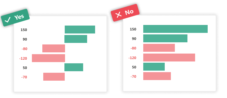
1. Distribute data symmetrically when using positive and negative values
In order to avoid the misinterpretation of your graph do not put positive and negative values on the same side of the axis.
Example : Place negative values on the left and positive ones on the right of the y-axis when using the vertical bar chart. In order to avoid misinterpretation of your graph, do not put positive and negative values on the same side of the axis.
2. Start grid axes at 0 for bar charts
This rule guarantees a better understanding of data on the part of users. On the example below, we can have the impression that the bar B on the graph on the right is 3 times larger than that of D. Whereas in reality this difference is much less important, which the graph shows us left whose axes start at 0.
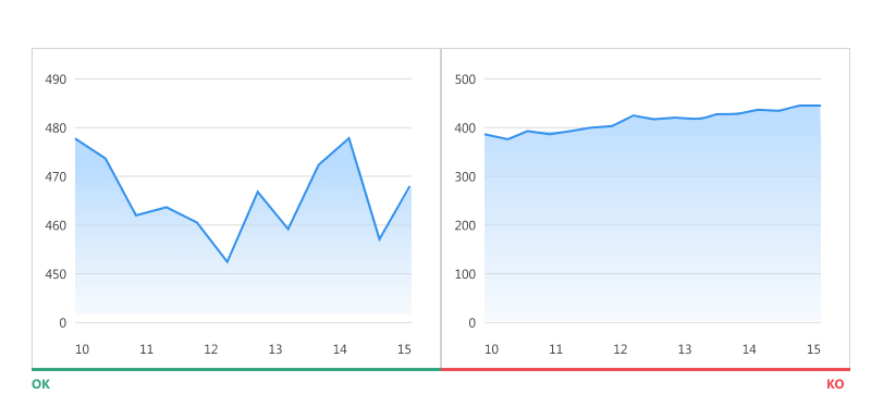
3. Fit Y-axis data for line charts
Unlike bar charts, line charts require special adaptation. Indeed, there is always a risk of making this type of graph “flat” when starting the axes at 0. Line graphs are intended to represent trends, and that is why it is important to make the axes clearly visible trends. To do this, the values of the axes must be adapted according to the data set so that the curve occupies 2⁄3 of the ordinate axis.
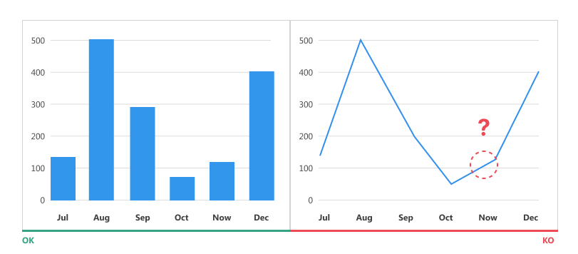
4. Use bar charts when presenting time series data
It is recommended to use bar charts to represent the evolution of data over time. On the example below you can clearly see the values and the difference between the data relating to each month on the diagram on the left. While the line chart on the right requires more visual and cognitive effort from users to associate exact Y-axis values with X-axis months.
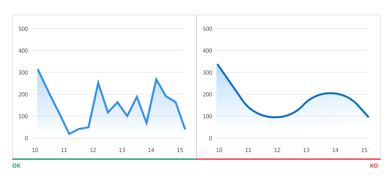
5. Stop smooth curves!
Smooth curves, although more pleasing to the eye than those with sharp points, “hide” the real numbers behind and can lead the user to misinterpret data.
6. Avoid dual-axis charts
This type of chart is often used to save space on a dashboard when there are two data series with 2 objects to be compared (ex: apples and carrots) on different measures (ex: price and quantity) . Not only is this type of graph complicated to read, but above all it leads users to draw the wrong conclusions, because most of them will not pay attention to the values displayed on the axes.
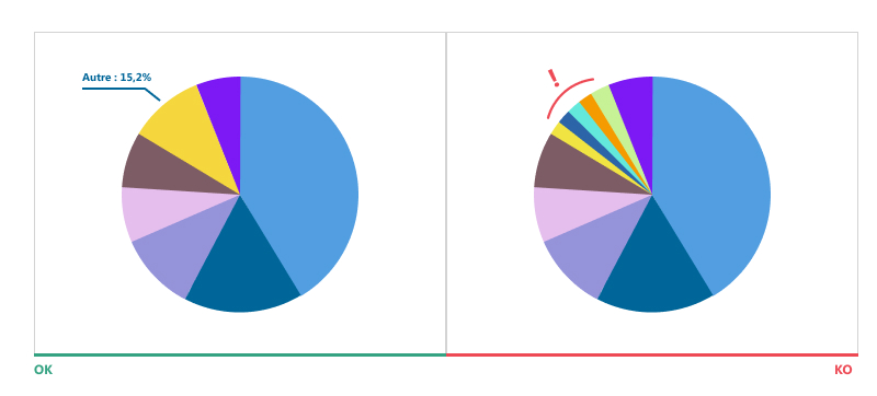
7. Limit the number of parts of a “pie chart”
The “pie chart” type diagram is one of the most used diagrams today, and it is most often the subject of incorrect use. Indeed, it is better to opt for a bar chart, as they are much easier to read. On the other hand, if you want to represent your data in the form of a pie chart, here are some recommendations to follow:
● Do not use more than 5-7 parts on the same chart
● Group the smaller parts into one and name it “Others”
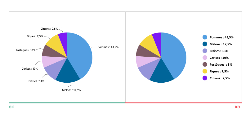
8. Place the labels in front of the “pie chart” parts
Placement of labels is very important because if they are misplaced no matter how nice your diagram is, it will be very difficult to read. Indeed, it often takes a lot of time and energy to associate labels to diagram segments if they are not at the same level as the segments in question.
Placing labels directly on shares is also not a good idea, as it can also make it difficult to read the results.
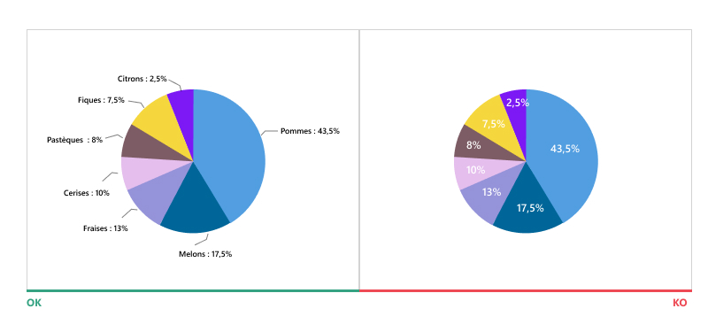
When using pie charts, the best solution is to use black font to display your data and place it in front of the corresponding segments.
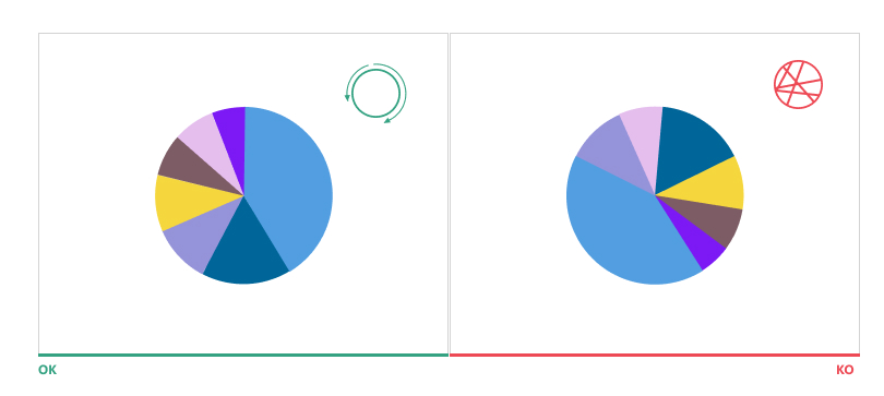
9. Arrange Camembert slices in descending order
Place the largest part at 12 o'clock and the following ones in descending order clockwise.
rhyming areas of certain characters. These “letters with holes” oblige the reader to monopolize more cognitive resources during his reading and it is precisely this effort which would allow him to better memorize the texts read.
Studies are not unanimous on the influence of this typeface on memory, so whether it's a real good idea or not... to be continued!
10. Avoid clutter
This recommendation is applicable almost for all chart types. Do not sort your data alphabetically. Place the larger value at the top of the grid (for horizontal bar charts) or to the left (for vertical bar charts). Higher values should take up more space on your chart grid. This technique consists of making eye movements more fluid and reducing the time it takes to read the results.

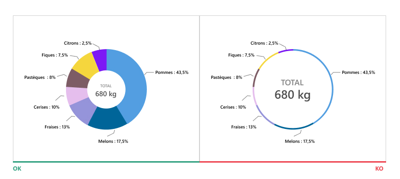
11. Pay attention to the donut chart margins
Very thin donut charts are extremely difficult to read. This type of chart is often used to free up space and display additional information in the middle. When we reduce the margins of the ring to put more data, we risk making the diagram impossible to interpret.
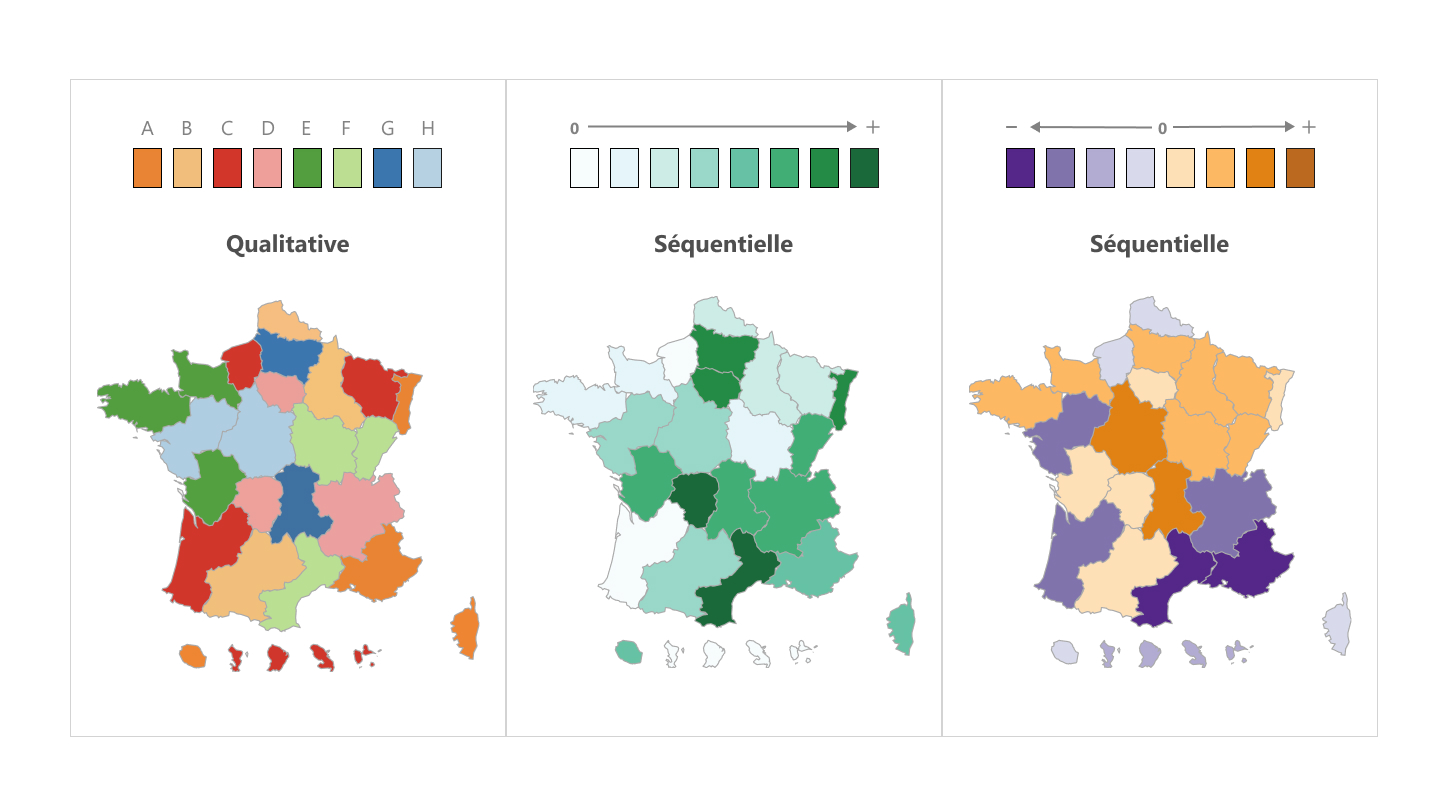
12. Choose the color palette that represents your data correctly
The choice of color is very important in the representation of your data, especially when presenting the data in the form of the geographical map diagram. Below are the types of palettes recommended for data visualization:
qualitative : this color palette is aptly named, as it is perfect for displaying qualitative variables. Be sure to use distinct colors to ensure the best perception of data.
Sequential : the color palette used to represent quantitative data. Its principle of use is simple: the higher the value, the darker the color assigned to it must be, and vice versa.
Divergent : it is a combination of 2 sequential palettes with different color shades. It is often used to distinguish between positive and negative values
Data Visualization is a relatively new discipline for UX Design, but it is developing very quickly. It is important to stay up to date with the latest trends in this discipline, because data is everywhere today, and its good or bad understanding impacts strategic decisions.
Polina HAYS, UX Designer @UX-Republic
Our next trainings

UX-DESIGN: THE FUNDAMENTALS # Paris
SMILE Paris
163 quay of Doctor Dervaux 92600 Asnières-sur-Seine

VISUAL THINKING: CONCRETE YOUR IDEAS # Paris
UX-REPUBLIC Paris
11 rue de Rome - 75008 Paris


DIGITAL ACCESSIBILITY AWARENESS #Paris
SMILE Paris
163 quay of Doctor Dervaux 92600 Asnières-sur-Seine
DIGITAL ACCESSIBILITY AWARENESS #Belgium
UX-REPUBLIC Belgium
12 avenue de Broqueville - 1150 Woluwe-Saint-Pierre
ACCESSIBLE UX/UI DESIGN # Paris
SMILE Paris
163 quay of Doctor Dervaux 92600 Asnières-sur-Seine
AWARENESS OF DIGITAL ECO-DESIGN # Belgium
UX-REPUBLIC Belgium
12 avenue de Broqueville - 1150 Woluwe-Saint-Pierre

STORYTELLING: THE ART OF CONVINCING # Paris
SMILE Paris
163 quay of Doctor Dervaux 92600 Asnières-sur-Seine


UX/UI ECO-DESIGN # Paris
SMILE Paris
163 quay of Doctor Dervaux 92600 Asnières-sur-Seine

DESIGN THINKING: CREATING INNOVATION # Belgium
UX-REPUBLIC Belgium
12 avenue de Broqueville - 1150 Woluwe-Saint-Pierre