We tend to equate a good user experience with a smooth user experience. If we talk about friction, it is generally to address irritants or even blockers in the experience that must be identified and eliminated. It's a vision very anchored in the present moment, as if each action on the interface had to be fast and fluid. But user experience is a collection of moments, a whole that is more than the sum of its parts.
It is built over the long term when the interface is used regularly.
Meeting an obstacle can be unpleasant at the time (but not always) AND have a positive impact on the overall user experience in the end.
Let's explore some examples.
#1 A tool in the prevention of errors

We are used to going through confirmation stages:
• Before deleting data,
• Before closing software without saving your work,
• Before sending an e-mail without its attachment when it is mentioned in the body of the e-mail.
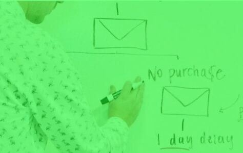
A confirmation pop-up is an example of friction when the action was deliberate, it adds a step, reading, choice, click, but will prevent making a mistake that could have significant irreversible consequences.
Before using this technique in our interfaces, it is up to us to balance the weight of the confirmation step, with the weight of the error.
This confirmation can be reassuring even for the user who was sure of his action: it reminds him that he will always be protected in the event of false manipulation.
#2 Strengthen user data security
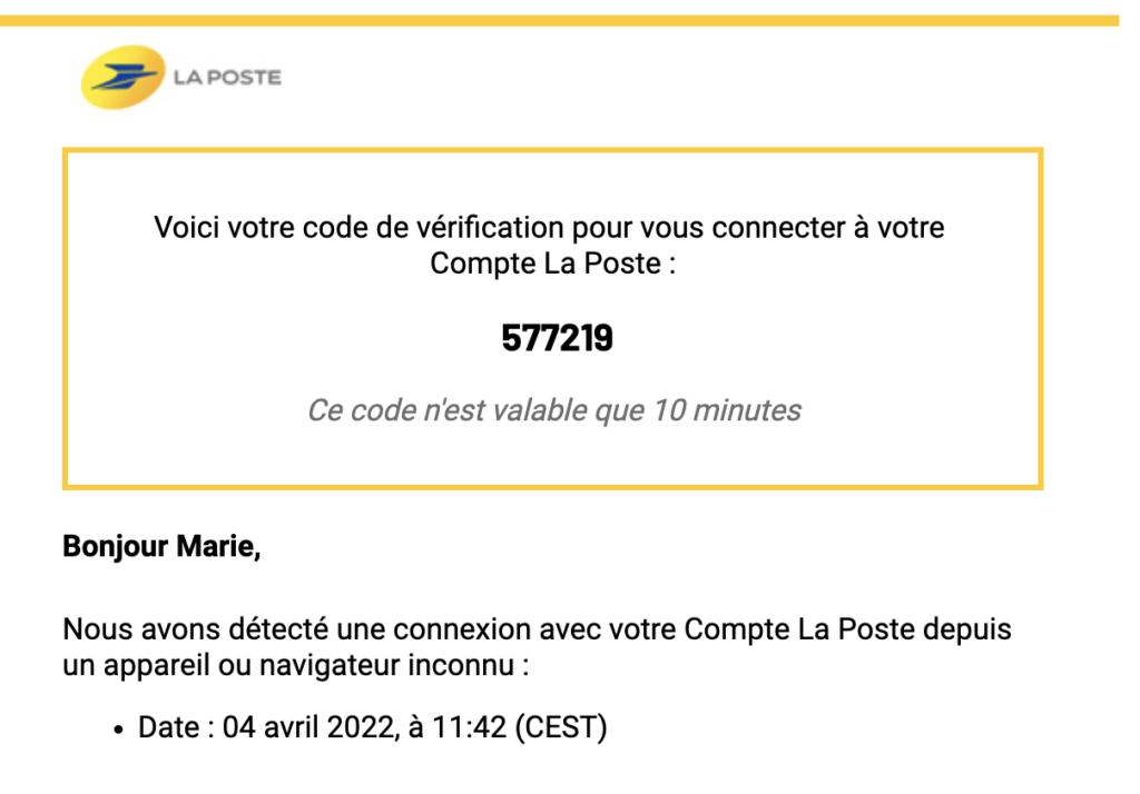
Steps for confirming the identity of the user make it possible to prevent an attempt to hack an account, for example when the system detects a connection from a new device. Friction is more important than when preventing an error, often it involves entering a code received by email or SMS. But the cost of hacking will also be greater when it involves the user's identity, resources or private data. This is indeed a positive friction.
#3 Accompany the user in his consumption of interfaces
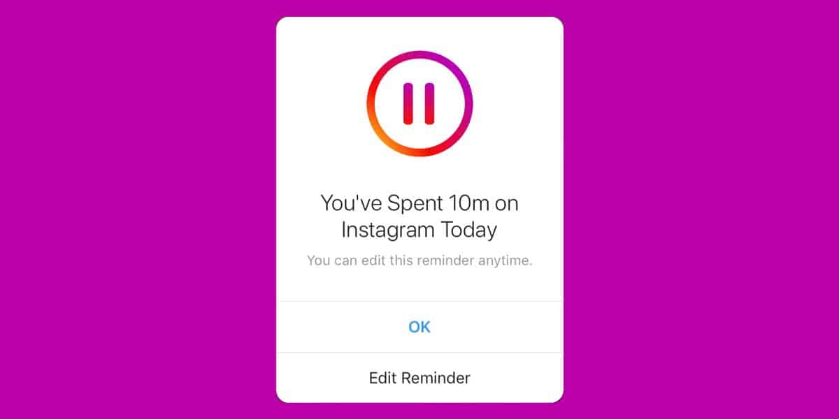
Other applications, often social networks but not only, interrupt the user in his navigation to remind him of his duration of use and suggest that he take a break. This
interruption clearly constitutes a friction, and its perception by the user is not easy to anticipate by the designer.
When the app restricts its access at the user's request, friction is more likely to be positive. If it is not initiated by the user, other internal and external factors will have a role: the duration before the triggering of the alert, the time of day when the user uses the application, usage pattern, user personality, alert tone, etc. The user experience may be degraded at a time t, but reinforced in the long term if the user uses the application less but in a more qualitative way.
#4 Give a good impression to the user
A study by Michael Norton and Ryan Buell exposed participants to two versions of an airline ticket sales site:
• In the first version the search delivers results instantly,
• In the second version, the banknotes take a few tens of seconds to appear but
the site materializes the effort provided by describing the steps under the loading bar.
Participants overwhelmingly preferred the second version.
This illusory effort gives an impression of quality to the user which is conditioned by the quality of the results. If the results are disappointing, the additional waiting time will on the contrary be detrimental to the user experience.
Another example concerns users of the Houston airport who complained about the waiting time to collect their luggage. By moving the baggage away from the terminals, this dissatisfaction has been greatly reduced: the total waiting time is the same, but the user is on the move and waits less time at his destination.
These two examples show that reducing the fluidity of the journey can improve the user experience. To implement this technique, knowledge of cognitive psychology must be used even if it contradicts good design practices (number of clicks, speed of execution, etc.).
#5 Generate sharing, a community spirit
Finally, the user can be encouraged to seek answers to his blockers around him, from peers using the same product. In this case friction has a positive effect. This sharing of knowledge creates a dynamic around the product which is beneficial both for the product but also for the users who are involved in this emulation.
Many examples of this type of friction come from video games, we think of Pokemon Go whose not always clear interface has led to the creation of online tutorials by players, or the game The Endless Forest where progression is only by sharing with other players, but it's not restricted to video games. Applications like Snapchat or TikTok can also be cited, and the community is valuable for users who want to understand how to best take advantage of these tools.
From a design point of view, one can imagine deliberately "hiding" a feature in its application so that its discovery is part of a transmission, of word of mouth in the product community. Provided that its use is easy once the user is “in the know”: for example, a shortcut by gesture to call up the functionality.
Reservations
Adding positive friction should be a well thought out action. Testing upstream on users is often crucial. If positive friction improves the overall user experience, we must also ask ourselves the question of accessibility and inclusiveness: for example, traveling through the Houston airport gives the illusion of a shorter waiting time which satisfies the greatest number, but is surely deleterious for all people who have difficulty moving. As soon as we add friction, we take the risk of leaving out some of the users or users. As with everything in UX, there is no ready-made recipe with positive friction, you have to do it on a case-by-case basis.
Take away
– Friction is not synonymous with a degraded user experience, you have to think about the overall vision and the relationship with the user in the long term,
– Adding friction is useful to protect the user and can influence the impression he will have of the interface and the product,
– However, the accessibility of the interface remains essential and this issue must be taken into account when adding friction points.
To learn more
More details on the Norton and Buell studies: https://hbr.org/2011/05/think-customers-hate-
waiting-not-so-fast
A poster classifying examples of positive friction by type https://ruthkschmidt.com/work#/positive-friction/
Marie Euzin, UX Designer @UX-Republic
Our next trainings
VISUAL THINKING: CONCRETE YOUR IDEAS # Paris
UX-REPUBLIC Paris
11 rue de Rome - 75008 Paris
DIGITAL ACCESSIBILITY AWARENESS #Paris
SMILE Paris
163 quay of Doctor Dervaux 92600 Asnières-sur-Seine
DIGITAL ACCESSIBILITY AWARENESS #Belgium
UX-REPUBLIC Belgium
12 avenue de Broqueville - 1150 Woluwe-Saint-Pierre
ACCESSIBLE UX/UI DESIGN # Paris
SMILE Paris
163 quay of Doctor Dervaux 92600 Asnières-sur-Seine
AWARENESS OF DIGITAL ECO-DESIGN # Belgium
UX-REPUBLIC Belgium
12 avenue de Broqueville - 1150 Woluwe-Saint-Pierre

STORYTELLING: THE ART OF CONVINCING # Paris
SMILE Paris
163 quay of Doctor Dervaux 92600 Asnières-sur-Seine

UX/UI ECO-DESIGN # Paris
SMILE Paris
163 quay of Doctor Dervaux 92600 Asnières-sur-Seine
DESIGN THINKING: CREATING INNOVATION # Belgium
UX-REPUBLIC Belgium
12 avenue de Broqueville - 1150 Woluwe-Saint-Pierre
MANAGING AND MEASURING UX # Paris
SMILE Paris
163 quay of Doctor Dervaux 92600 Asnières-sur-Seine
