
This article has been translated from English by Thibaut Tanguy from the post written by Manuel da Costa under the title What went wrong with the marks & spencer website redesign that made them lose sales?
Marks and Spencer, the British retail giant, recently launched its €190 million website redesign to the general public. However, this redesign, which took 2 years to release, got off to a bad start, causing online sales to decline by 8%, not to mention countless reviews and poor ratings from online consumers.

The main complaints that visitors mentioned were:
- Inability to login to the site or reset their password
- Navigation that is difficult to grasp and very different from the standards we are used to
- Finding a specific product was a challenge
- Random product delivery. Some users were delivered to the wrong address
Comments on the internet were calling with one voice for a return to the old site.

“Be careful if you use the new Marks and Spencer site. As many others have previously reported, we've had the same problem delivering to wacky addresses that you've used in the distant past - for example a gift being delivered to a friend. If you try to contact them, they'll tell you it's your fault and suggest you contact the package delivery/collection company. What a bullet in the foot they shoot! And what terrible customer service! »
“I just had an extremely frustrating time trying to place an order from the new redesigned site and I will NEVER do it again. It kept forcing my shipping and billing address to a Methuselah flower delivery address and I kept putting my address back trying to save it, until it started again again to crush me for this flower delivery address (I had to call them to finally get out of it).
Another thing, it didn't want to consider deleting an item and never accepted my Premium membership card number. It sucks!! »
Furious users found themselves commenting on the UK consumer site www.thisismoney.co.uk
When did it crash?
We have to consider how long this process took – two whole years, Laura Wade-Grey led a team of 50 website developers and tried a startup approach to redesigning this website. This was a reprogramming of the site distancing itself from the technical base of Amazon
A frustrating user experience
First, let's talk about user experience. For everyone, having to re-create an account and re-fill all their information on a site is undoubtedly a source of frustration and this means that visitors will drop their basket and leave the site. The old account information was invalid due to the decision, through the new development of the M&S site, to start from scratch, freeing itself from the database of 6 million users during the transition.
Technical issues and bugs
Second, an unusually large number of technical issues and bugs caused the site to crash during launch. These bugs not only impacted access to the site but also prevented users from buying and when they did, their orders were sent to random addresses they had not chosen. Worse still, the stock information was incorrect which meant that even though the order was placed, visitors were informed afterwards that the products were not available. These are basic functional bugs that should have been ironed out before the site was launched to the general public. Thorough testing phases would have taken place, so it is incomprehensible to see these rookie mistakes taking place, having a destructive effect on the brand image of M&S vis-à-vis the user.
Too big a change for the loyal user
Finally, it was the big launch that cost M&S the most. The redesign was seen more as a revolution than an evolutionary process, changing everything overnight. Loyal consumers who have used the site for years have acquired habits around this old user interface and the functionality of this old site. Such a radical change means that they have to unlearn to re-learn how to use the site. Considering the demographic target of M&S, this point should have been worked on more closely. Bigger sites like Amazon redesign parts of their sites on a regular basis, but in a much more controlled way. I don't doubt that M&S had the opportunity to do some user-testing with their target personas but the new site doesn't have a lot of fans...

“This website is a disaster. Many people have problems accessing and changing passwords. The major issues are that the new site requires re-registering all of our personal information. It is also not very intuitive or pleasant for the user. By targeting M&S consumers, it would have been easier to prevent the site from crashing and to make it work properly before the launch, while informing them of the future change. They must have lost a lot of sales.”
“[I have a big doubt about this.] I tried 4 times today Friday, to connect. Each time, I was asked to be patient and I was put on hold. I went somewhere else, they lost a client. It's sad to see this colossus with feet of clay on the ground. »
What could they have done to prevent this?
It's a good job of guessing what could have been done better in the redesign process, but the major problem was the length of the project. During all this time, trends have evolved and the world of a-commerce has not stopped either.
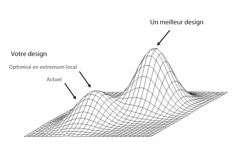
Amazon does this all the time. They redesign pages or elements of their site frequently but where they make the difference is that they know that their consumers are used to their site and how to navigate it. Any change is an imbalance of the building and must have a significant impact on improving sales and revenue before being put into production. A/B and multivariate testing allow you to limit risks and know precisely whether the changes you are about to make are positive or not. Drastic changes can never be intelligently managed and you won't be able to separate the variables that cause positive or negative impacts on conversion. By testing on your current site before redesigning it, you will reach a local extreme. This means that you will have optimized the site as well as possible in its current shell. It is at this stage that you will be able to learn lessons and evolve towards the global extremum by integrating the new design.
What lessons can we learn from this?
In a previous article, I wrote on the subject " why redesigning is dangerous and M&S fell into this trap.
Testing should be continuous. This means before, during and after launch rather than a drastic test of the redesign that took two years to release in production, testing small incremental changes and integrating the most sensible ones into the redesign.
Making website graphic updates can be risky, especially with a big production goal. Incremental and controlled changes, closely monitored, allow you to make improvements with confidence. Marks and Spencer may have other issues that may have caused this sales slump but messing with user experience certainly had an impact on it.
This article has been translated from English by Thibaut Tanguy from the post written by Manuel da Costa under the title What went wrong with the marks & spencer website redesign that made them lose sales?
Thibaut Tanguy, UX-Activist @UXRepublic


DIGITAL ACCESSIBILITY AWARENESS #Paris
SMILE Paris
163 quay of Doctor Dervaux 92600 Asnières-sur-Seine
DIGITAL ACCESSIBILITY AWARENESS #Belgium
UX-REPUBLIC Belgium
12 avenue de Broqueville - 1150 Woluwe-Saint-Pierre
ACCESSIBLE UX/UI DESIGN # Paris
SMILE Paris
163 quay of Doctor Dervaux 92600 Asnières-sur-Seine
AWARENESS OF DIGITAL ECO-DESIGN # Belgium
UX-REPUBLIC Belgium
12 avenue de Broqueville - 1150 Woluwe-Saint-Pierre

STORYTELLING: THE ART OF CONVINCING # Paris
SMILE Paris
163 quay of Doctor Dervaux 92600 Asnières-sur-Seine


UX/UI ECO-DESIGN # Paris
SMILE Paris
163 quay of Doctor Dervaux 92600 Asnières-sur-Seine
DESIGN THINKING: CREATING INNOVATION # Belgium
UX-REPUBLIC Belgium
12 avenue de Broqueville - 1150 Woluwe-Saint-Pierre


MANAGING AND MEASURING UX # Paris
SMILE Paris
163 quay of Doctor Dervaux 92600 Asnières-sur-Seine

DESIGN SPRINT: INITIATION & FACILITATION # Paris
SMILE Paris
163 quay of Doctor Dervaux 92600 Asnières-sur-Seine
